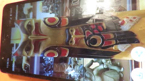
Art Design Project #5, Native American Animal Totem Pole Sculpture, Part 4
In this demo, I have taken the time to draw out all the pieces for each part of this totem pole sculpture. The shapes and sizes do matter.
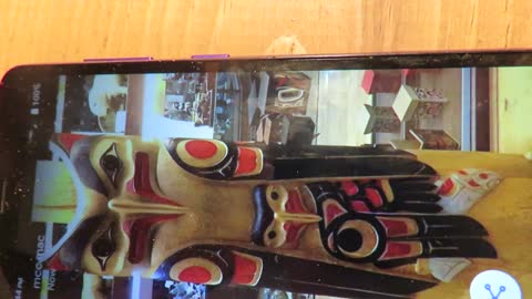
Art Design Project #5, Native American Animal Totem Pole Sculpture, Part 1
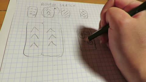
In this demo, we go over the sketch portion of how to draw it. Sketches are important to figure out how to then use the drawing to actually create it in real life. Whether in painting, or in our case, sculpture, it is helpful to sketch out your ideas. Think of a sketch as you road map to get where you need to go.
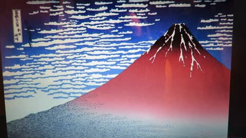
Mt. Fuji Print: Hokusai's print, Part 1
In this demonstration, we will talk about sketches (or in English class we can refer to them as 'rough drafts). These sketches are the blueprint or layout if you will in how we will figure out what will be black and what will be white. Remember that you only have one color in your Speedball ink kit, and that is black. And you have the white of your paper. So we have to be aware that even though Hokusai's print has red, blue, white, black and a little green, we only have two colors: black (ink) and white (paper).
So I have mapped it out for you by drawing a few sketches in order to figure out what is black and what is white for this print we are doing.
Also, if you ever want to do printmaking like this, consider that you can only work with the colors you have and also think about that the image that you create (sketch) will turn out to be a mirror image as the final print.
Keep this in mind as we go forward. Thank you!
Mt. Fuji Print: Hokusai's Print, Part 7
This demonstration talks about getting too much ink and/or too little ink on your roller. This is really important. If you don't get the right amount of ink on your roller, your print will not come out. Consider also if your ink is too thick, adding water.
You want it the consistency of pancake mix, not pudding, if that is helpful for you.
Mt. Fuji Print: Hokusai's Print, Part 3
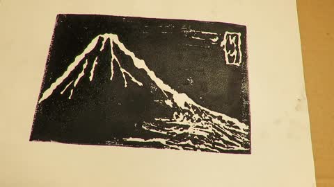
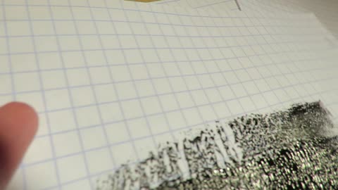
In this demonstration, there is more discussion on how to use the burin and follow the pencil lines in your matrix. Consider creating the clouds in the background or not. It's up to you. Also please keep in mind that in Hokusai's print, he created his mountain (Mt. Fuji) to be towards the right side of his page, not in the center. And then the white of his name on the side as Japanese and Chinese people sign their name in Characters, or in Japanese it is called "kanji", you see that his name is on the far upper left hand of the print.
If you get rid of his signature, the entire composition is off. Again, we are experimenting so I am not expecting us to be aware of how to create balance in a composition. But should you be interested, it may be worth listening to of how an artist considers an entire composition to be complete and balanced.

Mt. Fuji Print: Hokusai's Print, Part 2
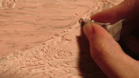
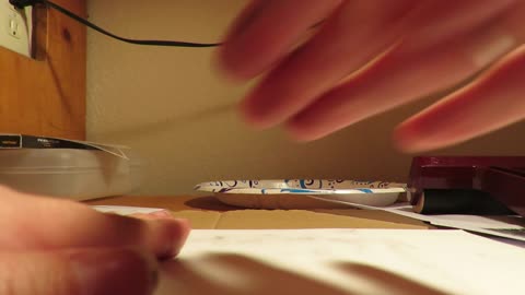
In this demonstration, we are now ready to carve into our matrix. Make sure that you always point the gouging tool away from you ( this took is called a "burin"). If you need to, you can always rotate your matrix so that you never have to have the burin cut towards you.
Make sure you cut deep enough but not too deep in your matrix as you don't want to create a hole. That would ruin your matrix and you would have to buy another matrix or a whole other Speedball ink kit.
Also, please note, that since these are manufactured in China, that they may not work as well. Mine as you have seen is broken. The blade would not fit into the burin. So keep that in mind. If you find that you have the same issue, you can use tape as I did and continue using the blade.
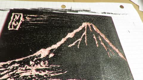
Remember, also that when you are cutting, you are cutting to create white, not black. Everything that you don't cut, is black. Keep in mind, this is just like how woodcut or woodblock prints are done.This is how Hokusai did his prints, however instead of using rubber-based plastic matrices as we are, he used wood to create his "Mt. Fuji" print.
Thank you!

Mt. Fuji Print: Hokusai's Print, Part 4
In this demonstration, we discuss more of the signature and the rectangular nature of it as opposed to the mountain to create a sense of balance. Again, if you want to create clouds in the background, you are definitely welcomed too. I was worried that it would make it too busy so I decided not to.
It's up to you. Consider as well, different techniques like dots, lines, curves, etc. that are both shapes and lines to help you create your design on your matrix.
Hope you have fun for this project!
Mt. Fuji Print: Hokusai's Print, Part 11
In this last demonstration, the final print is a lot better because I used a bit of water on the paper plate with the ink mixed in and used my roller. But the main thing is timing. It's definitely a lesson in timing once you get to the inking stage.
I hope you all enjoyed this demonstration and I am looking forward to seeing your prints!
Thank you!
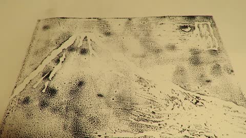
Mt. Fuji Print: Hokusai's Print, Part 10
As a result, I am not with my print. So I did it again. Remember what is really nice about printing, is as long as you have the ink, you can print again and again and again, until you get that perfect print. That is why you will see artists who are printmakers have 50 editions, and only let's say the 25th edition was the best.
Printmaking can be extremely tedious and can be, given all the constricts of straight, centered, etc. and imagery quality, quite labor intensive as well as it can make an artist/printmaker quite a perfectionist as a result.
But, again, I was not happy with my result. So I added a bit of water to my ink that was on my paper plate and that seemed to make a difference. I also printed right away instead of waiting, as my battery on the video camera kept dying, so I waited before.
Now I just did it. And you want to just do it too. You don't want to wait too long. If you wait too long what happens is the ink dries and no matter how hard you rub that paper, the ink is already dried to some extent on your matrix and you won't "pull a good print", as they say.
Mt. Fuji Print: Hokusai's Print, Part 8
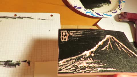
In this demonstration, we have gone through the inking process and are now ready to use our registration paper.
Remember that your registration paper should be half the size of either an 8.5 x 11 or 9 x 12 piece of paper.
Also recall:
1. half of that paper is your registration paper
2. the other half of that paper is your final print paper
Place your registration paper down first. Then place your matrix on top. Consider as well cleaning your fingers before you touch your registration paper and your final print paper. If you have black ink on your fingers, they can easy smudge your registration paper as well as your final print paper. Technically if this was a printmaking class, you should not have any smudges whatsoever on your registration paper or your final image. You will lose points if you do.
Also make sure your registration paper is straight. That is incredibly important for a print. And as such, if you were taking a printmaking class, you would be docked points if your final image because of your registration paper, came out crooked.
Then once you have your registration paper straight, then carefully place your matrix on top of the paper, facing out. Do not have your matrix facing in, as your registration paper is not your final printing paper. Situate it carefully in the middle. You want it to be centered. If you need to use a ruler prior to know where to place your matrix so that it is centered, feel free to do so. If you want to trace your matrix on your registration paper so you know where it is centered, you can do that as well. But be careful not to smudge any ink on the registration paper while you use your pencil and go around the entire matrix.
Finally, you are now ready to place your final printing paper on top of the registration paper. Make sure sure that your registration paper matches exactly the width and the height of your final printing paper. It is important that they are the same.
If you think about this, because your final printing paper is going on top of your matrix, it will create a mirror image as a result.
Mt. Fuji Print: Hokusai's Print, Part 9
In this demonstration, you can notice my fingers are inked and because they are inked, they create smudges. Again, if you were in a printmaking class, this is definitely something that can make a grade from an A drop to a C, if there are smudges. In that case, you'd want to do it over again because you cannot erase the smudges, not even with white-out or white paper.
But as this is for you to see if you like printmaking and experiment with this medium, I am only again grading you on your effort. And I have smudges on my fingers as you see.
You will also notice that this is a process and time-sensitive project once you get to the inking stage. In this video and the next, I discuss why my print turned out so faded. This was because I waited too long between inking and printing.
You can also wet your paper, although I would suggest you experiment with this before you try the final printing image. This means that I would see that your paper can handle being wet, rather than disintegrating. Remember, as we discussed in Jim Dine's charcoal drawing demonstration, the tooth of the paper matters. The weight of the paper matters as well. If you are using regular computer paper, and you wet this paper, it will not work and will wrinkle too much. If you use drawing paper like Bristol or other sketchbook paper that has at least 50 to 100 lbs in all in the paper (it says on the cover) you can put this in water.
If this is really up your alley and you think you want to explore printmaking more, than go ahead and take the leap and you can use cold pressed watercolor paper. This paper has a lot of "teeth", meaning it is woven together strongly and as such you will need to put this paper into water. The best is to use a tub of some kind and that will be sufficient.
So with this in mind, I used drawing paper. As you can see in the next videos, mine did not turn out well. It was not because I didn't have enough ink or too much ink, rather it was because I waited too long between the inking and the final print.
Mt. Fuji Print: Hokusai's Print, Part 5
In this demonstration, we will start to use the ink. Remember, we only have black ink and white paper. That is all we have to work with as far as ink and the white of the paper goes. You will want to wear an apron as it can get messy or you can wear dark clothing.
You will need the following:
-a roller
-newspaper or other paper so that the surface you are working on does not get dirty or messy
-registration paper (same size as your print)
-printing paper (your final print, again needs to be the same size as your registration paper)
-black ink (Speedball printing ink)
-a small glass of water (optional)
- a paper plate or you can use the newspaper (the newspaper needs be at least two pages or two layers)
Although I didn't say this in the demonstration, your registration paper and your final paper, I cut a 9 x 12 in paper in half so it was 3 x 6 for both the registration paper and the final paper. You can also use 8.5 x 11 inch paper and cut that in half.
In essence, when you cut that piece of paper in half (I would recommend using a ruler and either straight scissors or an x-acto knife) your paper will be the following
1. one half is your registration paper
2. the other half is your printing--final print paper
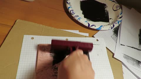
You will take your Speedball black printing ink and squirt it either on the paper plate or on two layers of newspaper. Then you will use your roller and roll into it. You want that silky look. Not too covered. There is a demonstration on too much and too little and what that looks like. Next, you will see that the ink is pretty even on the roller. This is the point where you are now ready to ink up your matrix.
Mt. Fuji Print: Hokusai's Print, Part 6
You are now ready to ink up your matrix. Consider as well going backwards and forwards quickly. Don't put too much pressure on the roller. You want to create as even as a "roll" as possible, if that makes sense. So quick forward, up and down, and side to side is best. You will see this demonstrated in these videos.

Stamp Print: Part 2
In this demonstration, I show you first how I decided to carve deeper into the eraser. I wanted to make sure that it was deep enough. I also mentioned earlier that this was like a relief printing process, meaning it was like a wood cut. Everything that is cut will be white and everything that is not cut (smooth surface of your matrix, which in our case is the eraser) will be the color of the stamp/ink pad (which in this case is black).
So putting that into consideration, there are a few different strategies that are used in order to get as much ink as possible onto the eraser (which in this case is the stamp/matrix). It seems the best is to use fingers to press evenly throughout the entire top of the eraser rather than using the heel of the hand to do it.
Consider as well, using a ruler (optional) to get your stamp/matrix design even and straight, if that is the look you are going for. Remember the more ink you have on your stamp/matrix, the better the image will come out when you stamp it. I called it "bang for your buck"--Hope this all helps you out!
Thank you! I hope you enjoyed this demonstration and most importantly I hope you enjoy this printmaking unit we are on.
Thank you again!
Look forward to seeing your work!
Stamp Print: Part 1
In this demonstration, we first go over the basic art supply list we need which include the following:
-Pink Pearl eraser also known as Papermate (you may need lots of these 5-10 if you find yourself carving too deeply
- white paper
-grid paper
-pencil
-ink or stamp pad (any color you wish)
-x-acto knife
-tracing paper (optional)
-ruler (optional)
Since this is just the basic idea, I didn't go into how to create a grid pattern like it states in your Project Art Lesson plan, pdf.
With that said then, it is an overview of the art supply/material list as well as sketching some ideas on paper for the final design/pattern. Remember the phrase: "Keep it simple, silly." That's important. As I stated you don't have much real estate to work with as far as your space is concerned (erasers are small) and so keeping your design/pattern simple is best.
You'll need to carve into your eraser to make the design/pattern. And I got over the basics of that.
Hope that helps you! Thank you.
Stay tune for Stamp Print: Part 2.
Please note: I tried to make this a lot easier so there were a lot less steps because I didn't want to confuse you and this is again for your enjoyment to experiment in different art mediums! Thank you again!
Charcoal Drawing: Jim Dine's Raven, Part 3
In this demonstration, we will go over some more ideas as related to proportion etc. Please also note that if you do not feel like you are artistic, it is more important that you take the time and do your personal best. This is a chance to experiment in this medium, charcoal. I hope you enjoy doing art.
Charcoal Drawing: Jim Dine's Raven, Part 1
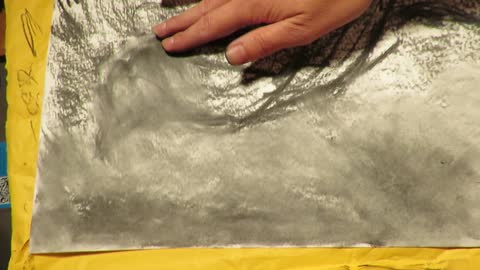
In this demonstration, a brief overview of the art supplies needed as well as how to create a ground, using vine/vinyl charcoal will be discussed and shown. Also shown will be how to draw the crow (head and body). Thank you!
TIP: Vine/vinyl charcoal is messy. It is a good idea to wear dark clothing or an old shirt or apron that is okay to get dirty.
If you do not want the table or surface you are working on to get black smudge marks and dust, you can use newspaper or some other covering on the surface that you are working on.
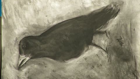
PLEASE NOTE: Raven and crows have been known in various cultural origin stories. Discussed later through these lessons, it is known that the difference between the raven and a crow is the size. Ravens are larger birds than crow. Raven was one of the birds that came to Jim Dine in a dream. This is why he decided to draw it in charcoal.
If interested, you may be able to go to the college library and see if you can find this documentary, "A Self Portrait on The Walls", 1995, located in a gallery in Ludwigsburg, Germany.

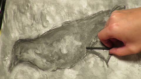
Charcoal Drawing: Jim Dine's Raven, Part 2
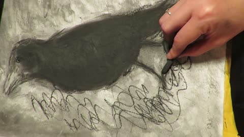
In this demonstration, we will make the shapes of the head (circle) and body (oval) more clear. A drawing technique called substractive will also be utilized shown through erasing. Using your fingers, smear around the outside of the raven/crow (your subject). Continue to smear and continue working a bit on the outline of your raven.
Charcoal Drawing: Jim Dine's Raven, Part 6
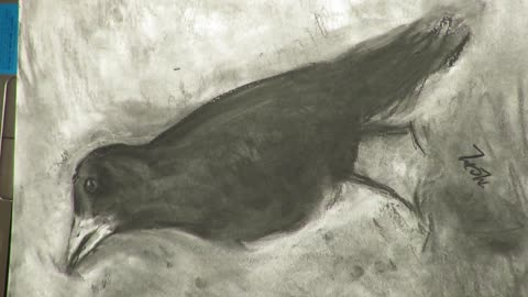
In this very brief demonstration, it will include signing your name. You can do it as your initials (two initials if you just want your first and last initials or you can include three initials, by adding the first letter of your middle name).
Charcoal Drawing: Jim Dine's Raven, Part 7
This is the last part of the demonstrations. Hope you enjoyed it and I also hope you were able to take pleasure in this medium, using charcoal. Thank you!
Charcoal Drawing: Jim Dine's Raven, Part 5
In this demonstration, there is just a few considerations, adding a little bit more detail to the drawing.
Charcoal Drawing: Jim Dine's Raven, Part 4
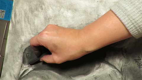
In this demonstration, there is just an overview of basic refining, including compressed charcoal. Creating texture and adding more texture through various mark-making techniques will also be explored.