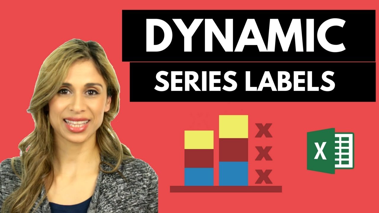
Excel Charts: Stacked Chart Dynamic Series Label Positioning for Improved Readability
May 5, 2017 Excel Charts
Download the workbook here: http://bit.ly/2pnDt5F
Get the full Excel Dashboard course here: https://courses.xelplus.com/p/professional-excel-dashboards
Learn how to add your legend "inside" your Excel chart for improved readability - and of course in a dynamic way.
This technique works great for stacked column charts. Instead of using the default Excel legend, add a dynamic series to the chart that controls the position of the series labels.
To learn how to add total values to a stacked column chart, take a look at this video: https://rumble.com/v2st54q
In the next video, I'll show you how you can add percentages are well as total values to each stack.
Get my complete Advanced Excel Chart Course: https://courses.xelplus.com/p/excel-charts-visualization-secrets-for-impressive-charts
★ My Online Excel Courses ► https://courses.xelplus.com/
✉ Subscribe & get my TOP 10 Excel formulas e-book for free
https://www.xelplus.com/free-ebook/
EXCEL RESOURCES I Recommend: https://www.xelplus.com/resources/
Get Office 365: https://microsoft.msafflnk.net/15OEg
Microsoft Surface: https://microsoft.msafflnk.net/c/1327040/451518/7593
GEAR
Camera: https://amzn.to/2FLiFho
Screen recorder: http://techsmith.pxf.io/c/1252781/347799/5161
Microphone: https://amzn.to/2DVKstA
Lights: http://amzn.to/2eJKg1U
Note: This description contains affiliate links, which means at no additional cost to you, we will receive a small commission if you make a purchase using the links. This helps support the channel and allows us to continue to make videos like this. Thank you for your support!
#MsExcel
-
 2:38
2:38
RahimZulfiqarAli
2 years agoCreate Dynamic Charts in Excel (Filter Function) & Dynamic Title on Chart
6 -
 4:56
4:56
Excelliott Technology
2 years agoExcel - Dynamic Date Function
1 -
 0:55
0:55
RahimZulfiqarAli
2 years agoCreate Actual vs Target Dynamic Chart in Microsoft Excel
1 -
 3:31
3:31
Ikyjudy
2 years agoTask 16d IGCSE ICT Charts - Add Chart Labels in Microsoft Excel Hodder Education
6 -
 43:52
43:52
humulica
2 years agoSales Dashboard in Excel | Dynamic Excel Dashboard for Sales
9 -
 LIVE
LIVE
The Jimmy Dore Show
2 hours agoTrump Threatens to INVADE Nigeria! Kash Patel CRASHES OUT Over Jet Use Criticism!
5,522 watching -
 LIVE
LIVE
Conductor_Jackson
21 hours agoLet's Play Unrailed 2 Solo! 🚂🚂🚂🚂🚂🚂
6 watching -
 1:25:38
Kim Iversen
3 hours agoTrump’s Nigeria Threat Isn’t About Christians — It’s About China
76K68 -
 LIVE
LIVE
VikingNilsen
6 hours ago🔴LIVE - ARC RAIDERS - QUEST GRINDING
11 watching -
 59:10
59:10
Sean Unpaved
2 hours agoDodgers Dynasty Rolls On, NFL Chaos Reigns, & MNF Showdown Countdown
13.1K1