Most Common World Map Is WRONG
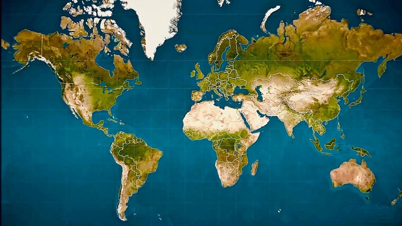
Thanks to a cartographic technique called the Mercator projection, most people have a skewed perception of the true size of countries.. Used just about everywhere, from textbooks to Google Maps, the Mercator projection map is the way most of humanity recognizes the position and size of Earth’s continents. In 1569, the great cartographer, Gerardus Mercator, created a revolutionary new map based on a cylindrical projection. The new map was well-suited to nautical navigation since every line on the sphere is a constant course, or loxodrome. In modern times, this is particularly useful since the Earth can be depicted as seamless in online mapping applications.
That said, the true sizes of landmasses become increasingly distorted the further away from the equator they get. Mercator’s map inadvertently pumps up the sizes of Europe and North America. Visually speaking, Canada and Russia appear to take up approximately 25% of the Earth’s landmass, when in reality they occupy a mere 5%. When Antarctica is excluded (as it often is), Canada and Russia’s visual share of landmass jumps to about 40%!
Canada is the second largest country in the world, but not by much.
Africa, South Asia, and South America all appear much smaller in relation to countries further from the equator.
And from a North American perspective, countries such as Australia and Indonesia appear much smaller than they actually are. Comparing the landmasses on the same latitude as Canada helps put sizes into perspective.
Greenland is the world’s largest island, but looking at its hyper-exaggerated depiction in the map below, you’d be forgiven for wondering why it isn’t a stand-alone continent. In reality, Greenland is about fourteen times smaller than Africa.
Is Bigger Better?
Though Mercator’s map was never intended for use as the default wall map in schools around the world, it has shaped the worldviews of billions of people. Critics of the map – and similar projections – suggest that distortion reinforces a sense of colonialist superiority. As well, the amount of territory a country occupies is often correlated with power and access to natural resources, and map distortions can have the effect of inadvertently diminishing nations closer to the equator.
A prime example of this argument is the “True Size of Africa” graphic, which demonstrated to millions of people just how big the continent is.
Growing awareness of map distortion is translating into concrete change. Boston public schools, for example, recently switched to the Gall-Peters projection, which more accurately depicts the true size of landmasses.
In our society we unconsciously equate size with importance and even power.
– Salvatore Natoli, Educational Affairs Director, AAG
Music: The Inventor by Dhruva Aliman
Amazon - https://amzn.to/3eyYxeD
https://music.apple.com/us/artist/dhruva-aliman/363563637
https://dhruvaaliman.bandcamp.com/album/king-neptunes-travelling-merchants-and-their-adventures-in-and-beyond-the-sea
http://www.dhruvaaliman.com/
Spotify - https://open.spotify.com/artist/5XiFCr9iBKE6Cupltgnlet
-
 2:19
2:19
Seeker Land
2 months agoFunny - Democrats In Split Screen Saying LA Riots Are Peaceful
97 -
 32:05
32:05
Tactical Advisor
2 hours agoNew Thermal Target for the Military | Vault Room Live Stream 038
23.9K2 -
 LIVE
LIVE
GamerGril
1 hour agoThe Evil Within 2 💕 Pulse Check 💕 Still Here
73 watching -
 LIVE
LIVE
ttvglamourx
5 hours ago $0.26 earnedPLAYING WITH VIEWERS !DISCORD
79 watching -
 LIVE
LIVE
TheManaLord Plays
7 hours agoMANA SUMMIT - DAY 2 ($10,200+) | BANNED PLAYER SMASH MELEE INVITATIONAL
189 watching -
 LIVE
LIVE
Jorba4
2 hours ago🔴Live-Jorba4- The Finals
66 watching -
 LIVE
LIVE
BBQPenguin_
2 hours agoSOLO Extraction. Looting & PVP
32 watching -
 1:57:14
vivafrei
19 hours agoEp. 280: RFK Jr. Senate Hearing! Activist Fed Judges! Epstein Victims DEBACLE! & MORE! Viva & Barnes
72.9K78 -
 LIVE
LIVE
GritsGG
3 hours agoTop 250 Ranked Grind! Dubulars!🫡
116 watching -
 5:31
5:31
WhaddoYouMeme
1 day ago $3.35 earned$8,000/hr Dating Coach Loses Everything (Sadia Kahn)
20.2K8