
Create a Map of UFO Reports Using Python and Plotly in Under 10 Minutes
4 years ago
16
Kaggle Dataset: https://www.kaggle.com/NUFORC/ufo-sightings
GitHub Repo: https://github.com/8CodeBuff8/NUFORC-fun
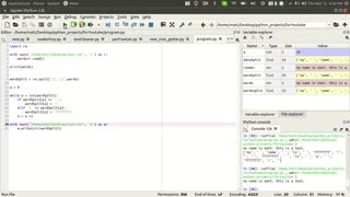
This video is a short intro to showcase the simple, yet powerful abilities that Python provides for data analysis.
Loading comments...
-
 6:11
6:11
Matea Vasileski
4 years agoAnalysing UFO Time of Day and Length of Encounter Report Trends with Python (NUFORC Data)
39 -
 7:52
7:52
monsterMatt
5 years agoPython Importing and Using Classes
189 -
 5:49
5:49
GinaCool
4 years agoWorkout in under 10 minutes
117 -
 2:01
2:01
RattlingJunkie
5 years ago $0.03 earned16 Bear Kills under 2 Minutes!
229 -
![How To Create Garage Band Arrangement Track [ Step by Step in under 5 minutes ]](https://1a-1791.com/video/s8/6/V/X/F/k/VXFkb.0kob.2.jpg) 4:34
4:34
Cyber Productions
4 years ago $0.01 earnedHow To Create Garage Band Arrangement Track [ Step by Step in under 5 minutes ]
8621 -
 10:25
10:25
Donald Feury
4 years agoHow to create a timelapse using ffmpeg
61 -
 4:56
4:56
monsterMatt
4 years agoImporting and Using Custom Classes in Python
114 -
 6:42
6:42
24Vignettes
4 years agoThe Christmas story in under 7 minutes
207 -
 1:08
1:08
bleuio
5 years agoCreate your own BLE application using BleuIO
17 -
![Gray Zone Warfare [RGMT CONTENT Mgr. | RGMT GL | GZW CL]](https://1a-1791.com/video/fww1/02/s8/1/-/n/s/B/-nsBz.0kob-small-ARC-RAIDERS-FIRST-DROP-IN.jpg) LIVE
LIVE
XDDX_HiTower
1 hour agoGray Zone Warfare [RGMT CONTENT Mgr. | RGMT GL | GZW CL]
35 watching