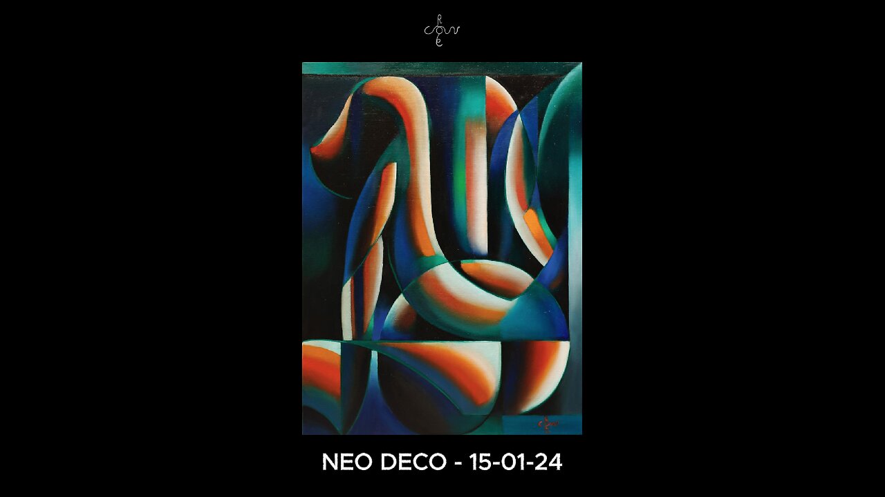
Neo Deco – 15-01-24
Website link: https://corneakkers.com/neo-deco-15-01-24/
Print: https://corneakkers.com/print-neo-deco-15-01-24/
Printable: https://corneakkers.com/product/printable-neo-deco-15-01-24/
An Elaboration
This oil painting ‘Neo deco – 15-01-24’ is an elaboration of a pastel of almost 7 years back. Together with my graphite pencil drawing ‘Roundism – 26-05-17 (Sold)’ they are prestudies for this oil. A bit late you’d say? Well, I have so many ideas and the best way to capture an idea is to draw it. Then I came to realize I was neglecting my ambitions with regard to oil painting a bit. Besides that, It’s always nice to refurbish an old idea and put it into color. Even though I sold both the pastel and the drawing something entered my mind. The colors in the first could need a bit of a redo. Especially after my last oil I fell in love with this matt green. Time for another Neo Deco.
Retro Feel
As said before I reminds me to the art deco epoque. To me it represents the patina of a bygone era. I visualize the smell of cigars, wood furniture and the look of a styled world. A bit goofy perhaps but I am not alone. Alledgedly Madonna has some Tamara de Lempicka’s in her house and you remember her song ‘Vogue’. “They had style, they had grace” lingers in my mind. Surely, such moviestars she’s referring to only strike a pose in front of the camera. Such a life full of beauty wasn’t in the books for my ancesters at least. But wouldn’t you agree to my remarks on bringing back the style a bit? It seems this world can use a bit of glamour. Not the cheap fake influencers ooze out but genuie new visual insights in true beauty.
A Bit of an Art Statement
Instead of mass consumption I strive to bring back the love for craft. Show how beautifully something of value is forged. That is why I don’t feel like belonging in this era, at least artwise. What do you think, me a bit sentimental? Today I spoke to a couple of students of mine who totally agree on this. They also know many others you think the same way. So, I’m not the only one.
Color Scheme
Now I set out to also employ the abovementioned green I had to come up with a new color scheme. The one in the pastel only knew red, blue and white. That was daring but this oil needed something else. First I enforced the reds but felt I was in need of orange as well. It serves as a counterbalance to blue. There you have it: two cool and two warm colours. Both complementary. Last but not least, I also took care of a saturational balance. That is why I kept the black and white colors serving as ligaments to keep all strong colors in place. A nice and very abstract female form. Probably one of the most abstract I ever made to date.
Oil on linen (60 x 80 x 2 cm)
Artist: Corné Akkers
-
 1:19
1:19
Corné Akkers Artworks
5 days agoCreating Model Session – 18-10-25 – 2
27 -
 LIVE
LIVE
Spartan
18 hours agoFirst playthrough of First Berserker Khazan
314 watching -
 28:01
28:01
Living Your Wellness Life
2 days agoTrain Your Hormones
2.92K -
 43:28
43:28
The Heidi St. John Podcast
1 day agoFan Mail Friday: Faith Over Fear and Finding Strength in Every Season
1.13K -
 1:05:30
SGT Report
1 day agoTHE HORRIBLE TRUTH ABOUT EVERYTHING -- Harley Schlanger
41.1K84 -
 11:04
11:04
Blackstone Griddles
15 hours agoCountry Fried Steaks on the Blackstone Griddle
86.1K13 -
 49:47
49:47
Brad Owen Poker
23 hours agoI Get My First BIIGGG Win! $25,000+ Buy-in! HORSE Championship! Don’t Miss! Poker Vlog Ep 324
10.5K1 -
 9:53
9:53
Rethinking the Dollar
23 hours agoWhen Detroit Bleeds, America Suffer! Layoffs Have Begun
14.6K30 -
 18:36
18:36
Clownfish TV
1 day agoYouTube Just NERFED YouTube Gaming... | Clownfish TV
18K31 -
 10:26
10:26
Silver Dragons
20 hours agoSilver is TAKING OFF Around the World
17.2K4