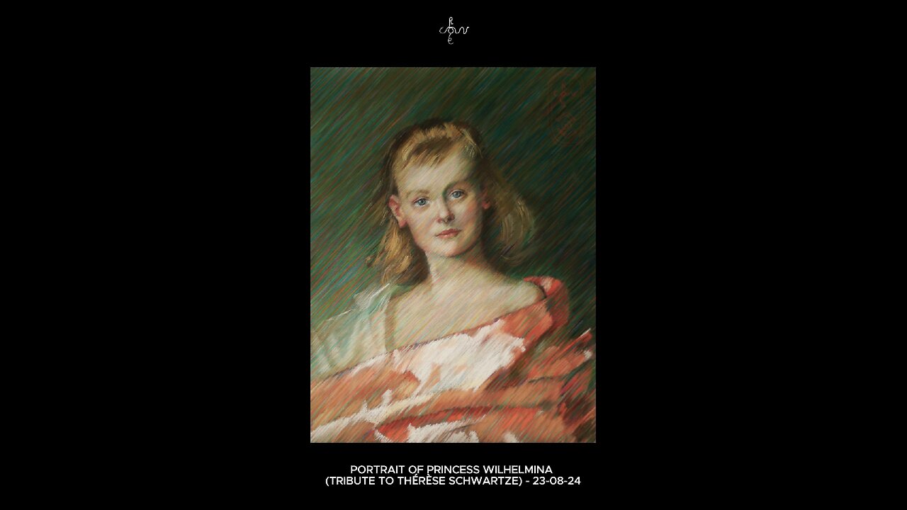
Portrait of Princess Wilhelmina (Tribute to Thérèse Schwartze) - 23-08-24
Website link: https://corneakkers.com/portrait-of-princess-wilhelmina-tribute-to-therese-schwartze-23-08-24
Print: https://corneakkers.com/print-portrait-of-princess-wilhelmina-tribute-to-therese-schwartze-23-08-24/
Printable: https://corneakkers.com/product/printable-portrait-of-princess-wilhelmina-tribute-to-therese-schwartze-23-08-24/
A Great Independant Female Artist
This pastel drawing ‘Portrait of Princess Wilhelmina (Tribute to Thérèse Schwartze) - 22-08-24’ is something special. A homage to a great independant female artist. Late 19th century women weren’t suppose to become artists really. Instead, they were considered as mere incubators. Take Suze Robertson for example. Contemporary of her and way less well-to-do whe was pelted with stones whilst once painting here The Hague. Uninmaginable but that’s just only a bit more than hundred years ago. Not Ms Schwartze though. She moved in affluent circles early on, way up to the royal family of Oranje-Nassau. Consequently she made a lot of money and if you’re loaded then you can’t be wrong. Even if you are a woman.
Impeccable Technique
What I really think of her? Well, throughout my whole life I have know her work. When visiting museums here in The Netherlands you often come across one of her paintings. Her technique is impeccable but personally I find her portraits a bit too flattering sometimes. Not that I blame her for doing so. Because she sold them very well she became an independant figure. It is as if she put up a gigantic brick wall of emancipation because of her pleasing artworks. After all, if you sell your stuff for top dollar you can be who you are. Eccentric like Dali or even a woman as artist without children.
Paul Tetar van Elven Museum
Now for some artistic considerations. There is this famous pastel portrait of Princess Wilhelmina she made in 1888 I believe. In dutch: ‘Portret van Prinses Wilhelmina’. Two years ago I saw it in the Paul Tetar van Elven Museum in Delft. Knowing it all my life I was thrilled to finally see it on display for real. Of course all comments on the pastel are true. The face is darling, smooth and the texture of the cloth are brilliantly roughly sketched. Then again, something was misssing. Personally I think tonally she made the eyes a bit to strong. For the effect of putting the focus on her gaze, that’s for sure. However, to the detriment of all other facial features. By those I mean other muscular patterns in a face.
Pink Chocolate
Next to this, I found the overall appearance of the drawing a bit of a gigantic pink chocolate. Surely I can imagine she was and still is loved for such a work. In the back of my mind these last 2 years this pastel kept on lingering though. What if…? The story begins with the AVROTROS television show ‘Het Geheim van de Meester’ in which this work was copied. There also was an art competition involved. That was when some of my students got triggered so they participated. At one given moment I thought to participate myself but I was busy completing ‘Venus Lamenting – 16-06-24’. Now it’s August 2024 and I had some time left to do this pastel drawing
My Personal Hatched Strokes Style
The main goal was to use more different skin hues than Thérèse did. Frankly I was just curious how this work would look like in my personal hatched strokes style. In the past I have explained how this hatchings of my would fit right into divisionism as artistic theory. To sum it all up: hatch complementary colors next to eachother. This way you get vibrancy in up close and the right greyish effect at a certain distance. Next to this I tried to emulate the difference in contrast between the face and the cloth Wilhelmina is wearing. he thickness of the hatched strokes in the facial features are much thinner than in the attire. All-in all, the result is a bit of a rough edge, reflecting the die hard queen she became to be later in life.
To Blend or Not to Blend
Some final remarks as to the copied result compared to Thérèse’s pastel. Halfway I saw that the angle is slightly off. Mine is a bit more tilted to the left. After some consideration I decided to keep the angle like that. Somehow it contributed to the direction of the strokes I laid. It delivered me some more dynamics as well. Looking and scrutinizing the result I see it’s not as soft looking as hers. That’s blended to the max but I’m bot a blender myself, especially not in laying those strokes.
Final Remarks
Besides that, her portrait is more bonny looking. Perhaps a typical depiction of how people wanted their children to be drawn. Slightly bigger eyes than they have for example and she put the stress on the eyes tremendously. When I compare her result to actual photos of the young Wilhelmina the resemblance in hers is actually poor. Therefor I also used aforemeant pictures like one of her and her dog from 1889.
Pastel drawing on Canson Mi-Teintes Touch paper (47 x 62 x 0.1 cm)
Artist: Corné Akkers
-
 0:24
0:24
Corné Akkers Artworks
4 days agoNude - 28-08-15
54 -
 35:40
35:40
The Mel K Show
2 hours agoMel K & Dr. Mary Talley Bowden MD | Heroes of the Plandemic: Doing What is Right No Matter the Cost | 10-25-25
8.73K7 -
 3:06:20
FreshandFit
7 hours agoNetworking At Complex Con With DJ Akademiks
187K22 -
 LIVE
LIVE
SpartakusLIVE
4 hours agoThe King of Content and the Queen of Banter || Duos w/ Sophie
284 watching -
 1:47:12
Akademiks
4 hours agoLive on complexcon
29.6K4 -
 3:07:36
Barry Cunningham
6 hours agoCAN PRESIDENT TRUMP STOP THE STORMS? ON AIR FORCE ONE | SNAP BENEFITS | MAMDANI | SHUTDOWN DAY 25
31.8K27 -
 13:38
13:38
Exploring With Nug
12 hours ago $7.15 earnedWe Searched the Canals of New Orleans… and Found This!
26.3K3 -
 13:36
13:36
Clintonjaws
1 day ago $32.41 earnedCBC 2024 Election Night - Highlights - This Is Priceless!
63.4K20 -
 23:20
23:20
Lady Decade
7 hours ago $19.69 earnedI Spent The Night With Alex Jones
34.5K32 -
 3:40:07
SavageJayGatsby
7 hours agoSpicy Saturday – Goblin Cleanup Chaos! 💀🌶
20.6K