Berg en Dal 01 (2014) (Sold)
Website link: https://corneakkers.com/2019/07/15/berg-en-dal-01-2014-sold/
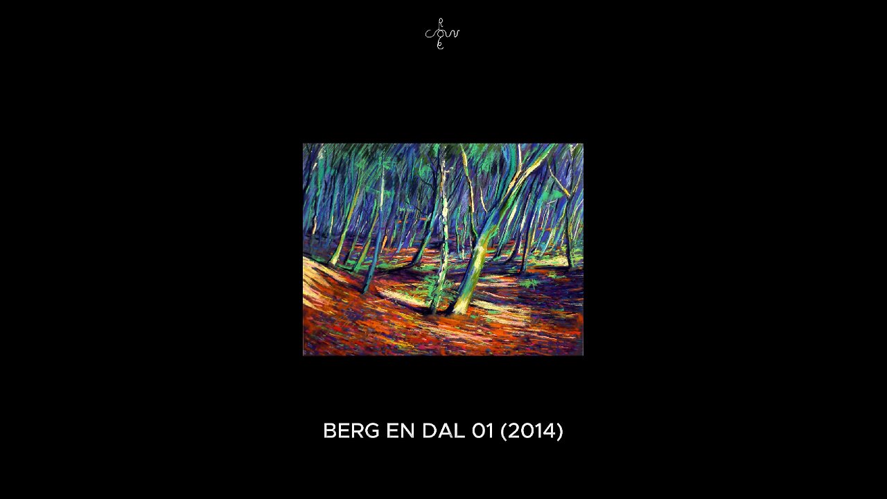
Realism but Foremost Expressionism
This pastel drawing ‘Berg en Dal 01 (2014) (Sold)’ shows a realist landscape or is it. You could say there is a bit of expressionism as well. Well, I exaggerated colors a bit. Almost too strong but the fun lies in the transition of warm to cool colors in the back. Besides that it’s a hefty display or complementary reds and greens, yellows and purples. In fact, I consider the depiction of the trees the only bit of realism. What makes it expressionist is the expression of my love for fallen leaves in autumn. Back in 2005 to be precise.
De Meerberg
That was when I walked down the so-called ‘De Meerberg path’ in Berg en Dal, Netherlands. Together with a colleague of mine who didn’t know the famous N70 route. It stretches from the outer skirts of Nijmegen to the Duivelsberg and back. A hilly side of The Netherlands not many people know of. However, most familiar to me since I come from Nijmegen. The Meerberg path basically stretches from Mount Devil (Duivelsberg) to the Wyler path. Half way you can look down the steep ridge, towards a green valley where there is a white old farmhouse.
The Trouble with Steepness
The trouble with sceneries containing altitudes and depths is that you really can’t show them in an artwork. Imagine yourself taking a picture on a skislope where you direct your camera up or downhill. These photos always let you down back home. What it takes is reference of other (flat) aspects of the same surroundings so you can compare the steepness. Consequently, this pastel isn’t showing that extreme downhill steepness as well. This said, I still like the overall view and its scenic quality. This is the first pastel I made of Berg en Dal, followed up by Berg en Dal 03 (2014). Strangely, number 02 never came to full fruition.
Pastel drawing on Canson Mi-Teintes Touch paper (50 x 65 x 0.1 cm)
Artist: Corné Akkers
-
 0:28
0:28
Corné Akkers Artworks
9 days agoParis 24 – 04-07-24
34 -
 1:48:42
Steven Crowder
6 hours agoDid You Vote for This: Why The Podcast Bros are Turning on Trump
417K487 -
 LIVE
LIVE
The HotSeat
50 minutes agoBondi On The Hill + Equitable Grading? We Are Failing Our KIDS!
616 watching -
 1:09:25
Winston Marshall
2 hours agoExposing Britain's Digital ID Plan and What’s Coming Next…
16K9 -
 3:29:52
Barry Cunningham
5 hours agoPRESIDENT TRUMP MEETS WITH CANADIAN PRIME MINISTER MARK CARNEY
32.4K12 -
 LIVE
LIVE
Owen Shroyer
38 minutes agoOwen Report - 10-07-2025 - Fake Government Shutdown Gets Real
940 watching -
 LIVE
LIVE
SportsPicks
3 hours agoCrick's Corner: Episode 95
70 watching -
 4:23
4:23
Michael Heaver
4 hours agoShellshocked France Is Quickly COLLAPSING
9.71K4 -
 1:08:17
Sean Unpaved
4 hours agoMNF Jaguars Shock: Is Bill's Cachet Fading? Hot Seat Sizzlers & Sanchez's Stabby Spiral
30.2K1 -
 2:59:11
Side Scrollers Podcast
5 hours agoDEI’s FINAL BOSS EXPOSED + Book Publisher REVERSES Cancel Attempt + More | Side Scrollers
30.6K9
