Microeconomics Help: The Graph represents the market for breakfast cereals. Now, suppose that
1 month ago
10
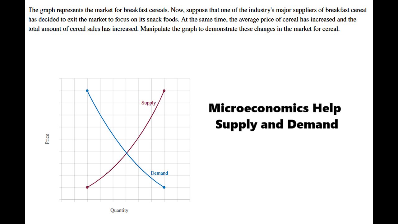
The graph represents the market for breakfast cereals. Now, suppose that one of the industry's major suppliers of breakfast cereal decided to exit the market to focus on its snack foods. At the same time, the average price of cereal has increased and the amount of cereal sales has increased. Manipulate the graph to demonstrate these changes in the market for cereal.
#MicroeconomicsHelp
#Techniques
#SupplyDemandCurve
#SupplyCurve
#DemandCurve
Loading comments...
-
 LIVE
LIVE
Kim Iversen
1 hour agoTrump Might Actually Run For A THIRD Term?! | Turbo Cancers Are Rising—Media Pretends It’s Fine
706 watching -
 LIVE
LIVE
Candace Show Podcast
2 hours agoCharlie's Angels Or Demons? Disturbing Footage Emerges. | Candace Ep 252
8,643 watching -

Redacted News
1 hour agoBREAKING! "LEAVE NOW OR BE ASSASSINATED" CIA BACKED COUP IN VENEZUELA HAS BEGUN | Redacted News
35.2K34 -
 1:55:47
vivafrei
8 hours agoEp. 288: VIva & Barnes Sunday Night Show... ON A MONDAY! Trump, Gavin, Government Shutdown & MORE!
110K22 -
 28:38
28:38
Standpoint with Gabe Groisman
1 hour agoPrime Minister Netanyahu: Inside Israel's War, Peace and the Path Forward.
3.04K10 -
 LIVE
LIVE
LFA TV
21 hours agoLIVE & BREAKING NEWS! | MONDAY 10/27/25
1,245 watching -
 LIVE
LIVE
freecastle
6 hours agoTAKE UP YOUR CROSS- The wicked accept bribes in secret to pervert the course of justice!
150 watching -
 LIVE
LIVE
LadyDesireeMusic
1 hour agoLive Piano Improv
137 watching -
 1:54:42
The Quartering
3 hours agoFood Stamp Riots Are Coming, New Charlie Kirk Assassin Discord Messages Leak & Console Wars End!
133K54 -
 16:09
16:09
iCkEdMeL
4 hours ago $4.69 earned🔴 LIVE: Tyler Robinson Pretrial Hearing in Charlie Kirk Assassination Case
15.8K3