Create STUNNING Bullet Charts in PYTHON | Data Visualization Tutorial
Create STUNNING Bullet Charts in PYTHON | Data Visualization Tutorial
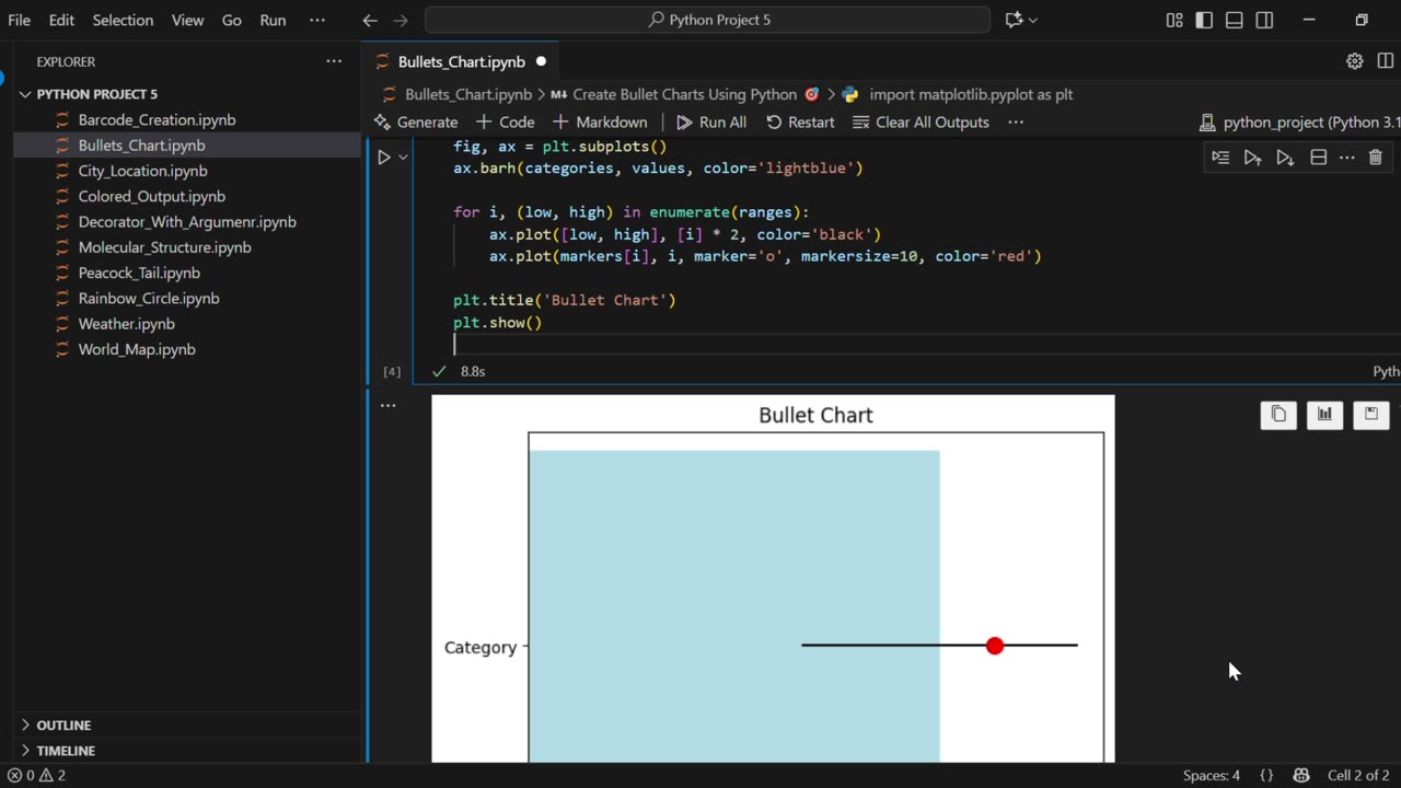
In this Tutorial Learn how to create professional, STUNNING Bullet Charts in Python with this step-by-step tutorial! Bullet charts are a powerful data visualization tool, designed as a modern replacement for dashboard gauges and meters. They effectively display a primary measure (like sales performance) against a target, and within the context of qualitative ranges (like Poor, Fair, Good).
In this video, you'll learn how to build these elegant charts from scratch using Matplotlib.
✨ What You'll Learn:
The core components of a bullet chart and why they are so effective.
How to create a basic bullet chart using matplotlib.pyplot.
Step-by-step code walkthrough: barh, plot, and customizing markers.
How to customize colors, sizes, and labels to make your charts clear and visually appealing.
Tips for extending the chart to display multiple categories.
🔔 Subscribe for more Python and Data Science tutorials! Hit the bell icon to get notified whenever I post a new video.
#Python #DataVisualization #PythonTutorial #Matplotlib #BulletChart #DataViz #PythonMatplotlib #DashboardDesign #DataAnalysis #BusinessIntelligence #PythonForDataScience #CodingTutorial #Programming #DataVizPython #PythonPlotting #MatplotlibTutorial #DataPresentation #PythonProjects #Pandas #DataAnalytics #PythonDataVisualization #HowToMakeBulletChart #StunningVisualizations #DataScience #PythonCoding
-
 1:05
1:05
AI Evolutionary Technology
12 days agoCreate Your Own Python Decorator | Repeat Functions Like a Pro
7 -
 1:58:26
Badlands Media
16 hours agoBaseless Conspiracies Ep. 151: Netanyahu, Dual Loyalties, and the Kirk Connection
50.1K32 -
 4:55:05
Akademiks
10 hours agoYoung Thug Dissing YFN Lucci. Ready to Go back to Jail. Offset vs Cardi b
74.4K4 -
 2:02:45
Inverted World Live
11 hours agoIs the Rapture Tomorrow? | Ep. 111
128K48 -
 3:02:41
TimcastIRL
10 hours agoABC REVIVES Jimmy Kimmel After TERROR Attack On Station, Sinclair REFUSES To Air Show | Timcast IRL
280K170 -
 2:32:12
The Charlie Kirk Show
11 hours agoTPUSA Presents This is The Turning Point Tour LIVE with Michael Knowles
162K70 -
 5:20:38
Drew Hernandez
15 hours agoDISNEY CUCKS FOR KIMMEL & ADDRESSING THE CHARLIE KIRK MEMORIAL AFTERMATH
72.9K21 -
 1:02:28
Flyover Conservatives
14 hours agoThe Most Overlooked Way to Fight Abortion (It’s Not Protests) - Robert Netzly; Why Triple-Digit Silver is Coming - Dr. Kirk Elliott | FOC Show
64.4K3 -
 1:55:33
Glenn Greenwald
14 hours agoDeceitful Hysteria over Tucker's Speech on Kirk; IDF Funder Larry Ellison to Take Over CBS, Paramount, and now TikTok; U.S. Embraces Leading Al-Qaeda Terrorist | SYSTEM UPDATE #519
224K115 -
 34:40
34:40
Donald Trump Jr.
15 hours agoWe Will Make Charlie Proud | TRIGGERED Ep.276
228K95