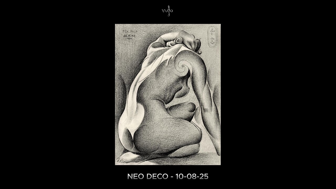
Neo Deco - 10-08-25
Website link: https://corneakkers.com/neo-deco-10-08-25/
Print: https://corneakkers.com/print-neo-deco-10-08-25/
Printable: https://corneakkers.com/product/printable-neo-deco-10-08-25/
More Chiaroscuro
This graphite pencil drawing ‘Neo Deco – 10-08-25’ has become a chiaroscuro variety in the Assia Series. Where art deco, impressionism and cubism converge. Somehow similar to Neo Deco – 28-07-25 but comparing that one to this drawing to this is is consirably darker. Again, one of Roger Schall’s 1933 pictures of Assia Granatouroff inspired me to do this one. However, unlike abovementioned previouw drawing I incorporated the full tonal range of the original photo. I even exaggerated a bit. The reason was very simple.
Some Issues
Even though the pose in itself was charming at there were some issues. The foreshortened hand resting on her head looked a bit undefined and rather smallish. Certainly compared to the lower part of the body. Sometimes this happes, due to distortions of the camera lens. In order to get a good picture I had to exaggerate its definition. One thing led to another. If I were to produce a lot of tonal differences in the arm and hand I should do the entire body too. This way all parts light and dark are in congruence with eachother.
A Fine Mess
This practise often can get me into a fine mess. The reason is that sometimes I see myself facing some difficulties. That is, to combine the impressionist chiaroscuro look with a bit of cubist styling. Curiously, I’m always afraid that part of cubism won’t show as such, leaving a viewer clueless or even misinterpretating it.
Yet Solved Satisfactory
Therefor I enforced some darker regions with some more hefty dark & light contrast such as in the breasts. Also the contour delineations in the right arm for that matter. The cubist approach is best seen in the shoulder blade. There I incorporated a big golden ratio curve. Last but not least, I took care of opening up parts of the body even more that it lets on at first sight. In deviation of the reference picture I also hatched the negative space in the right section consirably darker. This way the body flows into that negative space even more. All-in all a challenging drawing yet very satisfying to create.
Graphite pencil (Faber Castell, Pitt Graphite Matt, 14B) drawing on Fabriano Ingres paper (21 x 28.2 x 0.1 cm)
Artist: Corné Akkers
-
 0:29
0:29
Corné Akkers Artworks
6 days agoRoundism 04-07-17
32 -
 LIVE
LIVE
Robert Gouveia
2 hours agoSenators RAGE at Jack's Spying! CIA Declassifies Biden Memo! New Census NOW!
1,169 watching -
 LIVE
LIVE
LFA TV
21 hours agoLIVE & BREAKING NEWS! | TUESDAY 10/7/25
679 watching -
 34:06
34:06
BonginoReport
4 hours agoTiger Blood & Testosterone To Make Men Manly Again! - Nightly Scroll w/ Hayley Caronia (Ep.150)
20K12 -
 LIVE
LIVE
SpartakusLIVE
1 hour agoPREPARE to have your Frontal Lobe SEARED with MIND BENDING Content
154 watching -
 LIVE
LIVE
Nikko Ortiz
24 minutes agoRealistic COP Simulator | Rumble LIVE
100 watching -
 39:30
39:30
Scammer Payback
5 hours agoBefore you answer another scam call... Watch This
5992 -
 LIVE
LIVE
Edge of Wonder
5 hours ago‘Paranormal Forces Attacked My Daughter’: Laura Van Tyne Interview
126 watching -
 LIVE
LIVE
NAG Entertainment
58 minutes agoSAVAGE Drummer! LIVE Requests! FOLLOW Idiot! HELP Grow This Category!
47 watching -
 LIVE
LIVE
GritsGG
9 hours ago24+ Hour Marathon Stream! Most Wins in WORLD! 3704+!
54 watching
