Creating Neo Deco - 10-08-25
Website link: https://corneakkers.com/neo-deco-10-08-25/
Print: https://corneakkers.com/print-neo-deco-10-08-25/
Printable: https://corneakkers.com/product/printable-neo-deco-10-08-25/
More Chiaroscuro
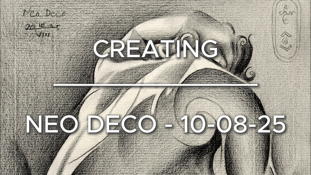
This graphite pencil drawing ‘Neo Deco – 10-08-25’ has become a chiaroscuro variety in the Assia Series. Where art deco, impressionism and cubism converge. Somehow similar to Neo Deco – 28-07-25 but comparing that one to this drawing to this is is consirably darker. Again, one of Roger Schall’s 1933 pictures of Assia Granatouroff inspired me to do this one. However, unlike abovementioned previouw drawing I incorporated the full tonal range of the original photo. I even exaggerated a bit. The reason was very simple.
Some Issues
Even though the pose in itself was charming at there were some issues. The foreshortened hand resting on her head looked a bit undefined and rather smallish. Certainly compared to the lower part of the body. Sometimes this happes, due to distortions of the camera lens. In order to get a good picture I had to exaggerate its definition. One thing led to another. If I were to produce a lot of tonal differences in the arm and hand I should do the entire body too. This way all parts light and dark are in congruence with eachother.
A Fine Mess
This practise often can get me into a fine mess. The reason is that sometimes I see myself facing some difficulties. That is, to combine the impressionist chiaroscuro look with a bit of cubist styling. Curiously, I’m always afraid that part of cubism won’t show as such, leaving a viewer clueless or even misinterpretating it.
Yet Solved Satisfactory
Therefor I enforced some darker regions with some more hefty dark & light contrast such as in the breasts. Also the contour delineations in the right arm for that matter. The cubist approach is best seen in the shoulder blade. There I incorporated a big golden ratio curve. Last but not least, I took care of opening up parts of the body even more that it lets on at first sight. In deviation of the reference picture I also hatched the negative space in the right section consirably darker. This way the body flows into that negative space even more. All-in all a challenging drawing yet very satisfying to create.
Graphite pencil (Faber Castell, Pitt Graphite Matt, 14B) drawing on Fabriano Ingres paper (21 x 28.2 x 0.1 cm)
Artist: Corné Akkers
-
 0:28
0:28
Corné Akkers Artworks
30 days agoMeyendel - 20-12-15
241 -
 LIVE
LIVE
Lofi Girl
2 years agoSynthwave Radio 🌌 - beats to chill/game to
179 watching -
 4:34:26
Akademiks
7 hours agoICEMAN EPISODE 3
152K -
 2:04:10
Inverted World Live
9 hours agoThe Robots Are Here | Ep. 103
65.1K16 -
 1:21:53
Man in America
17 hours agoInflation, Debt & War: The 2032 Crash Cycle Is Here—Nations Will FALL w/ Martin Armstrong
64.4K20 -
 1:53:48
Adam Does Movies
16 hours ago $4.21 earnedTalking Movies + Ask Me Anything - LIVE
27.5K3 -
 2:55:43
TimcastIRL
9 hours agoTrump DOJ To Ban Trans People From Owning Guns After Catholic School Shooting | Timcast IRL
192K122 -
 3:21:36
The Quartering
8 hours agoBaldur's Gate 3 First Playthrough!
52.1K8 -
 6:34:42
Rallied
10 hours ago $10.38 earnedWarzone Solo Challenges
81.6K2 -
 57:40
57:40
MattMorseTV
10 hours ago $12.33 earned🔴Trump just SHATTERED the RECORD.🔴
58.4K98