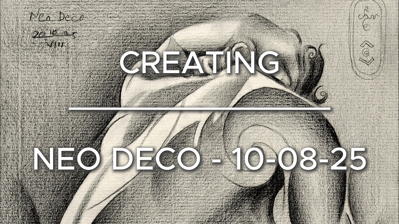
Creating Neo Deco - 10-08-25
Website link: https://corneakkers.com/neo-deco-10-08-25/
Print: https://corneakkers.com/print-neo-deco-10-08-25/
Printable: https://corneakkers.com/product/printable-neo-deco-10-08-25/
More Chiaroscuro
This graphite pencil drawing ‘Neo Deco – 10-08-25’ has become a chiaroscuro variety in the Assia Series. Where art deco, impressionism and cubism converge. Somehow similar to Neo Deco – 28-07-25 but comparing that one to this drawing to this is is consirably darker. Again, one of Roger Schall’s 1933 pictures of Assia Granatouroff inspired me to do this one. However, unlike abovementioned previouw drawing I incorporated the full tonal range of the original photo. I even exaggerated a bit. The reason was very simple.
Some Issues
Even though the pose in itself was charming at there were some issues. The foreshortened hand resting on her head looked a bit undefined and rather smallish. Certainly compared to the lower part of the body. Sometimes this happes, due to distortions of the camera lens. In order to get a good picture I had to exaggerate its definition. One thing led to another. If I were to produce a lot of tonal differences in the arm and hand I should do the entire body too. This way all parts light and dark are in congruence with eachother.
A Fine Mess
This practise often can get me into a fine mess. The reason is that sometimes I see myself facing some difficulties. That is, to combine the impressionist chiaroscuro look with a bit of cubist styling. Curiously, I’m always afraid that part of cubism won’t show as such, leaving a viewer clueless or even misinterpretating it.
Yet Solved Satisfactory
Therefor I enforced some darker regions with some more hefty dark & light contrast such as in the breasts. Also the contour delineations in the right arm for that matter. The cubist approach is best seen in the shoulder blade. There I incorporated a big golden ratio curve. Last but not least, I took care of opening up parts of the body even more that it lets on at first sight. In deviation of the reference picture I also hatched the negative space in the right section consirably darker. This way the body flows into that negative space even more. All-in all a challenging drawing yet very satisfying to create.
Graphite pencil (Faber Castell, Pitt Graphite Matt, 14B) drawing on Fabriano Ingres paper (21 x 28.2 x 0.1 cm)
Artist: Corné Akkers
-
 0:52
0:52
Corné Akkers Artworks
7 days agoThe Infinite Waves of Eternity – 06-02-24
38 -
 11:37
11:37
tactical_rifleman
2 days agoRare Breed BEATS THE ATF | FRT-15 | Tactical RIfleman
62.9K23 -
 2:51:46
Pepkilla
3 hours agoMore GOLD Camo's PLEASE Grind Call Of Black Ops 7
11K1 -
 1:35:54
LexTronic
2 hours ago $0.19 earnedMetroid Prime Remastered
7.05K -
 12:32
12:32
MetatronGaming
17 hours agoBLIGHT looks AMAZING - Trailer Reaction
28.4K12 -
 LIVE
LIVE
ProRedmanX
2 hours ago $0.21 earnedSunday Morning Coffee & Chaos ☕ | PUBG -> BF6 -> ??? #goonsquad
83 watching -
 5:23
5:23
Memology 101
22 days ago $14.21 earnedReporter HUMILIATES Kamala Harris over "WORLD-CLASS" dodge during interview
28.6K50 -
 LIVE
LIVE
ItsJustChrisTV
2 hours ago $0.19 earnedRescue Rangin'! Lets (try to) Save Some Folks!
60 watching -
![[Arc Raiders] Time for Some Keys, Increase This Stash, Scrappy and Tables Are All Max. Time for More](https://1a-1791.com/video/fwe2/ac/s8/1/4/g/x/C/4gxCz.0kob-small-Arc-Raiders-Time-for-Some-K.jpg) 1:11:44
1:11:44
Palermozeto
2 hours ago[Arc Raiders] Time for Some Keys, Increase This Stash, Scrappy and Tables Are All Max. Time for More
4.55K -
 LIVE
LIVE
The Sufari Hub
4 hours ago🔴WE ARE FEATURED - TTS ACTIVE - BLACK OPS 7 EXTRACTION MODE - LEVEL GRINDING
46 watching