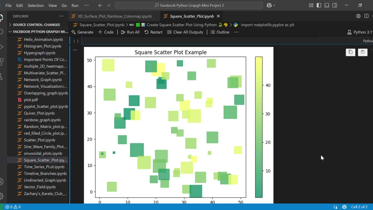
🟩📊 Create Square Scatter Plot Using Python 🐍🎨
How to Create a Square Scatter Plot in Python | Matplotlib Visualization
Learn how to create eye-catching random heatmaps in Python using Matplotlib! In this quick tutorial, I'll show you how to visualize matrix data as colorful heatmaps - perfect for data analysis, machine learning, or just creating cool visualizations.
Github Link:https://github.com/nazishjaveed/Pytho...
🔍 What You'll Learn:
✅ Generate random matrix data with NumPy
✅ Create heatmap visualizations using plt.imshow()
✅ Customize axis labels with meaningful categories
✅ Add professional touches to your plots
✅ Use emojis in your plot titles (bonus tip!)
👨💻 Perfect For:
• Python beginners looking to expand their visualization skills
• Data scientists needing quick data exploration tools
• Students working on math or CS projects
• Anyone who wants to make their data more visually appealing!
👍 Enjoyed This Tutorial?
Like 👍 if you found it helpful
Subscribe 🔔 for more Python/data science content
Comment 💬 with how you'll use heatmaps in your projects!
#Python #DataVisualization #Matplotlib #Heatmap #DataScience #NumPy #Programming #CodingTutorial #MachineLearning #pythontutorial
#datavisualization #matrixvisualization #pythonplotting #codingtutorial
#dataanalysis # programming #coding #pythonforbeginners #SquareScatterPlot #PythonScatterPlot #MatplotlibVisualization
#MatplotlibTutorial #ScatterPlotPython #PythonDataVisualization
#DataScience #PythonForBeginners #CustomizeScatterPlot #RandomDataPlot #PythonMatplotlibGuide #DataPlottingPython
#ScatterPlotWithColorbar #VisualizeDataPython
-
 1:15
1:15
AI Evolutionary Technology
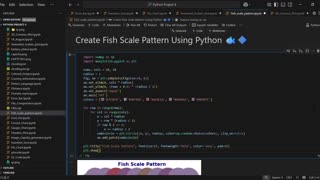
6 days agoCreate Beautiful Fish Scale Patterns with Python
6 -
 LIVE
LIVE
MYLUNCHBREAK CHANNEL PAGE
2 hours agoHistory’s Most SHOCKING Claims?
427 watching -
 LIVE
LIVE
Caleb Hammer
2 hours agoThe First LGBT Divorce On Financial Audit
115 watching -
 LIVE
LIVE
Badlands Media
1 hour agoBadlands Daily: September 3, 2025 (#2)
3,319 watching -
 LIVE
LIVE
Jim Jordan
1 hour agoEurope’s Threat to American Speech and Innovation
494 watching -
 LIVE
LIVE
The State of Freedom
5 hours agoFLF: #16 Delivering the Truth Comes at a Cost w/ Joe Hoft
16 watching -
 31:01
31:01
Rethinking the Dollar
1 hour agoWe're In A NEW Monetary Reality! Xi & Putin Knows How This ENDS | Morning Check-In: Let's Talk...
5.97K -
 LIVE
LIVE
House Committee on Energy and Commerce
2 hours agoExamining Opportunities to Advance American Health Care through the Use of AI Technologies
18 watching -
 1:04:12
Crypto Power Hour
3 hours ago $0.19 earnedSmart Contracts & Fintech 101
4.94K5 -
 45:55
45:55
Randi Hipper
1 hour agoBITCOIN HOLDS CRITICAL LEVEL! NEXT MOVE DETERMINES EVERYTHING
5.38K