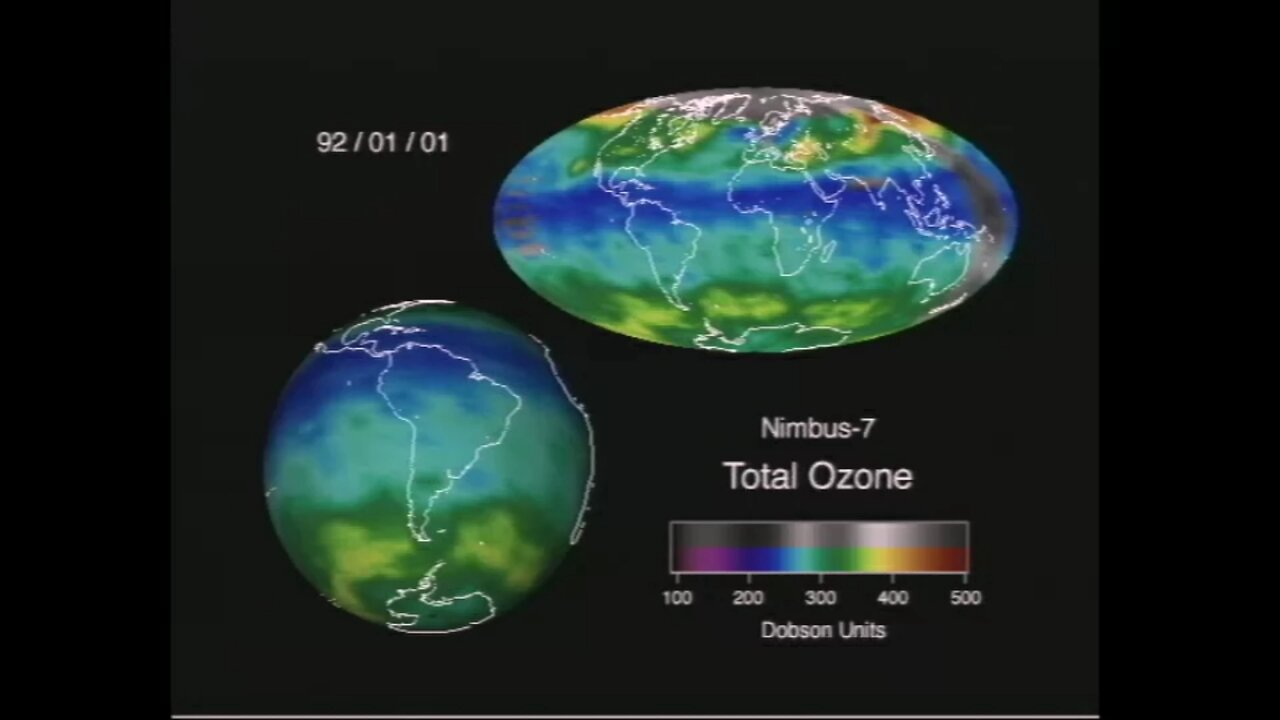
NASA Ozone Animation|How missing data is interpolated| Earth's Protective shield
🌍 Discover how NASA visualizes Earth’s ozone layer and fills gaps with cutting-edge data techniques!**
In this video, we explore an incredible NASA animation showing total ozone levels across the globe. You’ll see how vibrant colors represent ozone concentrations and learn why some areas appear in grayscale — indicating missing data that scientists fill using a process called interpolation.
✅ What you’ll learn:
What ozone is and why it’s crucial for life on Earth
How NASA satellites monitor the ozone layer
Why some regions have missing data
How luminance values help interpolate and create a complete global picture
The importance of these maps for tracking climate change and atmospheric health
🔬 Why it matters:
Understanding ozone helps protect our planet from harmful UV radiation. Thanks to satellite technology and smart data visualization, we can keep watch over Earth’s fragile protective shield.
👍 If you enjoyed this video, please like, subscribe, and turn on notifications for more amazing Earth and space science content!
#NASA #OzoneLayer #ClimateChange #EarthScience #DataVisualization #Space #Environment #Interpolation #OzoneHole
-
 39:31
39:31
Her Patriot Voice
13 hours ago $1.07 earnedBlack Conservative Surrounded + ROBBED By Leftists!
2.06K19 -
 13:25
13:25
The Gun Collective
13 hours agoWOW! A LOT of new GUNS just dropped!
2.84K5 -
 LIVE
LIVE
BEK TV
22 hours agoTrent Loos in the Morning - 9/04/2025
252 watching -
 8:13
8:13
Geoff_Tac
1 day agoMAC 1014 Shotgun (Benelli Clone)
2.51K2 -
 22:30
22:30
Ohio State Football and Recruiting at Buckeye Huddle
13 hours agoOhio State Football: How Matt Patricia Confused Arch Manning and Texas
8.98K -
 9:07
9:07
MattMorseTV
18 hours ago $4.52 earnedTrump just BLASTED the CCP.
29.8K47 -
 58:44
58:44
The Official Corbett Report Rumble Channel
12 hours agoTurning the Tide on 9/11 with Curt Weldon
9.71K17 -
 10:47
10:47
Nikko Ortiz
16 hours agoThese Tik Tok Clips Are Extremely Painful...
24.5K3 -
 8:12
8:12
VSOGunChannel
18 hours ago $0.71 earnedATF Still Wants to Take Your Incomplete Guns
7.98K8 -
 44:06
44:06
Esports Awards
18 hours agoUber: The Voice of Overwatch, VALORANT & Esports’ Biggest Moments | Origins Podcast #27
6.08K