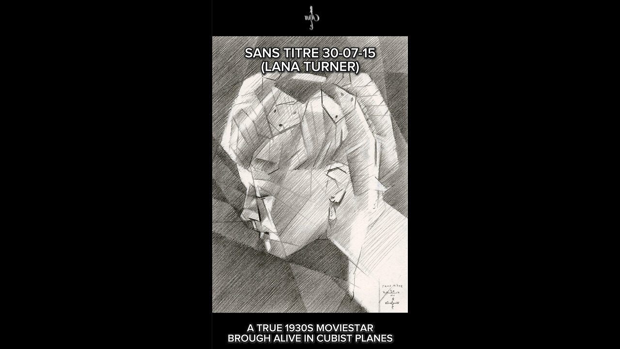
Sans titre - 30-07-14
Website: https://corneakkers.com/sans-titre-30-07-14/
Print: https://corneakkers.com/print-sans-titre-30-07-14-lana-turner/
Printable: https://corneakkers.com/product/printable-sans-titre-30-07-14-lana-turner/
Some Darker Tones
This graphite pencil drawing ‘Sans Titre – 30-07-14’ depics American moviestar and celebrity Lana Turner. I used a still from a movie from the 1930s. Yesterday’s drawing was a nude. Now it’s time for something else and I thought I’d extend my Sans Titre series. Last celebrity I drew was Shirley Maclaine in the beginning of this month. Even though the resemblance was accurate I thought it was a bit weak tonally. This time I had it in me to crank up tones even more. See what that might bring me. Not too much but hatching more denser black strokes in the negative space. This way I could carve out the head and let it contrast dramatically. That’s why I like Lauren’s Bacall’s portrait I made a couple of months back better.
Unexpected Sides
Best know for her roles as femme fatale and blonde bombshell she also played some interesting serious ones. Of course there were personal struggles and bad relationships. Personally I don’t like the glam of it all. Even though I’m an Art Deco grandure style kind of guy I usually pick out atypical pictures of moviestars. Just like I did with Marilyn Monroe, discovering softer and unexpected sides of actresses. The reference picture I used for this one was a still from an early movie starring her as leading lady.
Matching Tones and Cubes
What attracted me were the endless possibilities to cubistically style her hairdo into nothing but straight planes. Even the hairnet was fun to do. Because she leaned over to her male opponent her eyes are positioned incredibly low in the overall portrait. However, in her facial features there was a lot of chiaroscuro going on. A bit of balancing on a tight rope. One simply can either make the hairdo to striking or facial features. Only for them to appear ‘separated’ in some sort of way. This having said, I thing I did a mighty fine job having both part correspond both cubistically and tonally. Hence, there is balance and unity.
Graphite pencil drawing (Pentel 0.5 mm, 3B) on Winsor & Newton paper (14.8 x 21 x 0.1 cm – A5 format)
Artist: Corné Akkers
-
 0:53
0:53
Corné Akkers Artworks
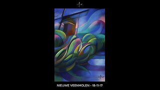
8 days agoNieuwe Veenmolen – 18-11-17
30 -
 17:38
17:38
Professor Nez
1 hour ago🚨THIS IS A NATIONAL SECURITY EMERGENCY: Stephen Miller with CHILLING WARNING for AMERICA
25762 -
 LIVE
LIVE
tminnzy
1 hour agoBLACK OPS 7 MULTIPLAYER ROAD TO MASTER PRESTIGE
268 watching -
 47:10
47:10
The Rubin Report
6 hours agoWhat Really Happened on ‘The View’ & ‘Curb Your Enthusiasm’ | Cheryl Hines
158K42 -
 3:08:37
LumpyPotatoX2
5 hours agoWhere Winds Meet: New Level Cap + Rumble Wallet - #RumbleGaming
26.3K1 -
 LIVE
LIVE
SOLTEKGG
3 hours ago🔴LIVE - Battlefield 6 - Going Pro in RED SEC
241 watching -
 11:37
11:37
tactical_rifleman
2 days agoRare Breed BEATS THE ATF | FRT-15 | Tactical RIfleman
67.5K23 -
 2:51:46
Pepkilla
3 hours agoMore GOLD Camo's PLEASE Grind Call Of Black Ops 7
11K2 -
 1:35:54
LexTronic
3 hours ago $0.46 earnedMetroid Prime Remastered
7.05K3 -
 12:32
12:32
MetatronGaming
18 hours agoBLIGHT looks AMAZING - Trailer Reaction
28.4K13