The Hague (Halstraat) - 12-03-15
Website link: https://corneakkers.com/the-hague-halstraat-12-03-15/
Print: https://corneakkers.com/print-the-hague-halstraat-12-03-15/
Printable: https://corneakkers.com/product/printable-the-hague-halstraat-12-03-15/
Nothing Particular
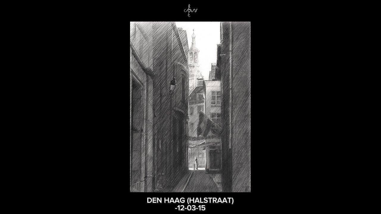
This graphite pencil drawing ‘The Hague – 12-03-15 offers an impressionist view on the Halstraat. It’s a small street in the centre of The Hague, Netherlands. One time I came across this street and I was instantly fascinated by the blocked-in light column. The street displays lots of depth in front and back to the St. Jacob’s Church in the background. However, nothing particular is there to be found and it used to be the back of the Maison de Bonneterie. Netherless am I attracted to this kind of back streets and alleys. That’s because of the imtimate, almost tucked away character they ooze out. It is almost like they need to be noticed too.
No Baudelaire Needed
There are plenty shopping streets with agressive demonstrations of advertisement. Not my cup of tea for artists like me. As to this I do not concurr with Baudelaire’s cry to portray daily life. Nowadays such is dominated by logo’s of retail chains and franchised stores. But hey, I am off topic now. I’d better accentuate the positive.
Inspirational Source
The drawing was directly influenced by my admiration for Gerrit Berckheyde’s oil painting ‘Gezicht op de Gouden Bocht’ of 1671-1672. He depicted some empty slots in Amsterdam’s most prestigeous part of the Herengracht, the so-called ‘Golden Bend’. It is not the invention of something great but rather the recognition of the tonal rhythym (light-dark-light-dark). Personally I think only great artist can see the implicite order behind matter. Others only will see houses and empty space between them where nothing has been built yet.
One Single Horizontal Beam
Another thing I was attracted to was the horizontal stripe of light in the back on the pavement of the Hoogstraat. The light is low in quantity but high in quality because it stands out amidst dark tones around it. Thus the horizontal is in balance with the verticals. I like balancing out these qualitative and quantitative aspects in a work.
Graphite pencil drawing (Pentel 0.5 mm, 3B) on Canson Bristol paper (21 x 29.7 x 0.1 cm - A4 format)
Artist: Corné Akkers
-
 0:29
0:29
Corné Akkers Artworks
2 days agoNeo Deco - 10-03-25
17 -
 30:58
30:58
SouthernbelleReacts
2 days agoWe Didn’t Expect That Ending… ‘Welcome to Derry’ S1 E1 Reaction
2.51K1 -
 13:51
13:51
True Crime | Unsolved Cases | Mysterious Stories
4 days ago $0.15 earned7 Real Life Heroes Caught on Camera (Remastered Audio)
5K -
 LIVE
LIVE
Total Horse Channel
10 hours ago2025 IRCHA Derby & Horse Show - November 1st
35 watching -
 4:19
4:19
PistonPop-TV
6 days agoThe 4E-FTE: Toyota’s Smallest Turbo Monster
3.08K -
 43:07
43:07
WanderingWithWine
5 days ago $0.04 earned5 Dreamy Italian Houses You Can Own Now! Homes for Sale in Italy
3.68K2 -
 LIVE
LIVE
Spartan
19 hours agoFirst playthrough of First Berserker Khazan
285 watching -
 28:01
28:01
Living Your Wellness Life
2 days agoTrain Your Hormones
6.54K -
 43:28
43:28
The Heidi St. John Podcast
1 day agoFan Mail Friday: Faith Over Fear and Finding Strength in Every Season
3.46K -
 1:05:30
SGT Report
1 day agoTHE HORRIBLE TRUTH ABOUT EVERYTHING -- Harley Schlanger
45.2K86