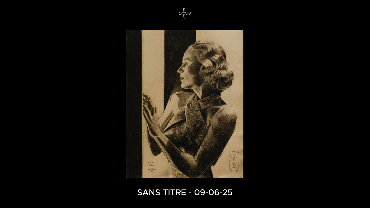
Sans Titre – 09-06-25 (Carole Lombard)
Website link: https://corneakkers.com/sans-titre-09-06-25-carole-lombard/
Print: https://corneakkers.com/print-sans-titre-09-06-25-carole-lombard/
Printable: https://corneakkers.com/product/printable-sans-titre-09-06-25-carole-lombard/
Another Carole
This graphite pencil drawing ‘Sans Titre – 09-06-25’ revisits American celebrity and moviestar Carole Lombard. More art deco-ish and less cubist, I guess. As to this one the amount of cubism is showing only mildly. That’s due to the usage of heavy chiaroscuro tones. Consequently there was little room for showing harsh and straight lines. Contour delineations were already blackened so many lines were incorporated into a perfect darkness. However, it still shows as a certain trademark personal to me. Which I came to call ‘Neo Deco’. That is because I think cubism is not the only aspect of this style I developed throughout the years.
Hollywood Photographer
Not the first time I drew her. Last time was in february of this year. Also on Ingres (Fabriano) and now on Hahnemühle’s. Perhaps I was just wondering how she would look like on this sort of paper. Ingres paper still is a favorite and a perfect reference picture I found was the inspirational source for this drawing. Which is Clarence Sinclair Bull’s by the way, a famous Hollywood photographer back in the day. So, thanks and respect to him. I simply adore those portrait side views and the reason for that is simple. These 1930s hairdos are nothing more than smashing pieces of art. Not even trying to imagine how much work have been put into these lush curly hairdos! They are perfect to cubist style them though. In Carole’s case there was a great tonal rhythym of white and dark areas cascading down her hair.
Glamour Attire?
She had this typical 1930s glamour attire on which I found incredibly difficult to capture. It resembles a sort of crocodile leather. A first attempt looked to dominant. Therefor I tuned it down a bit. The lower part of the drawing I kept quit simple. A bit of styling here and there and getting the tones and proportions right. The value added is all in the hair I see. A great little drawing in between, waiting for my oil in progress to become dry.
Pitt Graphite Matt pencil (Faber-Castell) drawing on Hahnenmühle Ingres paper (24 x 31 x 0.1 cm)
Artist: Corné Akkers
-
 0:52
0:52
Corné Akkers Artworks
8 days agoThe Infinite Waves of Eternity – 06-02-24
38 -
 LIVE
LIVE
The HotSeat With Todd Spears
45 minutes agoEP 214: Do YOU Believe In Miracles???
149 watching -
 8:22
8:22
ChukesOutdoorAdventures
1 day ago $0.06 earnedMarlin 1894 Trapper in 10mm
591 -
![[Ep 798] What the Hell is in our Food? | Brotherhood of Terror | 2026 Economic Boom!](https://1a-1791.com/video/fwe2/f7/s8/1/C/a/S/C/CaSCz.0kob-small-Ep-798-What-the-Hell-is-in-.jpg) UPCOMING
UPCOMING
The Nunn Report - w/ Dan Nunn
41 minutes ago[Ep 798] What the Hell is in our Food? | Brotherhood of Terror | 2026 Economic Boom!
34 -
 21:09
21:09
Neil McCoy-Ward
33 minutes ago🔥 SHOCK! As This 'UNEXPECTED' Move Has Left Western Leaders Scrambling!
-
 1:17:25
TheSaltyCracker
1 hour agoSALTcast 11-24-25
14.5K32 -
 7:51
7:51
Dr. Nick Zyrowski
6 days agoHow To Starve Fat Cells - Not Yourself!
41.7K6 -
 1:11:53
DeVory Darkins
3 hours agoBREAKING: Hegseth drops NIGHTMARE NEWS For Mark Kelly with potential court martial
101K56 -
 LIVE
LIVE
Dr Disrespect
5 hours ago🔴LIVE - DR DISRESPECT - ARC RAIDERS - BLUEPRINTS OR DEATH
2,332 watching -
 1:10:26
Sean Unpaved
4 hours agoJalen Hurts & Eagles COLLAPSE In LOSS vs. Cowboys | UNPAVED
25.9K2