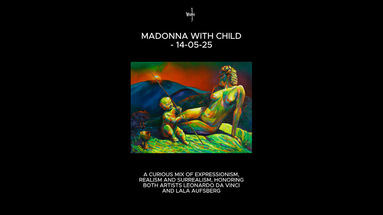
Madonna with Child - 14-05-25
Website link: https://corneakkers.com/madonna-with-child-14-05-25/
Print: https://corneakkers.com/print-madonna-with-child-14-05-25/
Printable: https://corneakkers.com/product/printable-madonna-with-child-14-05-25/
Twelve Years Ago
This oil painting ‘Madonna with Child – 14-05-25’ is a bit of an oddball in my repertoire. A mixture of expressionism, realism and even surrealism. Long ago, in 2013 I started this project only to put it against the wall for more than a decade. There are projects that end up that way, never to be completed. Often the reason is that you don’t see any progress anymore. Lack of inspiration may be the cause or loosing interest. Maybe these two are the same. Vaguely I remember my enthusiasm starting this one. It has got something to do with paying homage to Leonardo da Vinci’s ‘Benois Madonna’. To date I never did a Madonna with child theme. A bit corny I suppose.
Outdated?
That was when I came to realize this theme is outdated. Therefor never to be picked up by respectable artists. Everyone seems to delve into popular Neo Rauch and Nicole Eiseman themes. On the other hand, at the bottom part of the market there is kitsch. Lush poppy acrylics and African women’s portraits with decorative splatters are just some subjects that come to mind. Even at Gagosian’s there are on display. So why not pick up a Medieval theme and make it my own? After all, I’m totally countercyclical to begin with. After completing ‘Neo Deco – 07-05-25’ I stayed in the mood to lay thicker patches of paint. Hence, the reason why I started this one again. This painting must be the most blobbiest painting I ever finished. Normally I paint with lesser visible brush strokes but I got the hang of it.
Poignant Color Scheme
Mentioning Leonardo I also have to thank German photographer ‘Lala Aufsberg’. She took the picture of the nude included as Madonna. Hence the hairdo from the 1930s. The color scheme is almost poignant. Quite some time ago I used these kind of hefty schemes. However, that was what I did more than 10 years ago. Nowadays I tend to become more subtle, using more browns and grays. Usually these sink in when you become older and softer. Then again, why not use complementary greens and reds, purples and yellows, oranges and blues. The only difference complared to recent works is the hefty color saturation. Hmm, I’m not sure if I will make these kinds of paintings in the next future. As artists I catch the next wind around that will bring me to unknown destinations.
Oil on linen (60 x 80 x 2 cm)
Artist: Corné Akkers
-
 0:29
0:29
Corné Akkers Artworks
21 days agoNeo Deco – 27-08-25
401 -
 LIVE
LIVE
VINCE
1 hour agoThe "Finding Out" Phase Has Officially Begun | Episode 128 - 09/18/25
48,629 watching -
 LIVE
LIVE
Dear America
2 hours agoJimmy Kimmel’s Show Gets CANCELLED Because Of His Comments On Charlie!! + Kash EXPOSES CIA!!
2,213 watching -
 LIVE
LIVE
Benny Johnson
40 minutes agoHow We Got Jimmy Kimmel Ripped Off-Air, Why The Right Must Fight | Trump Press Conference LIVE Now
5,321 watching -
 LIVE
LIVE
The White House
1 hour agoPress Conference with the Prime Minister of the United Kingdom of Great Britain and Northern Ireland
732 watching -
 LIVE
LIVE
Barry Cunningham
10 minutes agoBREAKING NEWS: PRESIDENT TRUMP PARTICIPATES IN PRESS CONFERENCE IN ENGLAND
389 watching -
 LIVE
LIVE
Badlands Media
7 hours agoBadlands Daily: September 18, 2025
2,935 watching -
 LIVE
LIVE
JuicyJohns
1 hour ago🟢#1 REBIRTH PLAYER 10.2+ KD🟢
58 watching -
 LIVE
LIVE
Matt Kohrs
10 hours agoStocks Squeeze To New Highs 🚀🚀🚀 || Live Trading (OPEN, NVDA & TSLA)
560 watching -

Randi Hipper
46 minutes agoBITCOIN PRICE MOMENTUM PICKS UP! CRITICAL LEVELS TO WATCH
1.69K