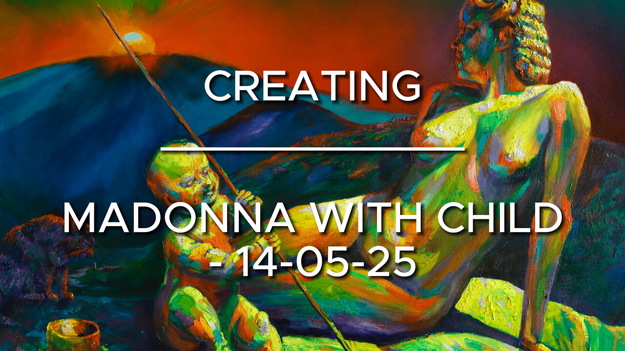
Creating Madonna with Child – 14-05-25
Website link: https://corneakkers.com/madonna-with-child-14-05-25/
Print: https://corneakkers.com/print-madonna-with-child-14-05-25/
Printable: https://corneakkers.com/product/printable-madonna-with-child-14-05-25/
Twelve Years Ago
This oil painting ‘Madonna with Child – 14-05-25’ is a bit of an oddball in my repertoire. A mixture of expressionism, realism and even surrealism. Long ago, in 2013 I started this project only to put it against the wall for more than a decade. There are projects that end up that way, never to be completed. Often the reason is that you don’t see any progress anymore. Lack of inspiration may be the cause or loosing interest. Maybe these two are the same. Vaguely I remember my enthusiasm starting this one. It has got something to do with paying homage to Leonardo da Vinci’s ‘Benois Madonna’. To date I never did a Madonna with child theme. A bit corny I suppose.
Outdated?
That was when I came to realize this theme is outdated. Therefor never to be picked up by respectable artists. Everyone seems to delve into popular Neo Rauch and Nicole Eiseman themes. On the other hand, at the bottom part of the market there is kitsch. Lush poppy acrylics and African women’s portraits with decorative splatters are just some subjects that come to mind. Even at Gagosian’s there are on display. So why not pick up a Medieval theme and make it my own? After all, I’m totally countercyclical to begin with. After completing ‘Neo Deco – 07-05-25’ I stayed in the mood to lay thicker patches of paint. Hence, the reason why I started this one again. This painting must be the most blobbiest painting I ever finished. Normally I paint with lesser visible brush strokes but I got the hang of it.
Poignant Color Scheme
Mentioning Leonardo I also have to thank German photographer ‘Lala Aufsberg’. She took the picture of the nude included as Madonna. Hence the hairdo from the 1930s. The color scheme is almost poignant. Quite some time ago I used these kind of hefty schemes. However, that was what I did more than 10 years ago. Nowadays I tend to become more subtle, using more browns and grays. Usually these sink in when you become older and softer. Then again, why not use complementary greens and reds, purples and yellows, oranges and blues. The only difference complared to recent works is the hefty color saturation. Hmm, I’m not sure if I will make these kinds of paintings in the next future. As artists I catch the next wind around that will bring me to unknown destinations.
Oil on linen (60 x 80 x 2 cm)
Artist: Corné Akkers
-
 0:40
0:40
Corné Akkers Artworks
10 hours agoBerg en Dal – 30-12-23
20 -
 58:18
58:18
Flyover Conservatives
1 day agoThe Truth About Halloween that You DIDN’T Know - Holiday Special - Historian Bill Federer | FOC SPECIAL Show
51K5 -
 3:10:46
Ellie_roe
7 hours agoEllie and Errys Halloween Spooktacular || Random Horror Games
24.2K1 -
 50:27
50:27
Sarah Westall
8 hours agoBig Banks Caught Rigging Market, IMF tells World to “Buckle Up” w/ Andy Schectman
43.6K17 -
 13:54
13:54
Degenerate Jay
15 hours ago $1.15 earned5 Best Superhero Movies To Watch On Halloween
22.9K5 -
 59:03
59:03
NAG Podcast
8 hours agoSarah Fields: BOLDTALK W/Angela Belcamino
39.4K8 -
 1:21:41
Glenn Greenwald
11 hours agoGlenn Takes Your Questions: On the Argentina Bailout, Money in Politics, and More; Plus: Journalist Jasper Nathaniel on Brutality and Settler Attacks in the West Bank | SYSTEM UPDATE #541
92K47 -
 3:10:08
Barry Cunningham
8 hours agoPRESIDENT TRUMP TO USE NUCLEAR OPTION? FOOD STAMPS END! | SHUTDOWN DAY 31
55.6K43 -
 1:06:56
BonginoReport
16 hours agoThe Battle Between Good & Evil w/ Demonologist Rick Hansen - Hayley Caronia (Ep.168)
105K39 -
 1:12:57
Kim Iversen
11 hours agoBill Gates Suddenly Says “Don’t Worry About Climate Change”?
94.1K67