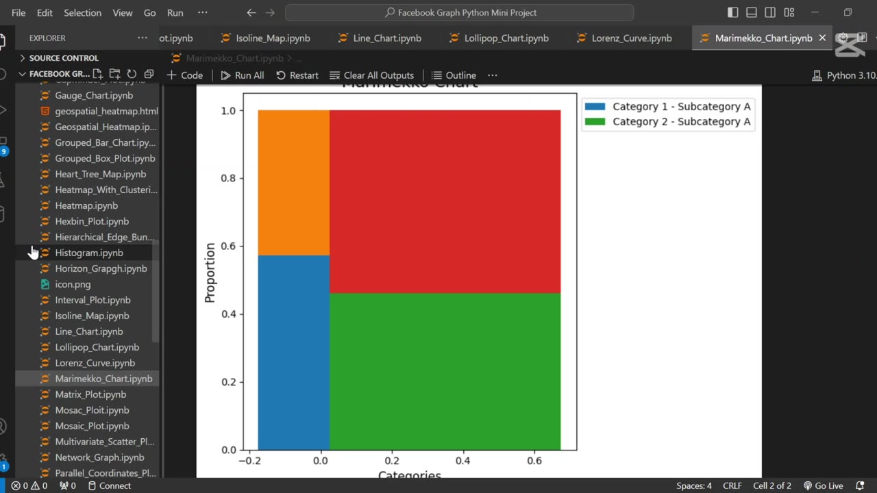
Create Marimekko chart using Python 📊
📊 How to Make Marimekko Charts with Matplotlib | Step-by-Step Guide | Python Tutorial
In this Python data visualization tutorial, you’ll learn how to create professional Marimekko Charts (also known as Mosaic Plots) using Matplotlib. Marimekko charts are perfect for visualizing multi-dimensional proportional data, making them essential for business analytics, market research, and data science!
🔹 What You’ll Learn:
✅ How to structure data for Marimekko charts
✅ Step-by-step coding in Python (Matplotlib)
✅ Customizing colors, labels, and legends
✅ Practical use cases for business & data analysis
🚀 Subscribe for More Python & Data Science Tutorials!
🔔 Hit the bell icon to stay updated!
💬 Got questions? Drop them in the comments!
#Python #DataVisualization #MarimekkoChart #Matplotlib #DataScience
#PythonTutorial #Coding #DataAnalysis #Programming #TechTutorial #LearnPython #DataViz #BusinessAnalytics #PythonProgramming #DataVisualizationTutorial
-
 0:52
0:52
AI Evolutionary Technology
5 days agoCreate Synchronized Multi-Plot Animations in Python
91 -
 LIVE
LIVE
Barry Cunningham
4 hours agoBREAKING NEWS: PRESIDENT TRUMP IS GOING TO TAKE CHICAGO! LFG!!! (IT'S MOVIE NIGHT!)
5,412 watching -
 LIVE
LIVE
Man in America
6 hours agoTrump Demands Big Pharma Come Clean on Covid Shots w/ Dr. David Martin
1,104 watching -
 1:40:27
megimu32
2 hours agoOTS: Labor Day Sitcom Blowout - Tim, Ray, & Relatable Chaos!
12.2K2 -
 LIVE
LIVE
StevieTLIVE
2 hours agoWarzone Wins w/ FL Mullet Man
92 watching -
 1:04:01
BonginoReport
5 hours agoLefties Wish Death on Trump but He’s BACK! - Nightly Scroll w/ Hayley Caronia (Ep.125)
163K64 -
 LIVE
LIVE
Tundra Tactical
2 hours ago $0.48 earnedWe Survived the Military… But Not This Basement
128 watching -
 20:12
20:12
Clownfish TV
10 hours agoDisney Needs MEN Back?! They ADMIT Star Wars and Marvel are DEAD!
9.35K22 -
 LIVE
LIVE
Anthony Rogers
9 hours agoEpisode 381 - Tim Kelleher
46 watching -
 1:01:42
The Nick DiPaolo Show Channel
7 hours agoTDS Hits New Level! | The Nick Di Paolo Show #1786
43.5K31