Create mosaic plot using Python 🧩
4 months ago
6
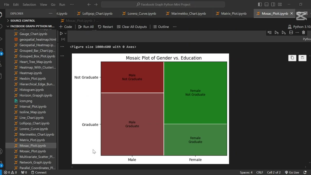
A mosaic plot is a graphical representation of categorical data that visualizes the relationship between two or more variables. 🧩 It displays rectangles whose area is proportional to the frequency of each category combination, making it easy to observe associations and patterns in the data.
In this tutorial, we use Python to generate a mosaic plot using the statsmodels library. We’ll walk through preparing a sample dataset, visualizing categorical relationships (e.g., gender vs. purchase decision), and interpreting the plot. This type of visualization is especially helpful for exploratory data analysis (EDA) and categorical comparison.
Let me know if you’d like a shorter version or a description tailored for a blog, presentation, or report.
Loading comments...
-
 0:20
0:20
AI Evolutionary Technology
5 days agoUsing Python to Analyze Your Internet Connection
21 -
 LIVE
LIVE
The Quartering
2 hours agoTrump Tricks Democrats Again, Cheerleader Monster, Abortion Clinics Shutdown & More
11,895 watching -
 LIVE
LIVE
Russell Brand
1 hour agoPfizer Agrees $70 Million Deal With Trump As Study Links Covid Vax to CANCER!! - SF644
2,551 watching -
 LIVE
LIVE
Sean Unpaved
2 hours agoOctober Blitz: Wild Card Game 3s, CFB Coaching Chaos, & TNF Fireworks
299 watching -
 LIVE
LIVE
Dr Disrespect
3 hours ago🔴LIVE - DR DISRESPECT - BLACK OPS 7 MULTIPLAYER GAMEPLAY - NEW!
1,701 watching -
 1:01:36
Dear America
1 hour agoEpisode 2 Graham Allen Show
6.93K20 -
 1:59:01
The Charlie Kirk Show
2 hours agoCancel Netflix? + The Secret Service Disaster + Turning Point Everywhere | Tatum, Cocca, Gaffrey
50.4K30 -
 LIVE
LIVE
ahdedazs
1 hour agoBlack Ops 7 EARLY ACCESS BETA! First Stream on RUMBLE!
82 watching -
 LIVE
LIVE
ZENNY
1 hour agoBO7 IS HERE BOT POV MF HAHAHAHA 6v6 PG18+ | UNFILTERED CHAT | CURSES AND BAD
99 watching -
 LIVE
LIVE
qixso
2 hours ago $0.26 earnedBO7 IS HERE TAP IN !! | @qixso
110 watching