Create mosaic plot using Python 🧩
6 months ago
7
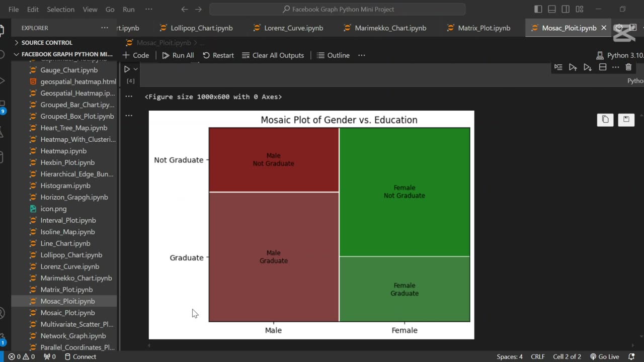
A mosaic plot is a graphical representation of categorical data that visualizes the relationship between two or more variables. 🧩 It displays rectangles whose area is proportional to the frequency of each category combination, making it easy to observe associations and patterns in the data.
In this tutorial, we use Python to generate a mosaic plot using the statsmodels library. We’ll walk through preparing a sample dataset, visualizing categorical relationships (e.g., gender vs. purchase decision), and interpreting the plot. This type of visualization is especially helpful for exploratory data analysis (EDA) and categorical comparison.
Let me know if you’d like a shorter version or a description tailored for a blog, presentation, or report.
Loading comments...
-
 0:20
0:20
AI Evolutionary Technology
1 month agoUsing Python to Analyze Your Internet Connection
171 -
 LIVE
LIVE
SpartakusLIVE
10 minutes agoTeam BUNGALATORS || From HUGE WZ DUBS to TOXIC ARC BETRAYALS
2,920 watching -
 12:38
12:38
Timcast
21 hours agoJasmine Crocket HUMILIATED By CNN To HER FACE Over Epstein LIE | Tim Pool
31.7K53 -
 19:32
19:32
MetatronHistory
18 hours agoWas Nazism Left Wing or Right Wing? An Answer From History
4406 -
 LIVE
LIVE
a12cat34dog
1 hour agoI'M FINALLY BACK :: Resident Evil 4 (2023) :: FINISHING MAIN GAME & DLC {18+}
265 watching -
 31:23
31:23
Stephen Gardner
1 hour agoFINALLY! Charlie Kirk MISSING DETAILS released!
2.76K26 -
 LIVE
LIVE
cosmicvandenim
6 hours agoCOSMIC VAN DENIM | SEX APPEAL & HORROR
109 watching -
 LIVE
LIVE
DoldrumDan
2 hours agoFINISHING SEKIRO - DEPTH 5 TOP RANKED - DAY 50 NEW LIFE
41 watching -
 23:40
23:40
MYLUNCHBREAK CHANNEL PAGE
1 day agoWe Want the Blueprints
45.5K13 -
 LIVE
LIVE
PenguinSteve
3 hours agoLIVE! Penguin to the Battlefield (6)
70 watching