Create mosaic plot using Python 🧩
6 months ago
7
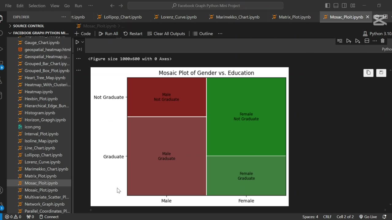
A mosaic plot is a graphical representation of categorical data that visualizes the relationship between two or more variables. 🧩 It displays rectangles whose area is proportional to the frequency of each category combination, making it easy to observe associations and patterns in the data.
In this tutorial, we use Python to generate a mosaic plot using the statsmodels library. We’ll walk through preparing a sample dataset, visualizing categorical relationships (e.g., gender vs. purchase decision), and interpreting the plot. This type of visualization is especially helpful for exploratory data analysis (EDA) and categorical comparison.
Let me know if you’d like a shorter version or a description tailored for a blog, presentation, or report.
Loading comments...
-
 0:20
0:20
AI Evolutionary Technology
1 month agoUsing Python to Analyze Your Internet Connection
171 -
 LIVE
LIVE
LumpyPotatoX2
23 minutes agoWhere Winds Meet: New Level Cap + Rumble Wallet - #RumbleGaming
102 watching -
 11:37
11:37
tactical_rifleman
1 day agoRare Breed BEATS THE ATF | FRT-15 | Tactical RIfleman
1.42K14 -
 12:32
12:32
MetatronGaming
14 hours agoBLIGHT looks AMAZING - Trailer Reaction
6373 -
 LIVE
LIVE
The Sufari Hub
37 minutes ago🔴BLACK OPS 7 EXTRACTION MODE - LEVEL GRINDING
10 watching -
 44:51
44:51
American Thought Leaders
14 hours agoHow This Tech Can Break China’s Rare Earth Monopoly | Dr. James Tour
2.54K2 -
 9:46
9:46
MattMorseTV
16 hours ago $24.50 earnedTrump just SHUT DOWN a $287,000,000 FRAUD RING.
38.6K94 -
 LIVE
LIVE
JakRazGaming
16 minutes agoPlaying Hogwarts Legacy!! Playthrough Stream 4
9 watching -
 1:16
1:16
From Zero → Viral with AI
21 hours agoAI Isn’t Killing Work. It’s Killing the Wrong Kind of Work.
995 -
 2:47:27
Squaring The Circle, A Randall Carlson Podcast
19 hours agoEPIC! Randall & Sabin Howard, Master Sculptor Known As "Michelangelo of America," talk WAR or PEACE!
1.48K