Create mosaic plot using Python 🧩
6 months ago
7
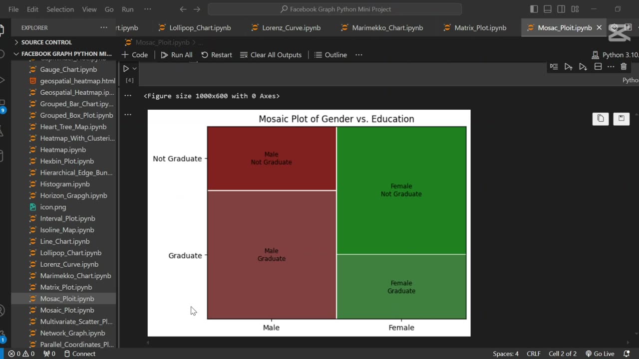
A mosaic plot is a graphical representation of categorical data that visualizes the relationship between two or more variables. 🧩 It displays rectangles whose area is proportional to the frequency of each category combination, making it easy to observe associations and patterns in the data.
In this tutorial, we use Python to generate a mosaic plot using the statsmodels library. We’ll walk through preparing a sample dataset, visualizing categorical relationships (e.g., gender vs. purchase decision), and interpreting the plot. This type of visualization is especially helpful for exploratory data analysis (EDA) and categorical comparison.
Let me know if you’d like a shorter version or a description tailored for a blog, presentation, or report.
Loading comments...
-
 1:02
1:02
AI Evolutionary Technology
2 months agoLive Weather App in Python | BeautifulSoup & Web Scraping Tutorial
101 -
 LIVE
LIVE
Man in America
5 hours agoCommunists VS Zionists & the Collapse of the American Empire w/ Michael Yon
5,031 watching -
 LIVE
LIVE
Akademiks
15 minutes agoSheck Wes exposes Fake Industry. Future Not supportin his mans? D4VD had help w disposing his ex?
581 watching -
 LIVE
LIVE
SpartakusLIVE
4 hours agoTeam BUNGULATORS || From HUGE WZ DUBS to TOXIC ARC BETRAYALS
2,534 watching -
 LIVE
LIVE
Camhigby
30 minutes agoLIVE - Riot Watch Portland, DC, NC
217 watching -
 LIVE
LIVE
CAMELOT331
2 hours agoYouTube Just Told Me I OWE THOUSANDS $ TO THEM... update
183 watching -
 LIVE
LIVE
Tundra Tactical
10 hours ago🛑LIVE AT 9PM CST!! Your Government Hates Your Guns : DOJ Holds Firm On National FIREARMS ACT
51 watching -
 LIVE
LIVE
NewsTreason
2 hours agoDECLAS w/ Rambo & Dave: Nuremberg 2.0 | MTG Exits Stage Left | Mamdani Psyop Confirmed, 8pm EST
7,890 watching -
 LIVE
LIVE
meleegames
1 hour agoSONG REQUESTS CLOSED - Melee Music - Beat Hazard 3 - Devil Inside
94 watching -
 LIVE
LIVE
The Connect: With Johnny Mitchell
9 hours agoIs Garth Brooks A Serial Killer? Exposing The Dark Secrets Of Country Music's Biggest Star
126 watching