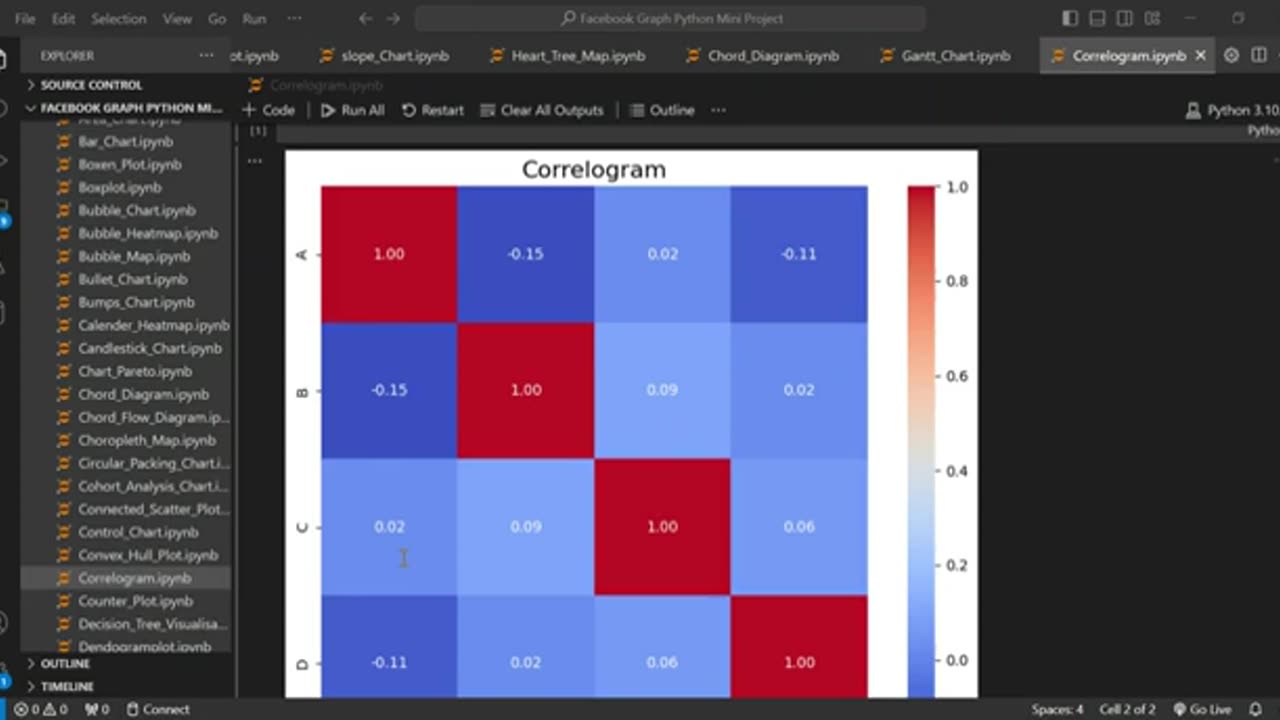
Create a Correlogram using Python
Learn how to visualize correlation matrices like a pro using Python! In this tutorial, I’ll walk you through creating a correlogram (correlation heatmap) with Seaborn, Matplotlib, and Pandas—perfect for data analysis, machine learning, and exploratory data visualization.
✅ What You’ll Learn:
✔ How to generate a correlation matrix from a Pandas DataFrame
✔ Creating a heatmap-style correlogram with Seaborn (sns.heatmap)
✔ Customizing annotations, colors, and labels for clarity
✔ Fixing common errors (e.g., plt.tight_layout(), formatting)
✔ Practical use cases in data science, finance, and AI
👍 Enjoyed this? LIKE, SUBSCRIBE, and hit the BELL for more Python tutorials!
#Python #DataVisualization #Seaborn #Correlogram #Heatmap
#DataScience #Pandas #Matplotlib #MachineLearning #Statistics
#PythonTutorial #ExploratoryDataAnalysis #EDA #DataAnalysis
#Coding #AI #DataViz #TechTutorial #LearnPython
-
 0:39
0:39
AI Evolutionary Technology
2 days agoHow to Create a Streamgraph in Python
1 -
 16:23
16:23
Actual Justice Warrior
1 day agoMom Sucker Punched By Repeat Offender In Chicago
11K29 -
 56:28
56:28
Professor Nez
1 day ago🚨Not Only is Epstein NOT Going Away… It Just Got Worse!
25K25 -
 8:09
8:09
MattMorseTV
17 hours ago $11.19 earnedTrump scores 17th CONSECUTIVE Supreme Court VICTORY.
76.7K60 -
 2:11:25
Side Scrollers Podcast
19 hours agoUK JAILS TV WRITER FOR WRONG THINK + TWITCH ALLOWS CYBERSTALKING + MORE | SIDE SCROLLERS LIVE
34.9K10 -
 10:47
10:47
Nikko Ortiz
1 day agoThese Tik Tok Clips Are Extremely Painful...
55.3K7 -
 13:43
13:43
GritsGG
15 hours agoI Made a Brand New Warzone Account! Will I Get Bot Lobbies?
12.4K1 -
 1:09:23
The HotSeat
15 hours agoTrump’s Parade = Mocked, China’s Parade = Praised: Leftist Hypocrisy EXPOSED
38.7K33 -
 LIVE
LIVE
Lofi Girl
2 years agoSynthwave Radio 🌌 - beats to chill/game to
237 watching -
 4:34:26
Akademiks
9 hours agoICEMAN EPISODE 3
160K1