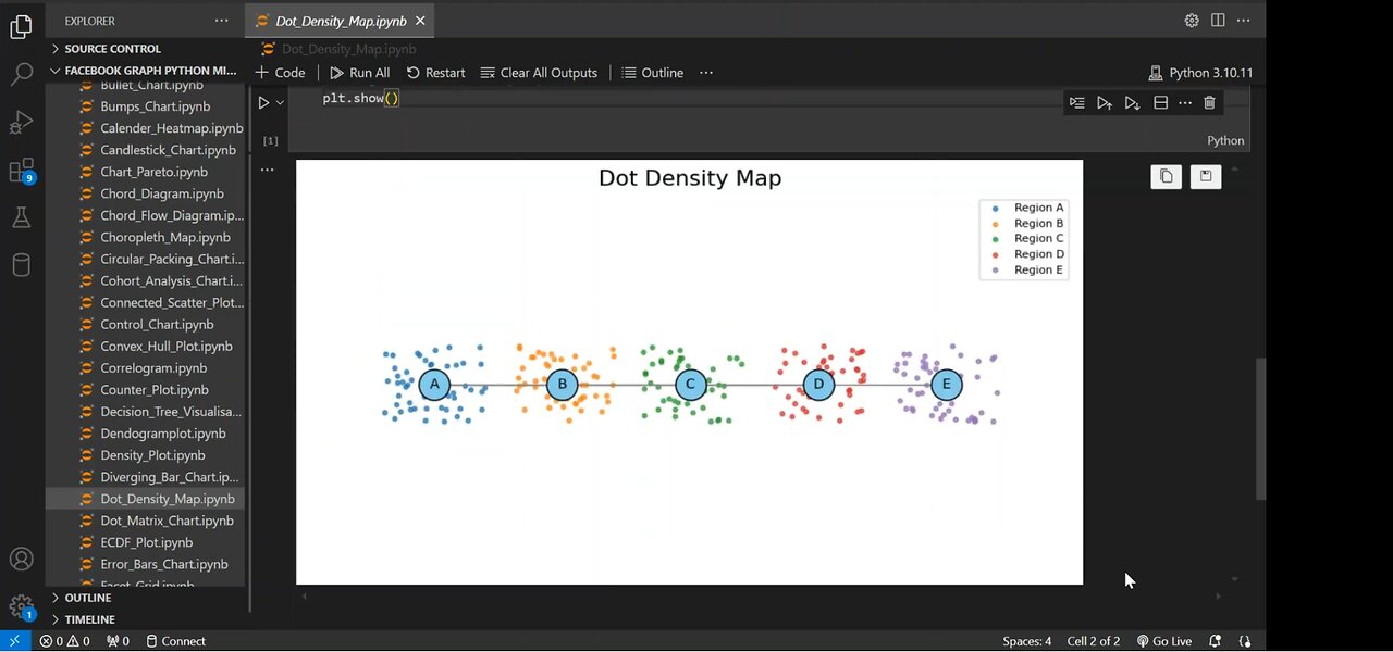
Create the Dot Density Map using Python 🗺️🐍
6 months ago
24
Dot density maps are a powerful way to visualize data distribution across different regions. In this step-by-step guide, we'll:
✅ Build a Network Graph using NetworkX
✅ Generate Random Dots to represent density in each region
✅ Customize the Visualization with colors, labels, and styling
✅ Combine Graph & Dot Density for an informative data representation
🔔 Subscribe for more Python & Data Science tutorials!
#Python #DataVisualization #NetworkX #Matplotlib #DotDensityMap
#PythonTutorial #DataScience #GraphTheory #PythonProgramming
#CodingTutorial #DataAnalysis #NetworkGraph #PythonForBeginners
#VisualizationTutorial #LearnPython #TechTutorial
Loading 1 comment...
-
 1:02
1:02
AI Evolutionary Technology
1 month agoLive Weather App in Python | BeautifulSoup & Web Scraping Tutorial
81 -
 15:36
15:36
JohnXSantos
1 day ago $0.59 earnedHow To Design A Luxury Clothing Brand With A.I (From 0-$100+)
6.88K -
 1:55:13
The Kevin Trudeau Show Limitless
4 days agoHow To Pray To Get Results!
11.2K9 -
 1:17:46
Squaring The Circle, A Randall Carlson Podcast
1 day agoRandall Carlson Defines The Younger Dryas
7.81K8 -
 40:03
40:03
WanderingWithWine
7 days ago $2.92 earnedBuy a Home for Less Than a Car? 5 Italian Homes for Sale in Puglia
9.36K3 -
 10:09
10:09
Advanced Level Diagnostics
2 days ago $0.39 earnedWhy I Never Use Cheap Fuses!
5.96K -
 10:23
10:23
Forrest Galante
5 hours agoAsking an Indian Billionaire Why He Is Saving 1 Million Animals
62.3K14 -
 8:43
8:43
MattMorseTV
20 hours ago $57.58 earnedTrump CALLED Schumer’s BLUFF.
37.7K121 -
 4:07:30
Joe Donuts Live
6 hours ago🟢 Fast XP Farming in Fortnite? | DropZone Sunday
17.4K4 -
 LIVE
LIVE
Lofi Girl
3 years agolofi hip hop radio 📚 - beats to relax/study to
223 watching