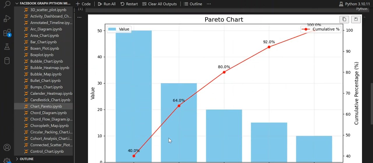
Create 📈 Professional Pareto Charts 📊 in Python 🐍
Unlock the power of Pareto Charts using Python and Matplotlib! 📊
In this step-by-step tutorial, you'll learn how to visualize the 80/20 rule and identify the most impactful categories in your dataset. We use pandas and matplotlib to create a beautiful Pareto Chart with a bar graph and a cumulative percentage line on dual axes.
📌 What you'll learn:
Creating a DataFrame in pandas
Sorting data by value
Calculating cumulative percentage
Plotting dual-axis chart with Matplotlib
Annotating and styling the chart for clarity
This tutorial is perfect for beginners in data science, data visualization, and Python programming.
🔔 Don’t forget to Like, Subscribe, and Comment for more Python tutorials!
#ParetoChart #PythonDataVisualization #MatplotlibTutorial #Pareto Chart Pytho #Python Matplotlib Chart #Data Visualization Python #Pareto Principle 80/20 Rule Python #Matplotlib Pareto #pandas matplotlib tutorial #python plotting tutorial #dual axis chart python #how to create pareto chart #data science project python #matplotlib for beginners #python charts tutorial #data analysis python
-
 0:52
0:52
AI Evolutionary Technology
2 days ago📦 Ignoring Built-In Functions and Libraries Using Python 🐍
3 -
 LIVE
LIVE
The White House
3 hours agoPresident Trump Makes Announcements, Sep. 5, 2025
1,907 watching -
 LIVE
LIVE
Nerdrotic
1 hour agoUK Has Fallen, Hollywood DOOM, DC Dysfunction | Friday Night Tights 370
1,432 watching -
 1:11:24
vivafrei
4 hours agoDearborn Heights Police Have Been CONQUERED! Gender Madness on PASSPORTS! Canada Stuff & MORE!
75K26 -
 1:44:43
The Quartering
3 hours agoConservative Scam Busted, Black Fatigue Hits Airlines, Kimmel Meltdown
96.5K33 -
 LIVE
LIVE
Tudor Dixon
19 minutes agoRFK Jr., Big Pharma, and the Hidden Risks of SSRIs in Pregnancy | The Tudor Dixon Podcast
52 watching -
 LIVE
LIVE
Dr Disrespect
5 hours ago🔴LIVE - DR DISRESPECT - CRONOS: The New Dawn - FIRST IMPRESSIONS
1,550 watching -
![MAHA News [9.5] RFK Lights Up Congress, CDC House Cleaning, Fight Over Vax Mandates For School Children](https://1a-1791.com/video/fww1/b9/s8/1/i/h/m/f/ihmfz.0kob-small-MAHA-News-9.5.jpg) LIVE
LIVE
Badlands Media
12 hours agoMAHA News [9.5] RFK Lights Up Congress, CDC House Cleaning, Fight Over Vax Mandates For School Children
522 watching -
 LIVE
LIVE
The Tom Renz Show
1 hour agoWho Is Undermining Trump?
160 watching -
 1:00:55
Mark Kaye
4 hours ago🔴 Trump Tells Tech Tycoons It's Time To Pay Up!
19.7K4