Create 🎨 Stunning Chord Diagrams 🎼 Using Plotly 📊 & NetworkX 🧠
Unlock the power of data visualization with this Python mini project! In this video, you'll learn how to create stunning Chord Diagrams using Plotly and NetworkX — perfect for representing complex relationships in a visually appealing way.
We'll walk through:
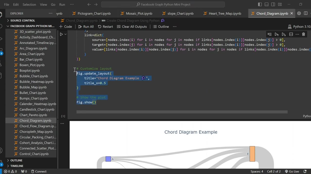
Defining nodes and links in a matrix format
Creating directed graphs with NetworkX
Visualizing connections using Plotly Sankey diagrams
Customizing layout and style
Whether you're a data science student, a Python enthusiast, or preparing a mini project for college — this tutorial is beginner-friendly and super useful! 💡
📌 Don’t forget to Like, Share, and Subscribe for more Python and data visualization content!
#PythonVisualization #ChordDiagram #PlotlyPython #python chord diagram
#plotly networkx tutorial #data visualization python #chord diagram using plotly #networkx python tutorial #python mini project #plotly sankey diagram #chord diagram for beginners #data visualization project
#python sankey chart #plotly python tutorial #data science mini project
#visualizing relationships python #python graph project #chord diagram explained
-
 0:52
0:52
AI Evolutionary Technology
5 days agoCreate Synchronized Multi-Plot Animations in Python
91 -
 LIVE
LIVE
Barry Cunningham
4 hours agoBREAKING NEWS: PRESIDENT TRUMP IS GOING TO TAKE CHICAGO! LFG!!! (IT'S MOVIE NIGHT!)
5,444 watching -
 LIVE
LIVE
Man in America
6 hours agoTrump Demands Big Pharma Come Clean on Covid Shots w/ Dr. David Martin
1,097 watching -
 1:40:27
megimu32
2 hours agoOTS: Labor Day Sitcom Blowout - Tim, Ray, & Relatable Chaos!
12.2K2 -
 LIVE
LIVE
StevieTLIVE
2 hours agoWarzone Wins w/ FL Mullet Man
93 watching -
 1:04:01
BonginoReport
5 hours agoLefties Wish Death on Trump but He’s BACK! - Nightly Scroll w/ Hayley Caronia (Ep.125)
163K64 -
 LIVE
LIVE
Tundra Tactical
2 hours ago $0.48 earnedWe Survived the Military… But Not This Basement
124 watching -
 20:12
20:12
Clownfish TV
10 hours agoDisney Needs MEN Back?! They ADMIT Star Wars and Marvel are DEAD!
9.35K22 -
 LIVE
LIVE
Anthony Rogers
9 hours agoEpisode 381 - Tim Kelleher
43 watching -
 1:01:42
The Nick DiPaolo Show Channel
7 hours agoTDS Hits New Level! | The Nick Di Paolo Show #1786
43.5K31