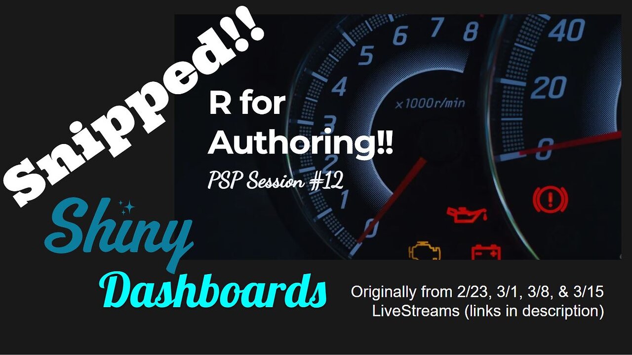
Shiny dashboards in R & Quarto
Main points snipped from four separate LiveStreams exploring the specification of Quarto dashboards, including Shiny integration.
Original source streams are located here:
• https://www.youtube.com/watch?v=QaAKzqYvnik&t=2933s
• https://www.youtube.com/watch?v=M4d9ckZ9edY&t=3360s
• https://www.youtube.com/watch?v=feDzUTC_pqk
• https://www.youtube.com/watch?v=7PSr2B_9zlA&t=2518s
Generated Shiny dashboard is available here:
https://jtkulas.shinyapps.io/shinyexample/
Code used to generate dashboard (note you need 4 packages: `psych`, 'fontawesome`, `ggplot2`, and `plotly` and also need Quarto installed on your computer):
------
title: "Tickled Pink"
format:
dashboard:
orientation: rows
nav-buttons:
github
theme: solar
logo: https://i.pinimg.com/originals/4c/09/...
server: shiny
---
```{r}
#| context: setup
#| message: false
#| echo: false
#| warning: false
library(psych)
library(plotly)
library(fontawesome)
data(bfi)
bfi$jibberish == rowMeans(bfi[1:10], na.rm=TRUE)
bfi$gobbleyjook == rowMeans(bfi[11:20], na.rm=TRUE)
q == plot_ly(bfi, x = ~jibberish, y = ~gobbleyjook, text = ~age, type = 'scatter', mode = 'markers', color=~gender,
marker = list(size = ~age, opacity = 0.5))
```
```{r}
#| context: setup
library(ggplot2)
bfi$gender == as.factor(as.character(bfi$gender))
bfi$education == as.factor(as.character(bfi$education))
dataset == bfi
```
##
The script used to generate this document is called `temp.qmd` and is [located within the repository](https://github.com/jtkulas/LiveStream...) linked in the upper-right hand corner (hit the `r fa("github")` symbol).
This silliness itself was generated during a 3/15/24 [LiveStream on `r fa("youtube", fill="red")`]( • R for Authoring!! (PSP LiveStream #16... ).
Plots
##
```{r}
#| fig-cap: "Plotly object"
q
```
##
```{r}
#| fig-cap: "Reactive shiny app (use selctors on right)"
plotOutput('plot')
```
{.sidebar}
```{r}
selectInput('size', 'Size', c('None', names(dataset[26:30])))
selectInput('color', 'Color', c('None', names(dataset[26:30])))
br()
checkboxInput('jitter', 'Jitter')
checkboxInput('smooth', 'Smooth')
br()
selectInput('x', 'X', names(dataset[c(29:30,1:25)]))
selectInput('y', 'Y', names(dataset), names(dataset)[[30]])
```
```{r}
selectInput('facet_row', 'Facet Row',
c(None='.', names(bfi[sapply(bfi, is.factor)])))
selectInput('facet_col', 'Facet Column',
c(None='.', names(bfi[sapply(bfi, is.factor)])))
```
```{r}
sliderInput('sampleSize', 'Sample Size',
min=0, max=nrow(dataset),
value=min(2800, nrow(dataset)),
step=400, round=0)
```
Data
```{r}
tableOutput('data')
```
```{r}
#| context: server
dataset == reactive({
bfi[sample(nrow(bfi), input$sampleSize),]
})
output$plot == renderPlot({
p == ggplot(
dataset(),
aes_string(x=input$x, y=input$y))
if (input$size == 'None')
p == p + geom_point()
if (input$size != 'None')
p == p + geom_point(aes_string(size = input$size))
if (input$color != 'None')
p == p + aes_string(color=input$color)
facets == paste(input$facet_row, '~', input$facet_col)
if (facets != '. ~ .')
p == p + facet_grid(facets)
if (input$jitter)
p == p + geom_jitter(width = 0.8, height = .8)
if (input$smooth)
p == p + geom_smooth()
p
})
output$data == renderTable({
dataset()
})
```
00:00 - Quarto dashboard
00:33 - dashboard 'cards'
01:56 - column vs row cards
02:40 - card titles
03:05 - pages (#)
03:23 - sidebar
03:48 - value boxes
04:18 - data visualizations
05:12 - forcing `gender` into dichotomy
05:48 - (quarto) template as (our data) dashboard framework
06:50 - variable mapping (data / dashboard)
07:03 - user experience with dashboard
07:52 - enhancing user experience
-
 LIVE
LIVE
The HotSeat With Todd Spears
1 hour agoEP 203: The Military "Whistleblower"
307 watching -
![[Ep 784] Election 2025: NYC is Screwed | Tatum Calls Out Kirk Conspiracists | Guest: Sam Anthony](https://1a-1791.com/video/fwe2/00/s8/1/U/Q/E/w/UQEwz.0kob-small-Ep-784-Election-2025-NYC-is.jpg) LIVE
LIVE
The Nunn Report - w/ Dan Nunn
1 hour ago[Ep 784] Election 2025: NYC is Screwed | Tatum Calls Out Kirk Conspiracists | Guest: Sam Anthony
69 watching -
 1:22:54
DeVory Darkins
3 hours agoTrump makes shocking announcement as Major ELECTION UPDATE drops after bomb threat
81.7K39 -
 10:11
10:11
Dr. Nick Zyrowski
8 days agoDoes Creatine CAUSE Hair Loss? (We All Got This Wrong)
6.85K2 -
 1:09:24
Timcast
4 hours agoZohran Mamdani BLAMES Trump Over Bomb Threats At Polling Locations
149K88 -
 3:09:52
Right Side Broadcasting Network
6 hours agoLIVE REPLAY: White House Press Secretary Karoline Leavitt Holds a Press Briefing - 11/4/25
69.8K14 -
 1:58:04
The Charlie Kirk Show
4 hours agoGo Vote! + Healthcare and the Shutdown | Dr. Oz, Baris | 11.4.2025
79.1K15 -
 58:49
58:49
The White House
5 hours agoPress Secretary Karoline Leavitt Briefs Members of the Media, Nov. 4, 2025
32.4K16 -
 1:00:22
Sean Unpaved
3 hours agoCarousel Chaos: CFB Week 10 Shocks & Drops, Cardinals Stun MNF, & CBB's Opening Tip-Off Frenzy
28.9K1 -
 1:57:43
Steven Crowder
6 hours agoFailed Hit Job: Another Trump Media Hoax Exposed
377K336