Premium Only Content

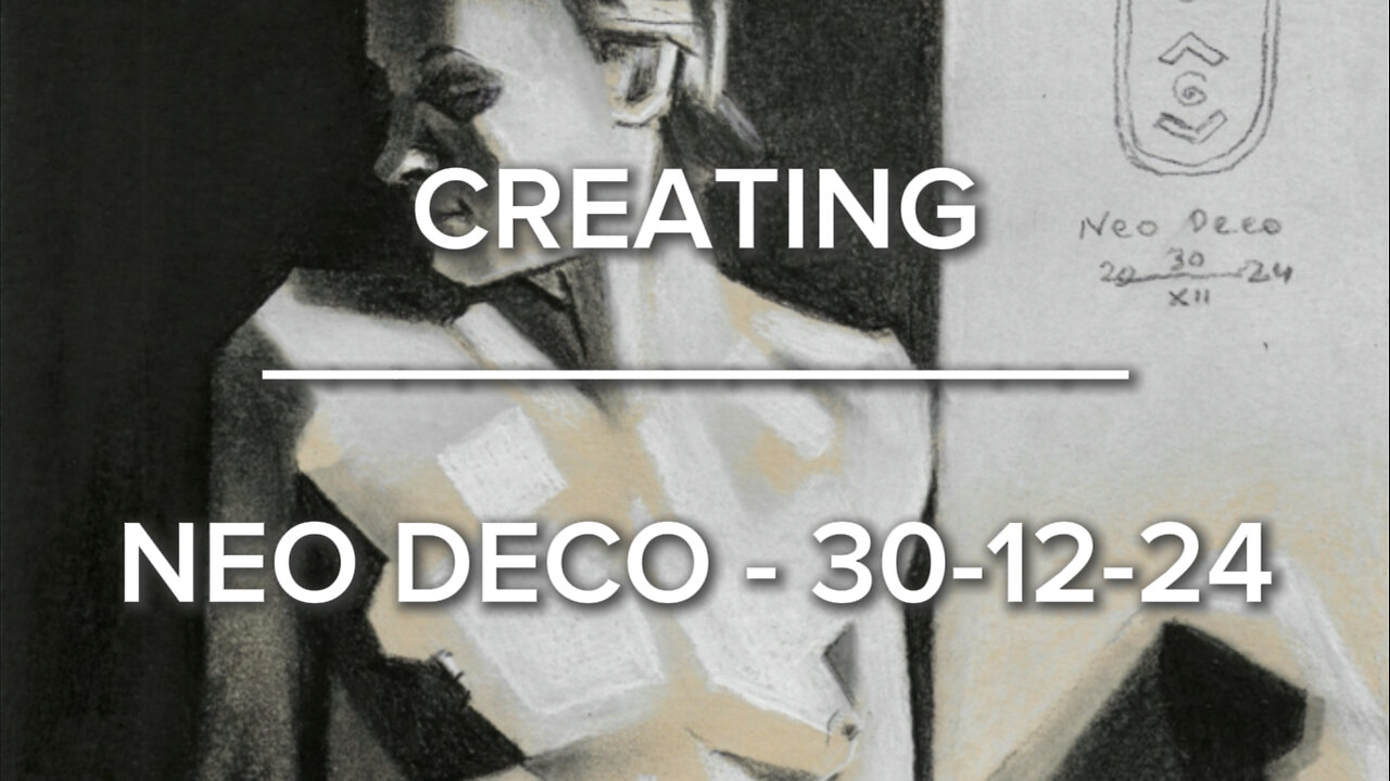
Creating Neo Deco – 30-12-24
Website link: https://corneakkers.com/neo-deco-30-12-24/
Print: https://corneakkers.com/print-neo-deco-30-12-24/
Printable: https://corneakkers.com/product/printable-neo-deco-30-12-24/
One More to Unlearn
This pastel drawing ‘Neo Deco – 30-12-24’ is inspired by a great reference picture by Laure Albin Guillot. There is a bit of value added from my side. First, I styled it into my kind of atmospheric cubism. That is a cubist approach employed by me over 15 years now. It contains all the right proportions, lighting but styled cubistically, leaning towards art deco really. With my goals for this month achieved I was left with some spare time. What more can a true artist do than continuing sketching? I thought that last pastel rounded up this year for me, Yet, another one came up.
Pencil Sharpeners
Now, I have to admit I quite get the hang of doing small pastels on A4 size paper. Filling up the tooth is easy because it is executed much more quickly than using graphite pencils. During live model drawing sessions I already exclusively use pastels. Especially white and black Conté carré chalks on toned paper, enabling me to capture proportions quickly. There are reasons though why I didn’t use pastel pencils on paper. Pencil sharpeners I bought in the past didn’t allow me to sharpen pencil into a fine tip. That’s a big encumbrance because drawing fine lines on an already comparatively small surface becomes a drag.
Mahle!
Acceptance there until I discovered a Mahle pencil sharpener at Brugman Art. I never had much confidence in those ones, believing they would ruin my fragile pastel pencil tips easily. Never could I have been so wrong though. It turns out this kind of sharpener (with an old fashioned swing on the back) grates rather than slices. The hand held little sharpeners do the latter but become blunt very quickly. Good news for me. Now I can both draw fine lines and fill up the tooth of the paper fast. Pastel pencil black is very dark anyway which is an advantage equal to my favorite graphite pencil sort. That would be Faber-Castell Pitt Matt graphite, 14B. Both satisfy my love for hefty chiaroscuro and will continue my weapons of choice in next coming year 2025.
Angularity
As to this very drawing, I decided to deviate slighty from the original photograph. By putting a black block behind the sitting model 2/3rd of the vertical side there is much more contrast. The picture was nice alright but a bit too light for my taste. The result is two blocks of blackness outside the female form. One vertical and one horizontal. The latter is the dark structure at the bottom. They mimic her angular posture. That was my very aim.
Pastel drawing on Clairfontaine Paint On Mix Media green paper (21 x 29.7 x 0.1 cm)
Artist: Corné Akkers
-
 20:30
20:30
Exploring With Nug
1 day ago $3.01 earnedMissing Father of 2 FOUND Underwater In Shallow Pond!
20.4K7 -
 19:19
19:19
This Bahamian Gyal
1 day agoThe View PRAISES Michelle Obama for DITCHING TRUMP inauguration, "when they go LOW, go even LOWER"
18.4K30 -
 14:25
14:25
Degenerate Jay
21 hours ago $5.20 earnedThe Flash Movie Failed Because People Hate The Character? Sure.
60.7K12 -
 28:30
28:30
CharLee Simons Presents Do Not Talk
6 days agoSam Anthony from YourNews.com (with host CharLee Simons)
39.9K2 -
 52:34
52:34
PMG
18 hours ago $2.67 earnedHannah Faulkner and Steve Friend | EXPOSE THE FBI CORRUPTION - KASH PATEL
28.3K7 -
 25:33
25:33
marcushouse
1 day ago $37.99 earnedStarship Exploded! What Went Wrong? Flight Test 7 Explained
189K66 -
 1:00:50
Squaring The Circle, A Randall Carlson Podcast
1 day ago#035 Cosmic Catastrophe In The Age Of Leo - Squaring The Circle: A Randall Carlson Podcast
119K34 -
 1:33:14
Jamie Kennedy
1 day agoThe LA Fires...
96.6K28 -
 2:01:45
Quite Frankly
2 days ago"Inauguration Eve: Trump Time Travel Review" 1/17/25
74.3K66 -
 58:42
58:42
SGT Report
4 months agoYour REAL NEWS vs. CIA Mockingbird LIES -- Sam Anthony
200K100