Premium Only Content

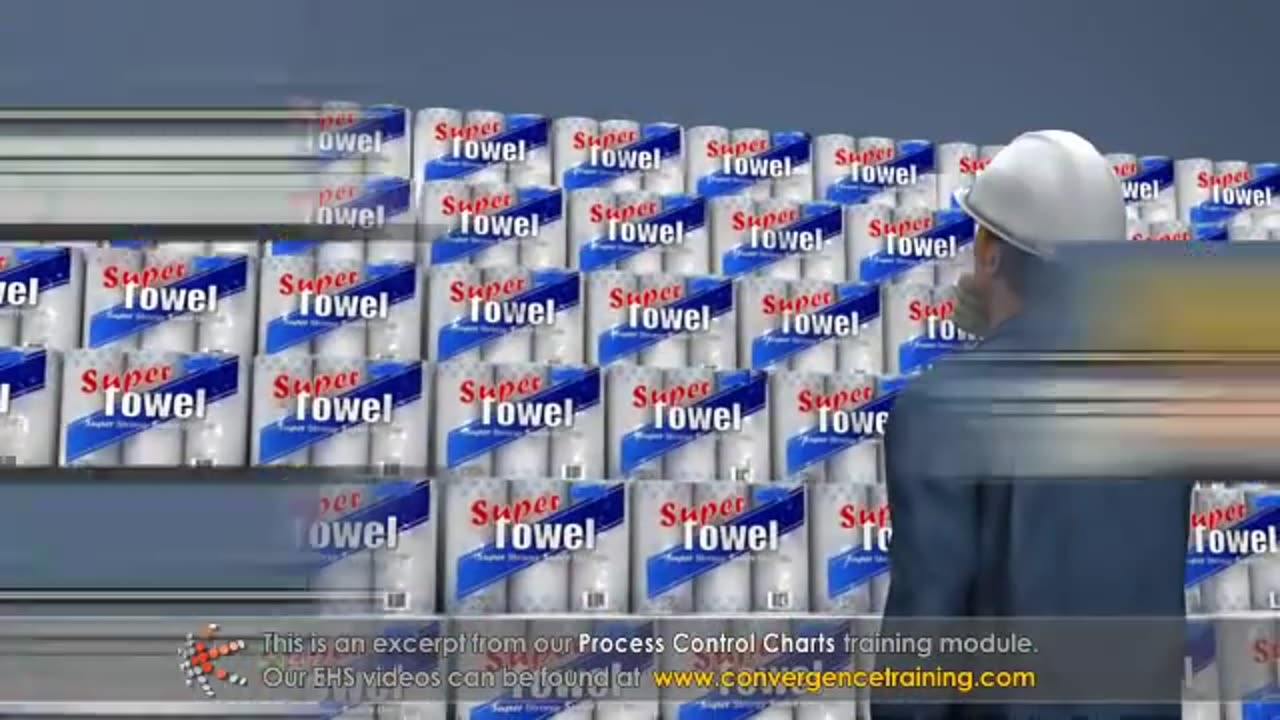
Process Control Charts
Process Control Charts are tools used in statistical process control (SPC) to monitor and control processes. They help detect variations in a process and determine whether the process is stable or needs corrective action. Here's a breakdown:
---
### **Key Components of a Control Chart**
1. **Center Line (CL):** Represents the process average or mean.
2. **Upper Control Limit (UCL):** The upper threshold for acceptable variation, typically set at three standard deviations above the mean.
3. **Lower Control Limit (LCL):** The lower threshold for acceptable variation, typically set at three standard deviations below the mean.
4. **Data Points:** Represent individual measurements or averages of samples taken over time.
5. **Control Zones:** Divide the chart into areas (±1σ, ±2σ, ±3σ) to help detect patterns or trends.
---
### **Types of Control Charts**
1. **Variable Data Charts (Continuous Data):**
- **X̄ and R Chart:** Monitors the process mean (X̄) and range (R).
- **X̄ and S Chart:** Similar to X̄ and R but uses standard deviation (S) instead of range.
- **Individuals and Moving Range (I-MR) Chart:** For single measurements, tracks individual values and their moving range.
2. **Attribute Data Charts (Discrete Data):**
- **P Chart (Proportion Chart):** Monitors the proportion of defective items in a sample.
- **NP Chart:** Tracks the number of defective items in a sample (used when sample size is constant).
- **C Chart:** Counts the number of defects per unit.
- **U Chart:** Tracks the number of defects per unit where the sample size can vary.
---
### **Steps to Create a Control Chart**
1. **Define the Process:** Identify the process or characteristic to monitor.
2. **Collect Data:** Gather data points in samples over time.
3. **Calculate Parameters:** Determine the mean, range/standard deviation, and control limits.
4. **Plot the Chart:** Plot data points, the mean, and control limits.
5. **Interpret the Chart:** Look for patterns, trends, or points outside control limits.
---
### **Interpreting Control Charts**
- **In Control:** Data points are within control limits with no unusual patterns.
- **Out of Control:** Indicators include:
- Points outside the control limits.
- Run of 7+ points above or below the mean.
- Sudden shifts or trends.
- Repetitive patterns or cycles.
---
### **Benefits of Control Charts**
- Detect process instability early.
- Identify special cause variations (unexpected events).
- Monitor process improvements over time.
- Improve decision-making with data-driven insights.
Control charts are essential for ensuring consistent quality and performance in manufacturing, service industries, and beyond.
-
 7:58
7:58
HSESafetyInformation
8 months agoAuthentic Peshawari Rosh _ Namkeen Gosht Recipe __ Traditional KPK and Baluchistan
721 -
 LIVE
LIVE
Chad Prather
12 hours agoQuit Fighting: Real Strength Starts Here!
3,609 watching -
 LIVE
LIVE
LFA TV
11 hours agoLIVE & BREAKING NEWS! | TUESDAY 11/4/25
4,637 watching -
 LIVE
LIVE
The Bubba Army
23 hours agoIS FETTERMAN GOING REPUBLICAN? - Bubba the Love Sponge® Show | 11/04/25
2,402 watching -
 2:05:08
BEK TV
1 day agoTrent Loos in the Morning - 11/04/2025
8.92K -
 21:38
21:38
Professor Nez
21 hours agoTrump JUST BROKE the INTERNET with SAVAGE Line on Ilhan Omar!
42.3K58 -
 1:17:52
Dialogue works
3 days ago $10.17 earnedMartin Armstrong: This Is How World War III Starts… And It Already Has
36.4K19 -
 38:16
38:16
daniellesmithab
3 days agoAlberta Update: Getting Kids Back to the Classroom
28.4K11 -
 20:48
20:48
BlaireWhite
5 days agoTrans TikTokers Are Crashing Out (Over Nothing)
32.6K11 -
 2:07:06
Side Scrollers Podcast
22 hours agoHasan Piker CAUGHT LYING AGAIN + Twitch URGES LEFTIST IDEOLOGY + More | Side Scrollers
74.8K11