Premium Only Content

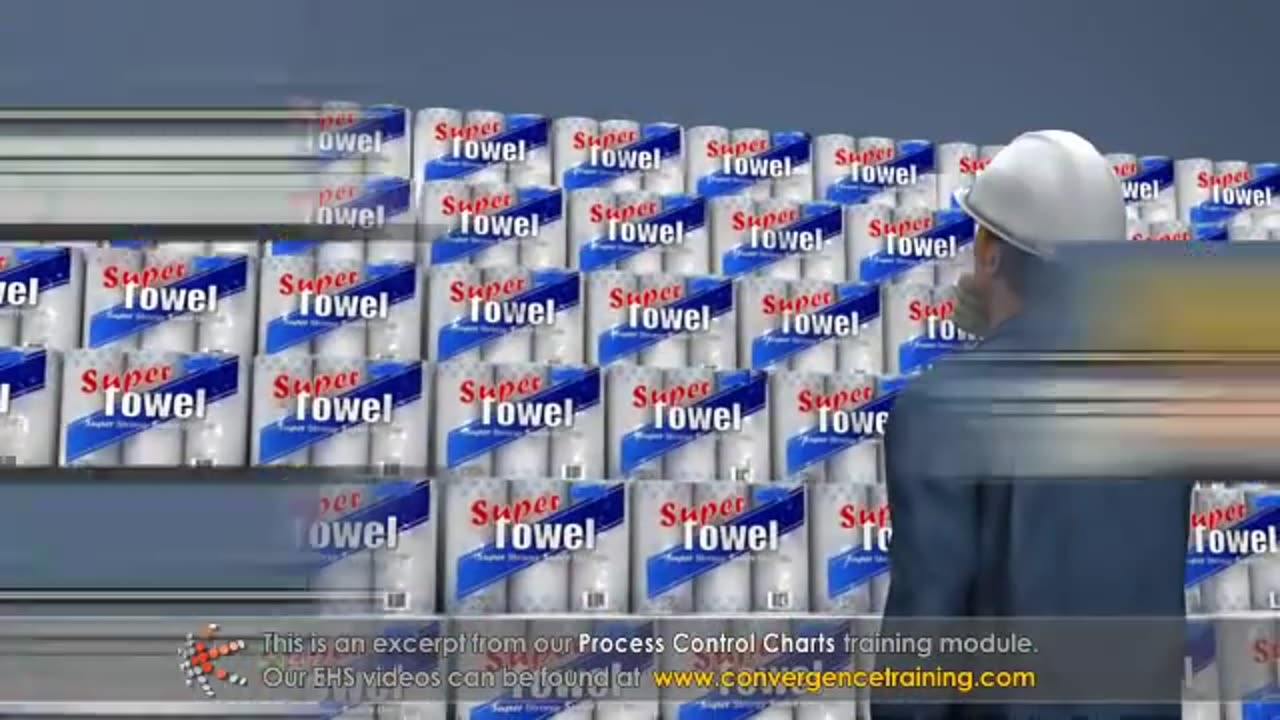
Process Control Charts
Process Control Charts are tools used in statistical process control (SPC) to monitor and control processes. They help detect variations in a process and determine whether the process is stable or needs corrective action. Here's a breakdown:
---
### **Key Components of a Control Chart**
1. **Center Line (CL):** Represents the process average or mean.
2. **Upper Control Limit (UCL):** The upper threshold for acceptable variation, typically set at three standard deviations above the mean.
3. **Lower Control Limit (LCL):** The lower threshold for acceptable variation, typically set at three standard deviations below the mean.
4. **Data Points:** Represent individual measurements or averages of samples taken over time.
5. **Control Zones:** Divide the chart into areas (±1σ, ±2σ, ±3σ) to help detect patterns or trends.
---
### **Types of Control Charts**
1. **Variable Data Charts (Continuous Data):**
- **X̄ and R Chart:** Monitors the process mean (X̄) and range (R).
- **X̄ and S Chart:** Similar to X̄ and R but uses standard deviation (S) instead of range.
- **Individuals and Moving Range (I-MR) Chart:** For single measurements, tracks individual values and their moving range.
2. **Attribute Data Charts (Discrete Data):**
- **P Chart (Proportion Chart):** Monitors the proportion of defective items in a sample.
- **NP Chart:** Tracks the number of defective items in a sample (used when sample size is constant).
- **C Chart:** Counts the number of defects per unit.
- **U Chart:** Tracks the number of defects per unit where the sample size can vary.
---
### **Steps to Create a Control Chart**
1. **Define the Process:** Identify the process or characteristic to monitor.
2. **Collect Data:** Gather data points in samples over time.
3. **Calculate Parameters:** Determine the mean, range/standard deviation, and control limits.
4. **Plot the Chart:** Plot data points, the mean, and control limits.
5. **Interpret the Chart:** Look for patterns, trends, or points outside control limits.
---
### **Interpreting Control Charts**
- **In Control:** Data points are within control limits with no unusual patterns.
- **Out of Control:** Indicators include:
- Points outside the control limits.
- Run of 7+ points above or below the mean.
- Sudden shifts or trends.
- Repetitive patterns or cycles.
---
### **Benefits of Control Charts**
- Detect process instability early.
- Identify special cause variations (unexpected events).
- Monitor process improvements over time.
- Improve decision-making with data-driven insights.
Control charts are essential for ensuring consistent quality and performance in manufacturing, service industries, and beyond.
-
 1:35
1:35
HSESafetyInformation
6 months agoMutton Chops two ways- baked & grilled Recipe by Food Fusion (Eid Recipe)
67 -
 LIVE
LIVE
SpartakusLIVE
2 hours agoThe BADDEST Duo in WZ Exhibits PEAK Physique || Duos w/ Sophiesnazz to start, quads later
635 watching -
 LIVE
LIVE
Nerdrotic
2 hours ago $0.07 earnedMysteries of 3I/ATLAS | Forbidden Frontier #113
590 watching -
 11:52
11:52
Exploring With Nug
1 hour ago $0.03 earnedWhat’s Hiding Under This Dallas Lake We Found a Vehicle!
7.07K3 -
 2:59:09
Barry Cunningham
7 hours agoBREAKING NEWS: PRESIDENT TRUMP SET TO TAKEOVER CHICAGO AND BOSTON!
26.1K22 -
 LIVE
LIVE
LumpyPotatoX2
2 hours agoSunday Funday on HellDivers - #RumbleGaming
153 watching -
 3:11:52
Esports Awards
5 hours agoEsports Awards: Decade Awards 2025
47.8K3 -
 1:02:58
Sarah Westall
3 hours agoMILITARY WHISTLEBLOWER: How Social Media Military Level Psyops are Manipulating You w/ Patrick Bergy
15.3K4 -
 30:41
30:41
Stephen Gardner
2 hours ago🔥WHITE HOUSE GETS UNEXPECTED BIG WIN!
18.4K15 -
 9:39
9:39
MattMorseTV
4 hours ago $0.55 earnedVance just DROPPED a BOMBSHELL.
15.3K50