Premium Only Content

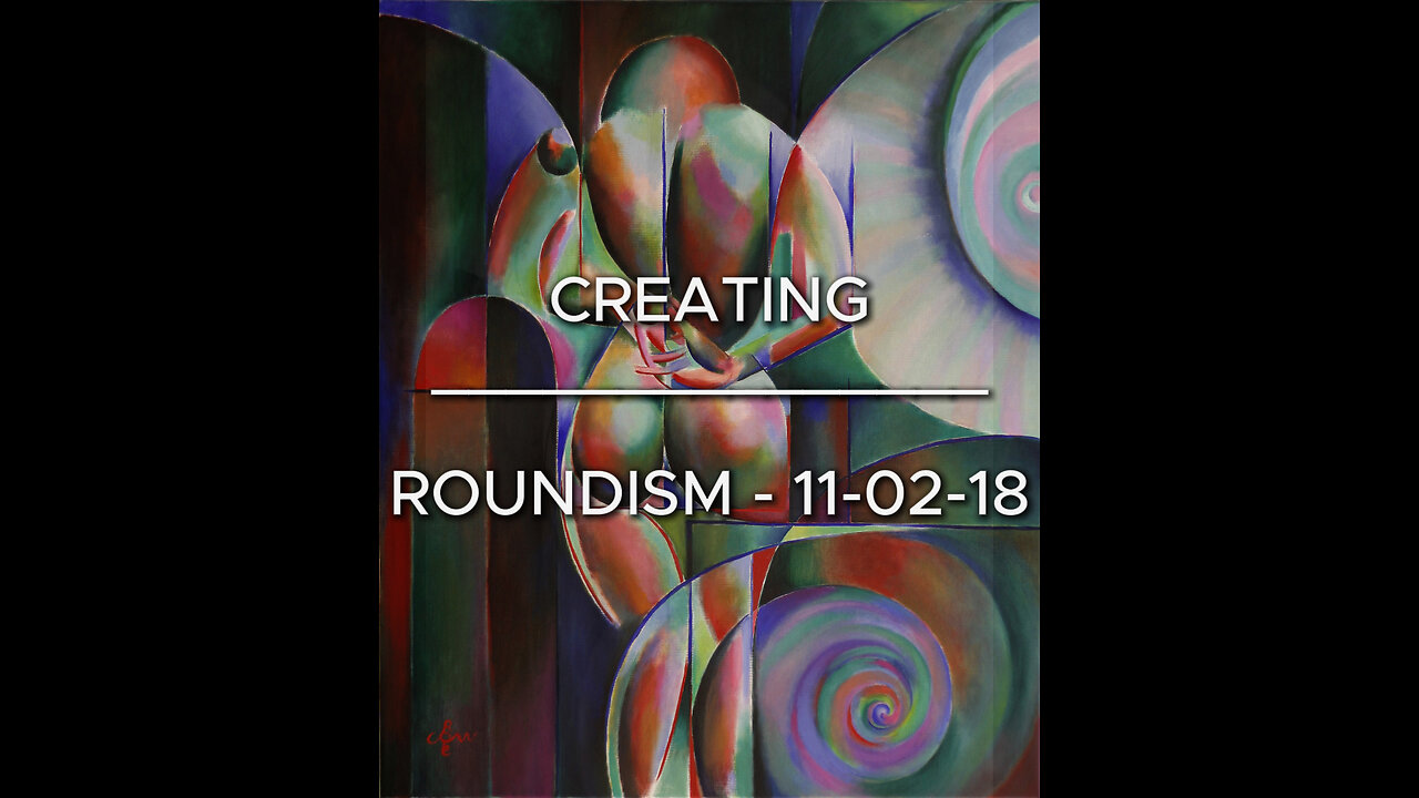
Creating Roundism - 11-02-18
Website link: https://corneakkers.com/roundism-11-02-18/
Printable: https://corneakkers.com/product/printable-roundism-11-02-18/
Reds and Greens
Based on two previous roundism artworks: a pastel drawing called ‘Into the light – 15-06-17’ (impressionistic, surrealsitic) and a graphite pencil drawing ‘Roundism – 04-07-17’. Given that I liked both works and took the colour scheme of the pastel drawing in reds and green, I also used the roundism style of the pencil drawing and combine them. At the same time, I was not satisfied with using two colours only and added blue als a ligament throughout the oil painting.
Cool and Warm
Next to this I also used cool and warm reds and greens in order to create a vivid impression. On the other hand I killed the yellow I used in the initial setup because it drew the attention too much. Futhermore, this type of ‘Roundism’ is based on my theories on singularity I put down in previous descriptions to other works I made in the recent past. Perhaps you will drawn into this painting and keep on looking at it through the path of singularity!
Whitespace
After Roundism -02-02-18 I experimented with whitespace around plains in order to avoid a certain lumpy feeling. Obviously I did not invented such myself but stole it from the grandmaster himself, Paul Cézanne. Similarly I spotted these kind of whitespaces in the works of Otto Dicke in his exhibition at the Dordtrechts Museum but I could have named any other great painter who used them.
Oil on linen (100 x 120 x 2 cm)
Artist: Corné Akkers
-
 LIVE
LIVE
Jeff Ahern
37 minutes agoThursday thrash with Jeff Ahern
69 watching -
 1:47:03
Russell Brand
3 hours agoJews, Gorillas and Kanye West: DARK RUSSELL THURSDAY – SF580
95.4K16 -
 44:36
44:36
Sean Unpaved
2 hours agoGridiron Goverance & Future Stars: Fixing CFB, Flagg's Pro Potential & Brady's Raiders QB Impact
20.4K -
 28:40
28:40
CryptoWendyO
1 hour ago $0.65 earnedBitcoin BULLRUN is back (WHAT YOU NEED TO KNOW)
11.6K -
 LIVE
LIVE
StoneMountain64
2 hours agoKar98k Optic IS BACK after HDR Nerf 😭
173 watching -
 1:04:29
TheAlecLaceShow
3 hours agoTrump Makes Major Trade Deal with UK | FBI’s Historic Bust | Guest: Jim Pfaff | The Alec Lace Show
12.4K1 -
 1:05:18
Timcast
3 hours agoDemocrat Polls Hit NEW LOW, Anti-Trump Smears BACKFIRING, Trump Approval Is REBOUNDING
214K90 -
 1:56:39
Steven Crowder
5 hours agoTrump Announces Major Trade Deal: What This Means For The Global Trade War
432K277 -
![BREAKING: Bitcoin is BIGGER Than Google [$100K Triggers Short Squeeze] | EP 1240](https://1a-1791.com/video/fww1/bc/s8/1/V/U/M/I/VUMIy.0kob-small-BREAKING-Bitcoin-is-BIGGER-.jpg) 1:22:12
1:22:12
Simply Bitcoin
3 hours ago $1.15 earnedBREAKING: Bitcoin is BIGGER Than Google [$100K Triggers Short Squeeze] | EP 1240
34.4K -
 1:58:09
The Charlie Kirk Show
3 hours agoThe First Trade Deal of Trump 2.0 + Exposing Planned Parenthood + AMA | Rose | 5.8.25
88.6K26