Premium Only Content

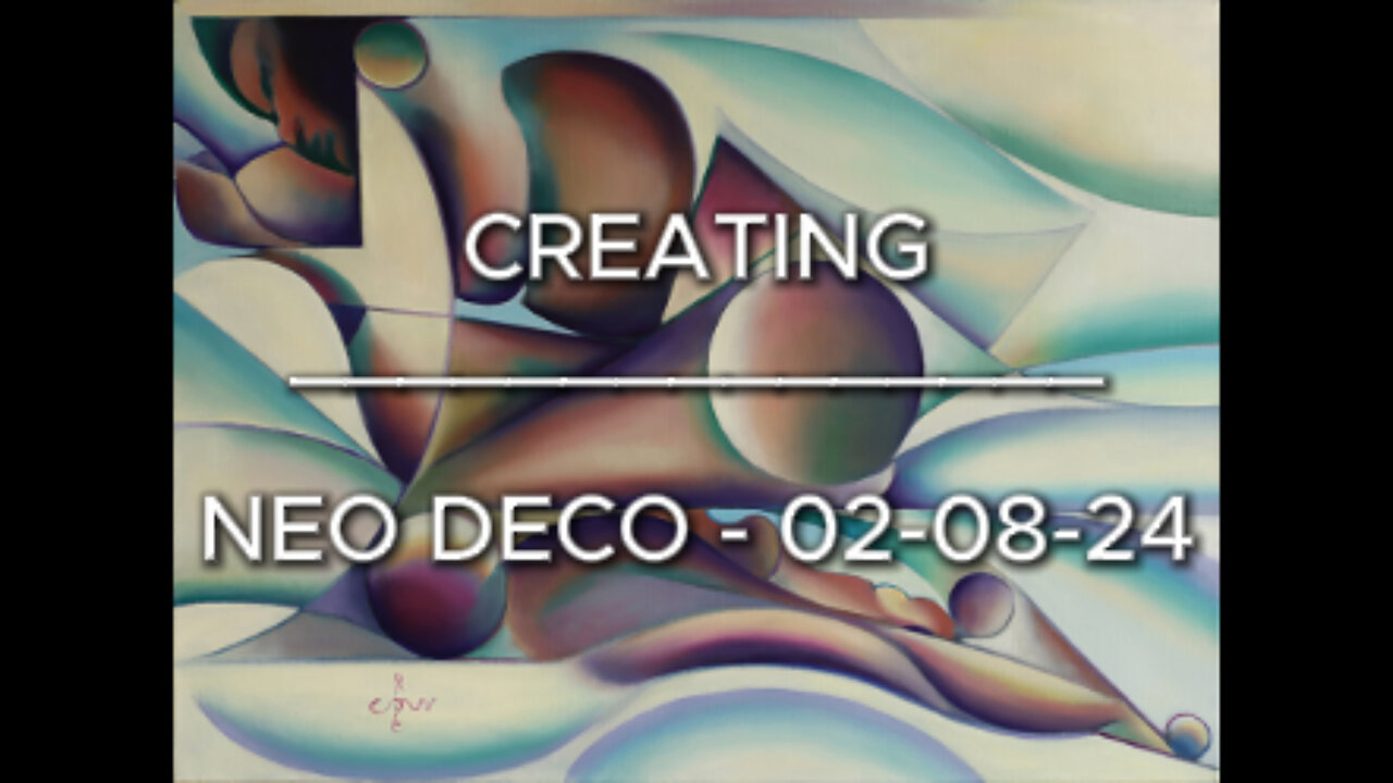
Creating Neo Deco - 02-08-24
Sales info: original (if not sold), prints & printable - visit my website:
Website link: https://corneakkers.com/neo-deco-02-08-24/
Printable: https://corneakkers.com/product/printable-neo-deco-02-08-24/
How Neo Deco Came About
This oil painting ‘Neo Deco – 02-08-24’ is an elaboration of my graphite pencil drawing ‘Roundism – 08-10-17’. At one given moment Roundism became Neo Deco as explained before. Personally, I think the latter covers the style of each artwork better. Roundism always was a temporary nickname, I think. The new name gives more expression to what I want. That is to search for a connection with pre-Word War II quality of art. As contemporary art lover you may think what you want. A little presumptuous you may find my intentions but know this. An artist who holds the brush in his hands is a might person. He will paint and thinks exactly what he visions. In my case that’s all about the idea and the craft to execute it. All balanced out exquisitely. I will leave contemporary art to whoever wants to squander their paints without skills randomly on canvas.
Explode in Color
Enough talk about style. Let me tell you about my considerations with regard to this oil. The prestudy already was done and I learn to appreciate the concept of it throughout the years. However, not sold yet. It doesn’t matter though. Sometimes there are works that you believe to be of value, whether it sells or not. This time it was all about a suiting color scheme to match. That’s always a tall order because as such, colors are so relative. I find them easy to explode into saturational violence. The amount of different colours also can be a drag. So, how do you begin? You can call me 24/7 if you have a sound system for that.
Not Satisfied Yet
First an undercoat in perylene black and white. That’s just copying the already invented forms. For no particular reason I decided to use orange and blue. In my last oil Venus Lamenting - 14-06-24 I also used an underlayment of perylene black. This time the preliminary result was not to my liking. Colors were to separated from each other. The abstract female form is reclining on sheets but the blue in the latter looked like ice.
Changing the Color Scheme
Then, I walked across my painting Roundism - 02-12-14 hanging in my hall. That was the color scheme I also could employ in this one. The transitions from yellow to purple were done by mixing up Old Holland Magenta and titanium white. To the latter I added a tad of Rembrandt Aureolin. Even though yellow and purple also are complementary, I feel better with this couple than orange and blue. Besides that this palette allowed me to create a full array of unsaturated skin hues. This way both purple / yellow and red / green complement eachother in different saturational degrees throughout the whole canvas.
Oil on linen (60 x 80 x 2 cm)
Artist: Corné Akkers
-
 0:29
0:29
Corné Akkers Artworks
7 days agoModel Session – 18-10-25 – 2
22 -
 LIVE
LIVE
vivafrei
9 hours agoEp. 289: Arctic Frost, Boasberg Impeachment, SNAP Funding, Trump - China, Tylenol Sued & MORE!
14,470 watching -
 35:27
35:27
megimu32
3 hours agoMEGI + PEPPY LIVE FROM DREAMHACK!
123K6 -
 1:03:23
Tactical Advisor
6 hours agoNew Gun Unboxing | Vault Room Live Stream 044
181K29 -
 19:12
19:12
Robbi On The Record
7 hours ago $9.25 earnedThe Loneliness Epidemic: AN INVESTIGATION
32.6K65 -
 14:45
14:45
Mrgunsngear
1 day ago $90.47 earnedFletcher Rifle Works Texas Flood 30 Caliber 3D Printed Titanium Suppressor Test & Review
63K16 -
 17:17
17:17
Lady Decade
1 day ago $4.63 earnedMortal Kombat Legacy Kollection is Causing Outrage
35.2K6 -
 35:51
35:51
Athlete & Artist Show
1 day ago $8.10 earnedIs Ryan Smith The Best Owner In The NHL?
45.6K4 -
 22:56
22:56
American Thought Leaders
2 days agoCharles Murray: I Thought Religion Was Irrelevant to Me. I Was Wrong.
44.2K21 -
 36:22
36:22
Brad Owen Poker
8 hours agoGIGANTIC $17,000+ Pot In BOBBY’S ROOM! TRAPPING Top Pro w/FULL HOUSE!! Big Win! Poker Vlog Ep 326
44.2K1