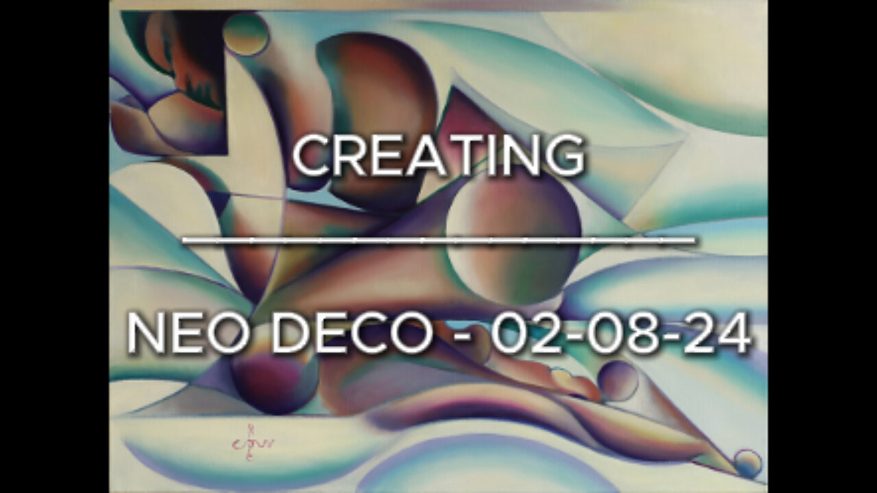
Creating Neo Deco - 02-08-24
Sales info: original (if not sold), prints & printable - visit my website:
Website link: https://corneakkers.com/neo-deco-02-08-24/
Printable: https://corneakkers.com/product/printable-neo-deco-02-08-24/
How Neo Deco Came About
This oil painting ‘Neo Deco – 02-08-24’ is an elaboration of my graphite pencil drawing ‘Roundism – 08-10-17’. At one given moment Roundism became Neo Deco as explained before. Personally, I think the latter covers the style of each artwork better. Roundism always was a temporary nickname, I think. The new name gives more expression to what I want. That is to search for a connection with pre-Word War II quality of art. As contemporary art lover you may think what you want. A little presumptuous you may find my intentions but know this. An artist who holds the brush in his hands is a might person. He will paint and thinks exactly what he visions. In my case that’s all about the idea and the craft to execute it. All balanced out exquisitely. I will leave contemporary art to whoever wants to squander their paints without skills randomly on canvas.
Explode in Color
Enough talk about style. Let me tell you about my considerations with regard to this oil. The prestudy already was done and I learn to appreciate the concept of it throughout the years. However, not sold yet. It doesn’t matter though. Sometimes there are works that you believe to be of value, whether it sells or not. This time it was all about a suiting color scheme to match. That’s always a tall order because as such, colors are so relative. I find them easy to explode into saturational violence. The amount of different colours also can be a drag. So, how do you begin? You can call me 24/7 if you have a sound system for that.
Not Satisfied Yet
First an undercoat in perylene black and white. That’s just copying the already invented forms. For no particular reason I decided to use orange and blue. In my last oil Venus Lamenting - 14-06-24 I also used an underlayment of perylene black. This time the preliminary result was not to my liking. Colors were to separated from each other. The abstract female form is reclining on sheets but the blue in the latter looked like ice.
Changing the Color Scheme
Then, I walked across my painting Roundism - 02-12-14 hanging in my hall. That was the color scheme I also could employ in this one. The transitions from yellow to purple were done by mixing up Old Holland Magenta and titanium white. To the latter I added a tad of Rembrandt Aureolin. Even though yellow and purple also are complementary, I feel better with this couple than orange and blue. Besides that this palette allowed me to create a full array of unsaturated skin hues. This way both purple / yellow and red / green complement eachother in different saturational degrees throughout the whole canvas.
Oil on linen (60 x 80 x 2 cm)
Artist: Corné Akkers
-
 0:30
0:30
Corné Akkers Artworks
8 days agoPsyche & Amor – 23-05-23
84 -
 17:25
17:25
BlackDiamondGunsandGear
1 day agoCustom Building the Cheapest MP5
317 -
 UPCOMING
BEK TV
21 hours agoTrent Loos in the Morning - 11/06/2025
102 -
 8:10
8:10
The Shannon Joy Show
15 hours agoShould we even VOTE anymore?
7142 -
 59:34
59:34
Dialogue works
1 day agoMohammad Marandi: It’s WAR: Iran’s Supreme Defense Council ACTIVATES –Hezbollah REFUSES to Surrender
21.8K9 -
 10:23
10:23
TheSaltyCracker
16 hours agoMuslims Immediately Threaten New Yorkers After Zohran Win
28.7K409 -
 18:40
18:40
Actual Justice Warrior
15 hours agoMamdani Pledges To DESTROY New York
12.3K40 -
 28:53
28:53
iCkEdMeL
15 hours ago $0.02 earnedBREAKING: 9 DEAD After UPS Plane BURSTS Into Fireball at Louisville Airport
21.6K7 -
 20:52
20:52
Professor Nez
18 hours agoThe TRUTH is Actually WORSE than we Thought...
9.26K18 -
 8:59
8:59
MattMorseTV
17 hours ago $0.05 earnedTrump’s DIRE WARNING to the Senate GOP.
72.7K81