Plotting Maps Directly on Excel with Statistics Displayed from Data Tabl
1 year ago
96
Plotting Maps Directly on Excel with Statistics Displayed from Data Tabl
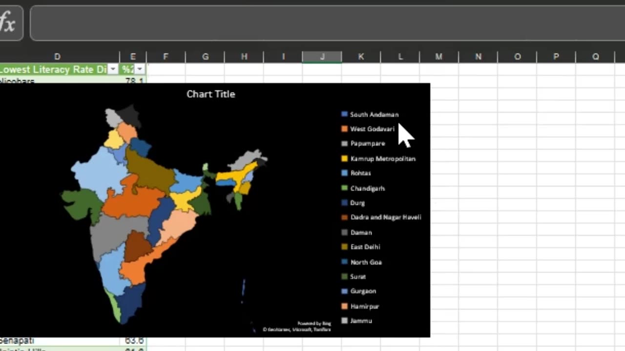
In this video, we'll show you how to plot maps directly on Excel using the power of the Bing Maps add-in. We'll demonstrate how to easily import data from a table and display it on a map, with statistics displayed directly from the data table. You'll see how to customize the map's appearance, add data labels, and even create animated maps. By the end of this tutorial, you'll have a deeper understanding of how to utilize Excel's powerful data visualization capabilities to create insightful maps for your next project
Excel Tips and Tricks - Plot MAP Directly on EXCEL With Statistics displayed from Data Table
Loading comments...
-
 LIVE
LIVE
Sean Unpaved
1 hour agoDodgers Dynasty Rolls On, NFL Chaos Reigns, & MNF Showdown Countdown
76 watching -
 1:35:56
Redacted News
2 hours agoA MAGA Civil War has just begun, Christians slaughtered in Nigeria, Charlie Kirk's audiit | Redacted
85.5K99 -
 LIVE
LIVE
Dr Disrespect
7 hours ago🔴LIVE - DR DISRESPECT - ARC RAIDERS - FULL SEND INTO THE RED
1,656 watching -
 26:34
26:34
Stephen Gardner
2 hours ago🔥Elon EXPOSES The Exact Blueprint Dems use to CHEAT on Joe Rogan!!
16.8K64 -
 51:10
51:10
Dad Saves America
6 hours ago $0.36 earnedMask Off Mamdani: NYC’s Socialist “Savior” Is Another Spoiled Aristocrat
3.63K3 -
 6:14
6:14
Buddy Brown
7 hours ago $1.61 earnedLaw Enforcement Caught SNOOPING on PRIVATE LAND! | Buddy Brown
4.66K13 -
 16:21
16:21
Real Estate
1 month ago $0.28 earnedIt’s Not Just You..NO ONE CAN AFFORD KIDS ANYMORE
3.99K6 -
 LIVE
LIVE
LFA TV
1 day agoLIVE & BREAKING NEWS! | MONDAY 11/3/25
1,039 watching -
 1:11:07
vivafrei
3 hours agoFishing for Lawsuits! I Get Blocked Because Zohran is Anti-Gay? Halloween Terror Plot & MORE!
85.9K29 -
 1:12:46
Russell Brand
5 hours agoWE’RE BACK! The Fight for Freedom Starts NOW - SF645
81.3K76