Why This New Map May Have Important Implications!|⚛
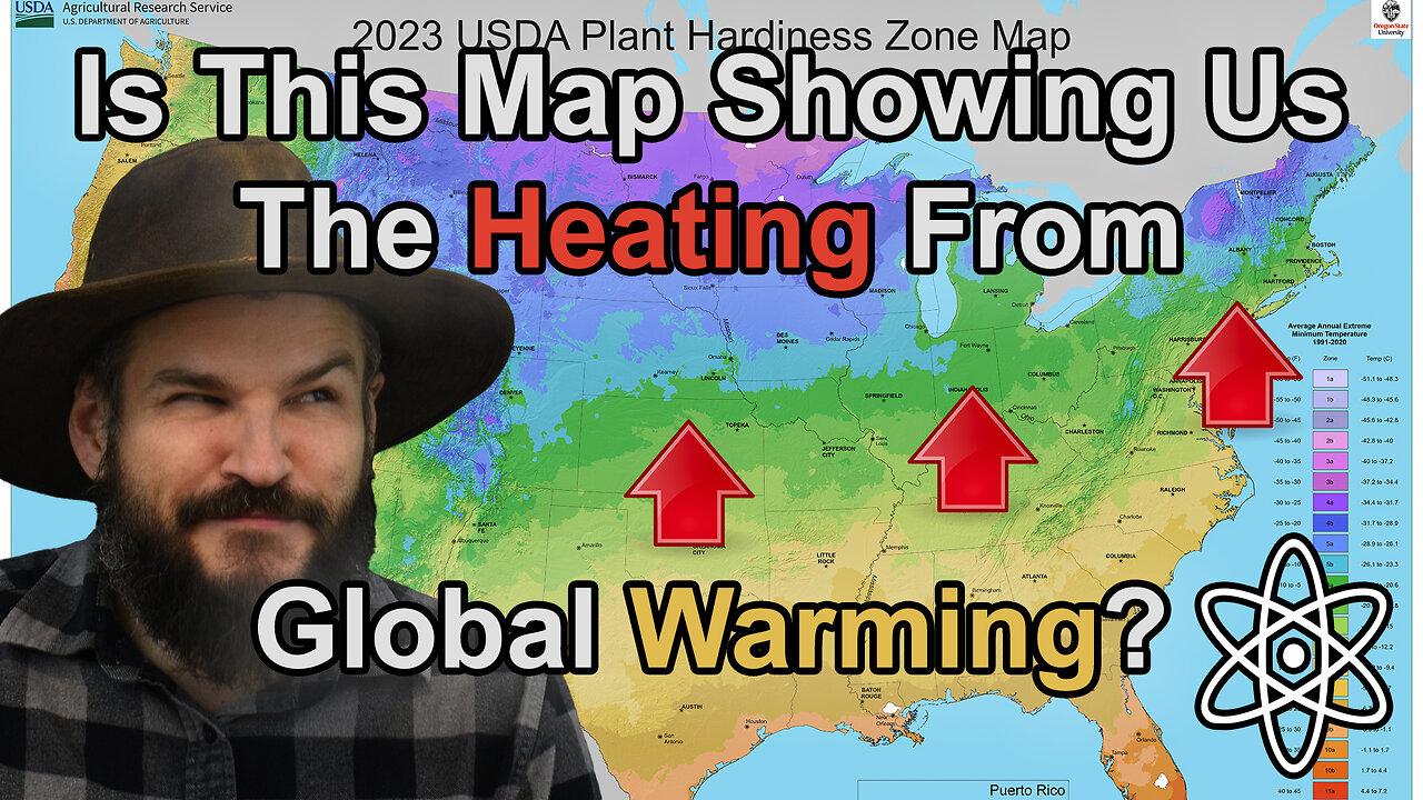
Why does this map have so many colors? It's because it's the new Hardiness Zone Map released by the USDA to help gardeners and more importantly farmers figure out where things are able to grow. What I think is even more interesting is how it's so different from the same map they released in 1992. Let me explain why!
#usdagrowingzones #hardinesszones #globalwarming
Background planet art is all my own unless otherwise stated.
✝=Religious Video
⚛=Science/Engineering Video
✝⚛=Both
Support me on Patreon:
https://www.patreon.com/daein
Engage me and others on discord:
https://discord.gg/hRpjUamzGj
Follow me on Twitter:
https://twitter.com/DaeinBallard
Follow me on Facebook:
https://www.facebook.com/DaeinExplains/
Follow me on Instagram:
https://www.instagram.com/daeinexplains/
-
 5:52
5:52
Daein Explains
2 months agoWhy Do Computers Think 256 Is A Round Number? |⚛
131 -
 35:55
35:55
ZeeeMedia
13 hours agoPfizer mRNA in Over 88% of Human Placentas, Sperm & Blood | Daily Pulse Ep 156
5.43K98 -
 LIVE
LIVE
Pickleball Now
3 hours agoLive: IPBL 2025 Day 5 | Final Day of League Stage Set for Explosive Showdowns
258 watching -
 9:03
9:03
MattMorseTV
16 hours ago $14.63 earnedIlhan Omar just got BAD NEWS.
26.7K80 -
 2:02:41
Side Scrollers Podcast
20 hours agoMetroid Prime 4 ROASTED + Roblox BANNED for LGBT Propaganda + The “R-Word” + More | Side Scrollers
133K14 -
 16:38
16:38
Nikko Ortiz
15 hours agoVeteran Tactically Acquires Everything…
20.6K1 -
 20:19
20:19
MetatronHistory
2 days agoThe Mystery of Catacombs of Paris REVEALED
11.7K2 -
 21:57
21:57
GritsGG
19 hours agoBO7 Warzone Patch Notes! My Thoughts! (Most Wins in 13,000+)
18.1K -
 2:28:08
PandaSub2000
12 hours agoMyst (Part 1) | MIDNIGHT ADVENTURE CLUB (Edited Replay)
12K -
 1:12:43
TruthStream with Joe and Scott
5 days agoJason Van Blerk from Human Garage: Reset your life with Fascial Maneuvers,28 day reset, Healing, Spiritual Journey, Censorship, AI: Live 12/3 #520
24.6K4