Creating Berg en Dal – 02-11-23
Availabe as original (if not sold), prints & printable. Visit my website to learn more:
Website link: https://corneakkers.com/2023/11/02/berg-en-dal-02-11-23/
Printable: https://corneakkers.com/product/printable-berg-en-dal-02-11-23/
A Perfect Mixture
This graphite pencil drawing ‘Berg en Dal – 02-11-23’ is a sort of mixture of cubism and impressionism. Less abstracted than the previous one but more cubist than the one before. That was my very aim. I’m still searching for the perfect balance between both styles. In fact, throughout the years my quest has been to prevent people from detecting a certain style. In the past I have been accused for being the new Picasso. In earlier days: “Hey, your style resembles Edward Hopper’s or Dali’s”. More than any other artist I long for creating a style to call my own, like Van Gogh or Cézanne did. My gut feeling still tells me to let both styles converge so they cancel eachother out, becoming one entirely new. What do you say? I think, it’s the only way to come up with something new.
The Very Spot
The motif is situated in Berg en Dal, Gelderland, Netherlands. At least, I guess it is. I couldn’t see it clearly on the map. I think Beek-Ubbergen is just around the corner. In fact, the very spot is at the end of the second-last path to the right from the Rijksstraatweg. There is this white house you can see behind the dominant tree. They rent it out as a vacation home. Anyway, the Duivelsberg is to the left and it’s a lovely valley that I frequently visit. Nearby I made a small drawing in 2019.
Grainy Structure
I like how the Winsor & Newton paper reacts to the Pitt Graphite Matt pencil made by Faber Castell. It’s rather grainy. When I draw a plane I can either rub it out or enjoy the ribbled structure. It favors an impressionist look but it’s still good enough for cubism though. These kinds of paper are conducive to vague contour delineations in the back. That’s something harder to achieve using Bristol paper. Its structure is rather dense and suited for fine detailing. Hence, there is a nice sketchy feel to these kinds of drawings. Don’t you agree?
Graphite pencil drawing (Faber Castell, Pitt Graphite Matt, 14B) on Winsor & Newton Bristol board paper (21 x 14.8 x 0.1 cm – A5 format)
Artist: Corné Akkers
-
 1:35
1:35
Corné Akkers Artworks
8 months agoCreating Berg en Dal – 30-10-23
83 -
 2:25
2:25
Corné Akkers Artworks
7 months agoCreating Berg en Dal - 19 12 23
115 -
 2:42
2:42
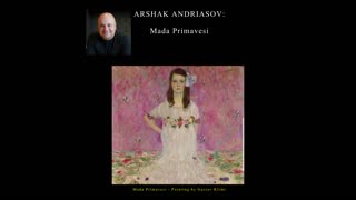
Arshak Andriasov
1 year agoGustav Klimt - Mada Primavesi
127 -
 2:48
2:48
ACHIKO2007
3 years agoIMPRESSIONISM IN THREADS
31 -
 19:45
19:45
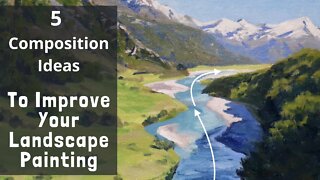
Samuel Earp Artist
2 years ago $0.10 earned5 COMPOSITION IDEAS to Improve Your Landscape Painting
4404 -
 3:29
3:29
JessicasFluidArt
2 years agoDynamic Dutch Pour
13 -
 3:21
3:21
Artist & Thinker
2 years agoThe Courtesan after Van Gogh Watercolor and Ink by Ginette
117 -
 4:04
4:04
DanielVoelker
1 year agoLOREM IPSUM | Contemporary Fine Art Photography | Created By Artist Daniel Voelker (2021)
541 -
 18:10
18:10
Samuel Earp Artist
3 years ago $0.09 earnedPainting TREES AND FIELDS en plein air
7635 -
 27:38
27:38
CoveFineArt
1 year agoEPIC TIMELAPSE of Peder Mørk Mønsted Master Copy! FULL PROCESS
54