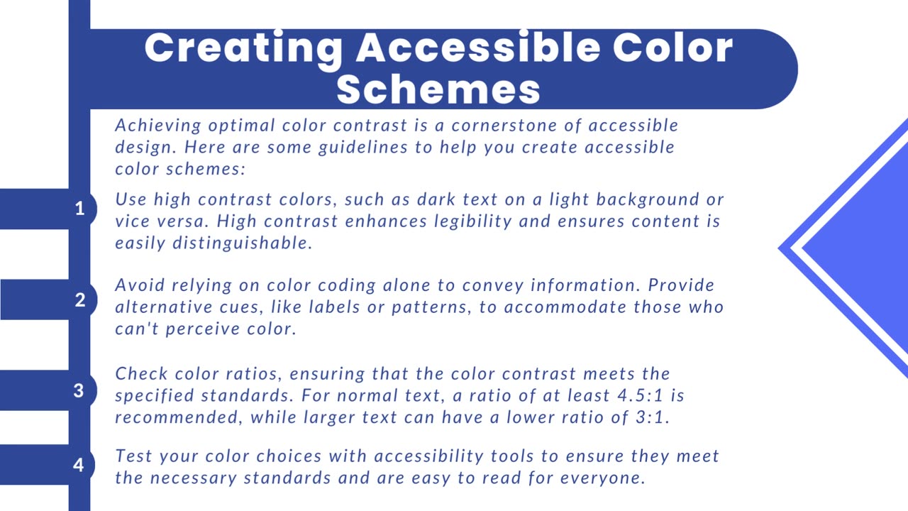
Introduction to color contrast and accessibility
Color contrast is the differentiation in brightness or color between text and its background in digital content. It plays a vital role in design as it directly impacts the readability of text, especially for individuals with visual impairments or difficulties in perceiving colors. A higher color contrast enhances the legibility of text and graphics, while lower contrast can make content more challenging to interpret.
The Web Content Accessibility Guidelines (WCAG) are universally acknowledged standards for web accessibility that provide specific recommendations for color contrast. WCAG suggests a minimum contrast ratio between text and its background, often specified as a ratio like 4.5:1 for regular text and 3:1 for larger text. This guideline ensures that text remains easily distinguishable for people with limited vision, making it a critical factor in expanding the accessibility of digital content to a broader audience.
https://www.acadecraft.com/accessibility/color-contrast-and-accessibility/
-
 LIVE
LIVE
Tundra Tactical
5 hours ago $6.99 earned🛑{LIVE NOW!!} The Great Tundra Nation Gun Show!!!! Presented By MGS Trade School
797 watching -
 4:35:07
Right Side Broadcasting Network
4 days agoLIVE: VP Vance Attends the U.S. Marine Corps 250th Anniversary Celebration - 10/18/25
45K39 -
 LIVE
LIVE
Mally_Mouse
20 hours ago🔥🍺Spicy HYDRATE Saturday!🍺🔥-- Let's Play: Prison Life 2
98 watching -
 LIVE
LIVE
Pepkilla
2 hours agoBattlefield 6 SMG Camo Grind
99 watching -
 14:22
14:22
Exploring With Nug
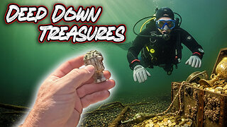
9 hours ago $4.28 earnedThe River Exposed a Secret That No One Was Supposed to See!
34.6K2 -
 23:23
23:23
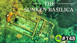
MYLUNCHBREAK CHANNEL PAGE
11 hours agoThe Sunken Basilica
77.4K6 -
 8:05
8:05
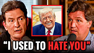
Hollywood Exposed
2 hours agoCharlie Sheen STUNS Tucker Carlson With His Shocking Political Confession
1.82K9 -
 LIVE
LIVE
SavageJayGatsby
1 hour ago🔥 Spicy Saturday – Let's Play: Prison Life 2🔥
50 watching -
 30:02
30:02
The White House
2 hours agoVP JD Vance Delivers Remarks at 250th Anniversary Celebration for the United States Marine Corps
8.35K16 -
GamerGril
5 hours agoShould I Get A Zoob Job 💞Dying Light The Beast💞
11.3K5