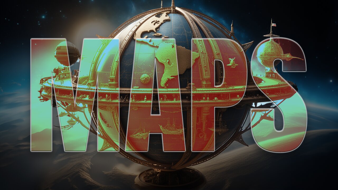
MAPSTROCITY: Unmasking the Secrets of Map Trickery
Land masses can differ significantly in size compared to reality on maps, depending on the map projection used. For example, the Mercator projection, which is the most common map projection used in textbooks and atlases, greatly exaggerates the size of land masses near the poles and shrinks land masses near the equator. This means that Greenland appears to be roughly the same size as Africa on a Mercator map, when in reality Africa is 14 times larger!
Other map projections also distort the size of land masses to varying degrees. For example, the Robinson projection, which is used by National Geographic, gives a more accurate representation of the relative sizes of land masses, but it still distorts their shapes.
The reason why maps distort the size of land masses is because it is impossible to represent the spherical Earth on a flat surface without some distortion. This is known as the map projection problem. There are many different map projections, each with its own advantages and disadvantages. Cartographers choose a map projection based on the specific purpose of the map.
For example, the Mercator projection is well-suited for navigation because it preserves the direction between two points. However, it is not accurate for comparing the sizes of land masses.
If you're looking for a map that shows the true size of land masses, you should look for a map that uses an equal-area projection, such as the Peters projection or the Gall-Peters projection. These projections distort the shapes of land masses, but they preserve their relative sizes.
It is important to be aware of the distortions caused by map projections when using maps. Otherwise, you may be misled about the true size of land masses.
#maps #trickery #cartography #distorted
-
 18:03
18:03
Nikko Ortiz
18 hours agoNikko Ortiz Night Routine...
91.6K15 -
 24:21
24:21
a12cat34dog
1 day agoGUITAR HERO AT DREAMHACK | HALLOWEEN 2025
12.7K8 -
 17:14
17:14
GritsGG
14 hours agoWarzone Victory Number 3999! Most Winning Warzone Player!
7.61K -
 22:15
22:15
The Pascal Show
1 day ago $3.77 earnedTEXTS REVEALED Charlie Kirk Head Of Security Breaks Silence On A**assination! Leaders Being Bought?
11.2K12 -
 LIVE
LIVE
Lofi Girl
3 years agolofi hip hop radio 📚 - beats to relax/study to
328 watching -
 21:37
21:37
Forrest Galante
1 day ago6 Deadly Sea Monsters That Actually Exist
154K10 -
 23:24
23:24
Stephen Gardner
13 hours agoYou WON'T Believe What Happened To Lindsey Graham
77.9K60 -
 8:05:17
SpartakusLIVE
12 hours agoSolos on ARC: UNBANNED
264K12 -
 30:29
30:29
Robbi On The Record
12 hours ago $12.56 earnedWhales Are Selling. Banks Are Nervous. Bitcoin analysis ft Simply Bitcoin Tv
29.1K9 -
 2:28:12
vivafrei
20 hours agoEp. 291: More Epstein Documents! Stacey Plaskett SCANDAL! Butler Cover-Up, Tucker Smea & MORE!
222K285