Stripes Across My T-Shirt
How the climate is changing at an unprecedented rate and is turning out to be unprecedentedly hot. Cool and important insights in a heated discussion.
About cherry picking, statistics and lies. But especially about the cool figures that show the opposite of what is being told to us. A must see for anyone who loves the earth (13 min).
A disturbing video. Or rather, an extremely hopeful one. Shown honestly. Based on simple facts. The realization that the story we have been confronted with more and more insistently for decades is simply not correct. And that we as people are not guilty of 'the era of Global Boiling'. And that we as people do not have to do penance by returning to the life of 1850. A life that was often unhealthy, unfree, hard, short and for many very unhappy.
The narrative of 'unprecedented heat' and 'unprecedented rapid climate change' can hardly be avoided. This almost self-evident 'truth' resonates in every TV programme, in every classroom, every news broadcast, every election program and every business model.
But is it really true?
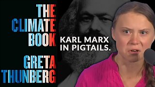
On May 22, 2018, Ed Hawkins presented the graph visualizing global temperature change since 1850. An alarming overview from 'cool blue' in 1850 to 'boiling hot red' in the 21st century. Hawkins, lead author for the IPCC's 6th Assessment Report (AR6), received the Kavli Medal from the Royal Society in the same year, "for actively communicating climate science and its various implications to a wide audience".
The dramatic graphic was soon called The Warming Stripes. And has since been used worldwide as seemingly irrefutable and visually strong evidence of unprecedented - and therefore man-made - global warming. In 2022, the graph was still on the cover of Greta Thunberg's 'The Climate Book'.
Cheap trick
In the Climate Discussion NEXUS video, the image evoked by the 'Warming Stripes' is unequivocally exposed as a cheap trick.
Only by choosing the end of the Little Ice Age (ca 1850) as the start and reference of a graph can you create the image of an unparalleled and unprecedented anthropomorphic warming. However, if you do not look at the last 170 years, but at, for example, the last 2000 years, a completely different picture emerges. Namely that of a period in which temperatures were at least as warm for most of the time as they have been over the past 170 years. And more than 1,000 years ago – in the so-called Medieval Warm Period – clearly warmer than now. Without human CO2 this could have had an influence.
And on a scale that is slightly more relevant to planet Earth, an even more surprising picture emerges. For example, let's look back 400 million years. And try to estimate temperatures using 'proxies' (indicators that gave a reasonable indication of the temperature on Earth in the time before we started measuring and recording temperatures with thermometers only about 150 years ago). proxies about which the makers of the video are refreshingly transparent). Then a picture emerges of the actual climate changes on Earth. An earth that is usually ice cold. In which major ice ages dominate the earth for approximately 100 million years. Cold. Inhospitable. And in which thick ice caps cover most of the Earth.
Only in a few relatively short intermediate periods, the so-called 'interglacials', is the temperature comparable to today (250 and 400 million years ago) or clearly warmer (100 and 300 million years ago). Temperatures that have clearly not led to catastrophes or extinction of 'the world' or 'nature'. Interglacials that are the warm, fertile and healthy breathing spaces in an especially very icy world history.
170 years or 47 seconds?
Watch the video. Try to understand what the makers mean by it. How easily a message can be manipulated. By choosing your references wisely. The time period. The (unscientific) choice of temperature proxies. Or a handy reference year. And see how great the natural variability in the climate is. An unprecedentedly complex, chaotic and interdependent dynamic system, that climate. Which we understand only to a very limited extent. But in any case, all kinds of geological forces such as the changing angle of the Earth's axis of rotation and the eccentricity of the Earth's orbit around the sun cause the so-called Milankovitch cycles of about 100,000 years per cycle. But Atlantic Multidecadal Oscillation, varying solar activity, (undersea) volcanism, clouds (albedo) also play a major role.
And also realize that the Earth is approximately 4.6 billion years old. And if we now look back 'no less than' 170 years in that history and try to measure the temperature of the earth, those 170 years are comparable to no less than 47 seconds in the life of a 40-year-old. And that based on those 47 seconds we seem to know for sure that the 40-year-old is critically ill and will be dead in 10 seconds if we do not intervene. Do the math:
(170/4,600,000,000) * (60*60*24*365*40) = ± 47
Are we absolutely sure?
-
 15:03
15:03
ClimateDN
1 year agoStripes Across Our Channel
36311 -
 0:43
0:43
TimelessMysteriesThroughTime
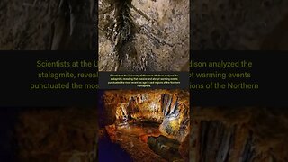
1 year agoUncovering Abrupt Climate Swings in North America's History #shorts #shortsvideo #cave
55 -
 0:56
0:56
FunFactFanatic2023
1 year agoBreaking News - You Need To Know 😱🙄🤕🤧🥴#shorts #weather #end #news #newshorts #flood #rain
5 -
 9:20
9:20
CERES-Science
1 year agoThe “hockey stick” debate. Was there a Medieval Warm Period?
121 -
 0:58
0:58
FunWithFreedomTV
11 months agoRising 🌊 Levels ⚠️ #shorts
3 -
 0:57
0:57
Aaron Linsdau
1 year agoHow to Tie the Figure 8 on a Bight Knot #shorts
16 -
 6:55
6:55
JUST A HOMELESS MAN
5 months agoToday’s ‘Climate Crisis’ Is a Fairy Tale.
116 -
 0:11
0:11
ViralHog
5 years agoShirt Frozen Solid After Moments Outside
51 -
 43:59
43:59
RobertHolmesPhD
1 year agoClimate Science 5 - The IPCC's Forcing Estimates are Wrong Too
2221 -
 0:41
0:41
Dr Berry's Proper Human Diet
7 months ago $0.18 earnedRedneck Sauna! #shorts
1.37K1