Premium Only Content

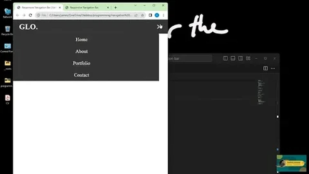
Responsive Navbar Tutorial using HTML, CSS, and JavaScript | Create a Stunning Navigation Menu
Description:
🔥 Want to create a responsive navigation menu for your website? Look no further! In this step-by-step tutorial, we'll show you how to build a beautiful and fully responsive navbar using HTML, CSS, and JavaScript.
🌐 Whether you're a beginner or an experienced developer, this tutorial is designed to help you create a navigation menu that adapts seamlessly to different screen sizes, providing an optimal user experience for both desktop and mobile users.
📋 Here's what we'll cover:
Setting up the HTML structure for the navbar
Styling the navbar with CSS to make it visually appealing
Implementing JavaScript to make the navbar responsive
Adding smooth animations and transitions for a polished look
🚀 By the end of this tutorial, you'll have the skills to design and code your own responsive navigation menu, ensuring that your website looks great on all devices.
👍 Don't forget to like this video, subscribe to our channel for more web development tutorials, and hit the notification bell to stay updated with our latest content.
📁 Download the source code and resources from the link in the video description to follow along.
Let's get started on creating an amazing responsive navbar for your website! 💻💡
#WebDevelopment #ResponsiveNavbar #HTMLCSSJS #Tutorial
-
 29:54
29:54
DeVory Darkins
1 day ago $4.41 earnedHegseth drops explosive speech as Democrats painfully meltdown over Trump truth social post
6.71K33 -
 19:39
19:39
James Klüg
1 day agoAnti-Trump Protesters Threaten To Pepper Spray Me For Trying To Have Conversations
8566 -
 34:54
34:54
MattMorseTV
10 hours ago $13.32 earned🔴Trump just FIRED 154,000 FEDERAL WORKERS. 🔴
32.9K59 -
 2:03:32
Side Scrollers Podcast
18 hours agoMASSIVE Netflix Boycott + The TRUTH About Jimmy Kimmel’s Return + BIG Side Scrollers NEWS
19.7K10 -
 15:05
15:05
GritsGG
1 day agoFlawless Duos Victory w/ Most Winning Duo in Warzone History!
8.51K1 -
 1:53:52
FreshandFit
15 hours agoShe Was In 3 Domestic Violence Cases? Happy Birthday Fresh!!!
141K49 -
 2:03:22
Inverted World Live
7 hours agoThe Aliens Are Underwater | Ep. 117
57.3K18 -
 2:20:24
Badlands Media
15 hours agoDevolution Power Hour Ep. 394: The Long Game, Media Traps, and Military Signals
81.1K24 -
 2:08:38
TimcastIRL
9 hours agoNetflix Shares TANK, Elon Says BOYCOTT After Writer MOCKS Charlie Kirk Assassination
221K173 -
 8:48:01
SpartakusLIVE
11 hours agoI'M BACK || Quads w/ The Boys
83.4K6