Premium Only Content

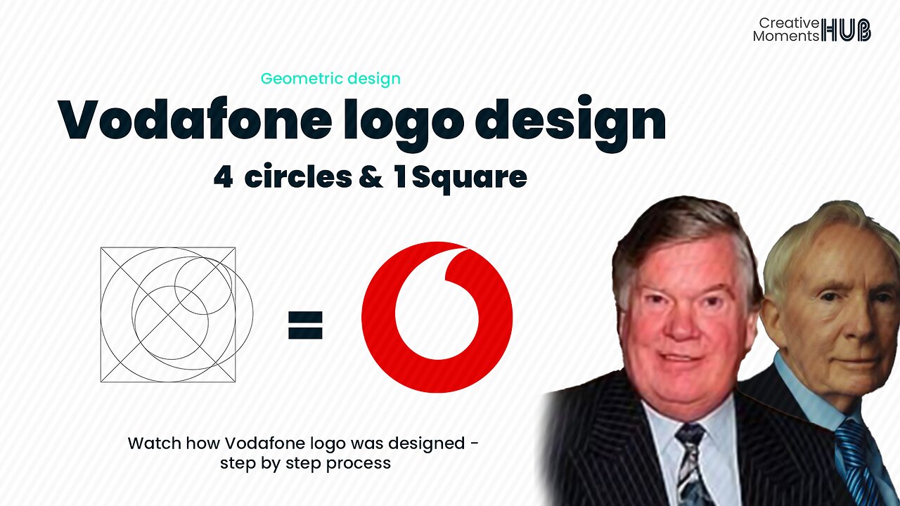
Vodafone Logo Geometric Design - 4 circles and 1 Square
The geometric design is a style of visual composition that focuses on using simple shapes and lines to create complex and visually appealing designs.
The Vodafone logo was designed in 1997 by the famous global firm Saatchi & Saatchi. The speech mark in the emblem symbolizes conversation and voice communication. it captures the essence of the telecommunications brand as it effectively communicates its desired message through a visually sophisticated medium. The red color in the Vodafone logo represents talking, sound, and passion - Founders: Gerry Whent, Ernest Harrison
..................................................
- Hey there, I appreciate your support - comments, likes, and sharing this video - Let's make this Creative Hub a family with special moments - thank you
........................
#backgroundmusic - Get through - Neffex
follow our social media handles
Twitter - https://twitter.com/CMHub_
Instagram - https://www.instagram.com/creativemomentshub/
facebook - https://www.facebook.com/CreativeMomentsHub
tiktok - https://www.tiktok.com/@creativemomentshub?_t=8dY8dGuG2Tu&_r=1
rumble - https://rumble.com/register/CreativeMomentsHub/
whatsApp - https://wa.me/message/CFCJ3Q4RTYK3C1
#creativehub #creativemoments #thehub #elonmus @apple #twitter #vodafone #geometricdesign #logo #logodesign #design #graphicdesign #illustration #youtube #apple #applemusic #applemusic #applelogo #applelogodesign #vodaphoneidea #vodafonetv @VodafoneEgypt @vodafonetr @ElFuturoEsApasionante
-
 LIVE
LIVE
BrookieMonster
2 hours ago $0.01 earnedChristmas Stream: Marvel Rivals with CallmeSeags 🎄
1,290 watching -
 LIVE
LIVE
TheSaf3Hav3n
3 days ago| RUMBLES FIRST SUBATHON IS HERE!!! | DAY 4 |
1,481 watching -
 3:14:33
Joe Donuts Gaming
4 hours ago🟢 Live : Christmas is Here!! | Fortnite, Caroling, Light Tours and Donos !!
10.9K5 -
 LIVE
LIVE
CLUJ
3 hours agoCHRISTMAS EVENING HYPE!! LETS HAVE FUN GAMING!!
715 watching -
![I AM FINALLY BACK :: PUBG: BATTLEGROUNDS :: RUMBLE NOW HAS GIFTED SUBS!!! [Merry Christmas] {18+}](https://1a-1791.com/video/fwe1/22/s8/1/e/f/C/6/efC6v.0kob-small-I-AM-FINALLY-BACK-PUBG-BATT.jpg) LIVE
LIVE
a12cat34dog
5 hours agoI AM FINALLY BACK :: PUBG: BATTLEGROUNDS :: RUMBLE NOW HAS GIFTED SUBS!!! [Merry Christmas] {18+}
187 watching -
 3:55:42
STARM1X16
4 hours agoMerry Christmas Fortnite
9.95K2 -
 2:45:33
Sgtfinesse
4 hours agoMerry Christmas Night
21.6K6 -
 LIVE
LIVE
tacetmort3m
21 hours ago🔴 LIVE - (MERRY CHRISTMAS) TIME TO SPREAD DEMOCRACY - HELLDIVERS 2 OMENS OF TYRANNY
57 watching -
 12:42
12:42
Cooking with Gruel
19 hours agoBrown Butter Trifle with Salted Caramel and Cinnamon Apple
5.49K2 -
 2:46
2:46
BIG NEM
8 hours agoDiscovering RAKIJA: The Holy Liquer of the Balkans
4.03K2