Vodafone Logo Geometric Design - 4 circles and 1 Square
The geometric design is a style of visual composition that focuses on using simple shapes and lines to create complex and visually appealing designs.
The Vodafone logo was designed in 1997 by the famous global firm Saatchi & Saatchi. The speech mark in the emblem symbolizes conversation and voice communication. it captures the essence of the telecommunications brand as it effectively communicates its desired message through a visually sophisticated medium. The red color in the Vodafone logo represents talking, sound, and passion - Founders: Gerry Whent, Ernest Harrison
..................................................
- Hey there, I appreciate your support - comments, likes, and sharing this video - Let's make this Creative Hub a family with special moments - thank you
........................
#backgroundmusic - Get through - Neffex
follow our social media handles
Twitter - https://twitter.com/CMHub_
Instagram - https://www.instagram.com/creativemomentshub/
facebook - https://www.facebook.com/CreativeMomentsHub
tiktok - https://www.tiktok.com/@creativemomentshub?_t=8dY8dGuG2Tu&_r=1
rumble - https://rumble.com/register/CreativeMomentsHub/
whatsApp - https://wa.me/message/CFCJ3Q4RTYK3C1
#creativehub #creativemoments #thehub #elonmus @apple #twitter #vodafone #geometricdesign #logo #logodesign #design #graphicdesign #illustration #youtube #apple #applemusic #applemusic #applelogo #applelogodesign #vodaphoneidea #vodafonetv @VodafoneEgypt @vodafonetr @ElFuturoEsApasionante
-
 5:01
5:01
Creative Moments Hub
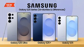
7 months agoSamsung Galaxy S25 Ultra, S25+ and S25 - Buyers guide
8 -
 LIVE
LIVE
SpartakusLIVE
5 hours ago#1 MACHINE Never Stops The GRIND || LAST Stream UNTIL Friday
20,416 watching -
 28:36
28:36
Afshin Rattansi's Going Underground
1 day agoDoug Bandow: ENORMOUS DAMAGE Done to US’ Reputation Over Gaza, Trump ‘Easily Manipulated’ by Israel
12.9K22 -
 2:45:13
Barry Cunningham
11 hours agoCBS CAUGHT AGAIN! CHICAGO A MESS! LISA COOK IS COOKED AND MORE LABOR DAY NEWS!
82.9K39 -
 LIVE
LIVE
StevieTLIVE
5 hours agoMASSIVE Warzone Wins on Labor Day w/ Spartakus
131 watching -
 10:46:42
Rallied
11 hours ago $12.73 earnedWarzone Challenges w/ Doc & Bob
177K3 -
 3:26:25
Joe Donuts Live
4 hours ago🟢 Lost in Space with My Clones: The Alters Adventure Begins
21.6K -
 7:20:22
Dr Disrespect
13 hours ago🔴LIVE - DR DISRESPECT - TRIPLE THREAT CHALLENGE - WINNING AT EVERYTHING
203K12 -
 2:35:33
Chrono
6 hours agoBirthday-eve Stream | Helldivers II
18.4K1 -
 54:40
54:40
BonginoReport
1 day agoLABOR DAY SPECIAL! The Best of Nightly Scroll - Nightly Scroll w/ Hayley Caronia (Ep.124)
119K14