Simple Excel Trick to Conditionally Format Your Bar Charts
23 July 2020 Excel Charts
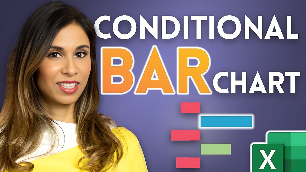
If you want to help your audience to make sense of your Excel chart quickly, consider color coding it. In this video I'll show you how you can apply Conditional Formatting to show different colors for positive and negative deviations. This way you can quickly create an Excel bar chart with conditional formatting based on change % or based on any logic you choose.
Comparison charts and bar graphs in Excel can be quite intimidating and force the reader to spend considerable time to make sense of them. Color can help to immediately grasp important patterns in the chart like good and bad performance. Research also shows that information that's color coded is easier understood and better retained in memory. For example if you use a column or bar chart to show deviations you can have a different color for negative values to positive values. You might choose to show the bars for negative values in red and positives values in green or any other color of your choice.
I'll show you a technique how you can apply such conditional formatting to any type of chart in Excel. As a bonus tip I'll cover how to emphasize a particular part of a chart like the maximum value by defining a logic.
⯆ DOWNLOAD the workbook at the bottom of the blog post here: https://www.xelplus.com/excel-conditional-bar-charts
Complete Excel Dashboard Playlist: https://www.youtube.com/playlist?list=PLmHVyfmcRKyz_4TwSfxzN_gsRtg3ODzyx
Excel data visualization & advanced chart tricks: https://www.youtube.com/playlist?list=PLmHVyfmcRKyyEj7oQkCf7TL9yQQWXbGOQ
★ My Online Excel Courses ► https://www.xelplus.com/courses/
✉ Not sure which of my Excel courses fits best for you? Take the quiz: https://www.xelplus.com/course-quiz/
EXCEL RESOURCES I Recommend: https://www.xelplus.com/resources/
Get Microsoft 365: https://microsoft.msafflnk.net/15OEg
Microsoft Surface: https://microsoft.msafflnk.net/c/1327040/451518/7593
GEAR
Screen recorder: http://techsmith.pxf.io/c/1252781/347799/5161
Main Camera: https://amzn.to/3a5ldBs
Backup Camera: https://amzn.to/2FLiFho
Main Lens: https://amzn.to/39apgeD
Zoom Lens: https://amzn.to/3bd5pN7
Audio Recorder: https://amzn.to/2Uo5rLm
Microphone: https://amzn.to/2xYy9em
Lights: http://amzn.to/2eJKg1U
More resources on my Amazon page: https://www.amazon.com/shop/leilagharani
Time Stamps
00:00 Conditional formatting of charts
00:48 Setting up first bar chart
03:17 Setting up the deviation chart
05:31 Negative red, positive green
06:31 Conditional formatting of maximum value or other logic
09:32 Finalizing the charts (grouping charts together)
Let’s connect on social:
Instagram: https://www.instagram.com/lgharani
Twitter: https://twitter.com/leilagharani
LinkedIn: https://at.linkedin.com/in/leilagharani
Note: This description contains affiliate links, which means at no additional cost to you, we will receive a small commission if you make a purchase using the links. This helps support the channel and allows us to continue to make videos like this. Thank you for your support!
#MsExcel #Excel #LeilaGharani
-
 2:17:05
Blabs Life
6 hours agoPART 3: Peter Jackson's King Kong: The Official Game of the Movie | Noob Plays
12.8K2 -
 18:07
18:07
MetatronCore
4 hours agoAmala Ekpunobi is BASED
14.9K5 -
 1:01:48
BonginoReport
5 hours agoWaddle & Gobble Receive Presidential Pardons! - Nightly Scroll w/ Hayley Caronia (Ep.185)
101K31 -
 53:41
53:41
Katie Miller Pod
4 hours agoMike & Kelly Johnson on Marriage, Family, & Demands of the Job | The Katie Miller Podcast Ep. 16
21.8K14 -
 1:31:04
The Daily Signal
5 hours ago $3.94 earned🚨BREAKING: Judicial CHAOS—$7 Million Somalian Fraud Scandal Thrown Out, Trans Terrorist Released
24.9K11 -
 9:07:11
GritsGG
11 hours ago#1 Most Warzone Wins 4049+!
24.4K2 -
 1:05:43
TheCrucible
6 hours agoThe Extravaganza! EP: 65 (11/25/25)
114K15 -
 7:29:53
The Rabble Wrangler
18 hours agoBattlefield 6 Free Week | Come Play With The Best in the West!
15.8K -
 1:35:57
Kim Iversen
5 hours agoThe Macrons Tried To KILL Candace Owens?
52.7K114 -
 1:15:59
vivafrei
8 hours agoKash interview - 27 Minutes of No Answers! Another Soft-on-Crime Catastrophe! Pedo Coach? & MORE
186K103