Charting Survey Results in Excel (Visualize Employee Satisfaction results)
April 18, 2019 Excel Charts
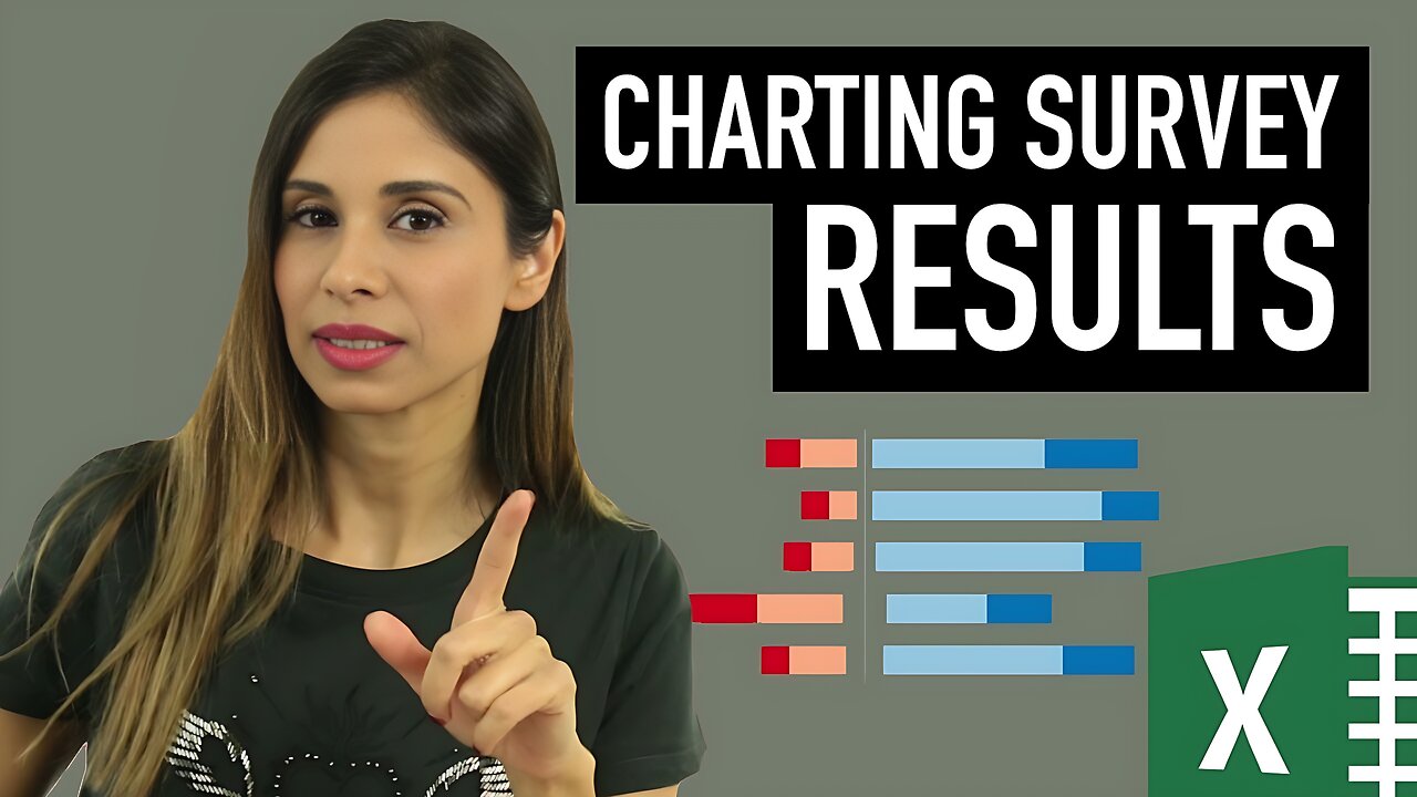
Find out how you can visualize survey results in Excel. This is specially good if you have conducted an employee satisfaction survey and you'd like to present the results.
Of course the chart can also be applied to any survey data that uses a Likert scale (which is based on people's attitudes or emotions to a topic). This can range from strongly disagree, disagree, neutral, agree and strongly agree.
I show how you can create a stacked bar chart, as well as a diverging stacked bar chart as shown on Jon Peltier's website here (https://peltiertech.com/charting-survey-results/).
Peltier Tech Chart Utility for Excel: https://peltiertech.com/Utility20/PeltierTechUtility.html
Link to Custom Formatting Blog Post: https://www.xelplus.com/excel-custom-number-formatting_1/
⯆ DOWNLOAD the workbook here: https://www.xelplus.com/charting-survey-results-excel/
★ My Online Excel Courses ► https://courses.xelplus.com
✉ Subscribe & get my TOP 10 Excel formulas e-book for free
https://www.xelplus.com/free-ebook/
EXCEL RESOURCES I Recommend: https://www.xelplus.com/resources/
Get Office 365: https://microsoft.msafflnk.net/15OEg
Microsoft Surface: https://microsoft.msafflnk.net/c/1327040/451518/7593
GEAR
Camera: https://amzn.to/2FLiFho
Screen recorder: http://techsmith.pxf.io/c/1252781/347799/5161
Microphone: https://amzn.to/2DVKstA
Lights: http://amzn.to/2eJKg1U
More resources on my Amazon page: https://www.amazon.com/shop/leilagharani
Note: This description contains affiliate links, which means at no additional cost to you, we will receive a small commission if you make a purchase using the links. This helps support the channel and allows us to continue to make videos like this. Thank you for your support!
#MsExcel
-
 UPCOMING
The Shannon Joy Show
1 hour agoICE Brutality In Evanston, Illinois Sparks New Outrage * GOP Seeks New FISA Re-Authorization * Are Tucker Carlson & Nick Fuentes Feds?
36 -
 LIVE
LIVE
The Mel K Show
1 hour agoA Republic if You Can Keep It-Americans Must Choose 11-04-25
284 watching -
 UPCOMING
Grant Stinchfield
34 minutes agoThe Mind Meltdown: Are COVID Shots Fueling America’s Cognitive Collapse?
-
 1:00:46
VINCE
3 hours agoThe Proof Is In The Emails | Episode 161 - 11/04/25
117K87 -
 LIVE
LIVE
Benny Johnson
2 hours ago🚨Trump Releases ALL Evidence Against James Comey in Nuclear Legal BOMBSHELL! It's DARK, US in SHOCK
5,358 watching -
 2:04:05
Badlands Media
10 hours agoBadlands Daily: November 4, 2025
31.3K6 -
 2:59:49
Wendy Bell Radio
7 hours agoBUSTED.
48.9K79 -
 LIVE
LIVE
The Big Mig™
3 hours agoDing Dong The Wicked Witch Pelosi Is Gone
27 watching -

Daniel Davis Deep Dive
3 hours agoFast Tracking Weapons to Ukraine, Close to $3 Billion /Lt Col Daniel Davis
6.12K6 -
 LIVE
LIVE
The State of Freedom
4 hours ago#347 Relentlessly Pursuing Truth, Transparency & Election Integrity w/ Holly Kesler
22 watching