Highlight Max & Min Values in an Excel Line Chart (Conditional Formatting in Charts)
March 21, 2019 Excel Charts
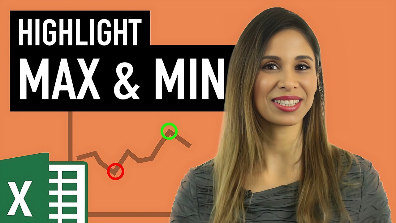
Learn how to insert a line chart in Excel and how to conditionally format the data points of the line chart to emphasize the maximum and minimum points of the line.
We apply the conditional formatting in a dynamic way so that whenever the source data changes, the position of the highlighted markers changes on the chart. With this method you can conditionally format the series of any chart you'd like. For example, to highlight the months that had the highest values or to highlight the data points in red if they are below target and green if above target - or to add conditional data labels to the chart series.
This chart is a good addition to corporate reports and Excel dashboards.
⯆ DOWNLOAD the workbook here: https://www.xelplus.com/highlight-max-min-values-in-an-excel-line-chart/
LINKS to related videos:
Chart Basics - https://youtu.be/DAU0qqh_I-A
Complete Chart Playlist: https://www.youtube.com/playlist?list=PLmHVyfmcRKyyEj7oQkCf7TL9yQQWXbGOQ
★ My Online Excel Courses ► https://courses.xelplus.com
✉ Subscribe & get my TOP 10 Excel formulas e-book for free
https://www.xelplus.com/free-ebook/
EXCEL RESOURCES I Recommend: https://www.xelplus.com/resources/
Get Office 365: https://microsoft.msafflnk.net/15OEg
Microsoft Surface: https://microsoft.msafflnk.net/c/1327040/451518/7593
GEAR
Camera: https://amzn.to/2FLiFho
Screen recorder: http://techsmith.pxf.io/c/1252781/347799/5161
Microphone: https://amzn.to/2DVKstA
Lights: http://amzn.to/2eJKg1U
More resources on my Amazon page: https://www.amazon.com/shop/leilagharani
Note: This description contains affiliate links, which means at no additional cost to you, we will receive a small commission if you make a purchase using the links. This helps support the channel and allows us to continue to make videos like this. Thank you for your support!
#MsExcel
-
 1:27:57
Tucker Carlson
3 hours agoTucker and Col. MacGregor Warn How Neocons Are Exploiting the Drug Crisis to Drag America Into War
12.9K49 -
 2:08:50
Badlands Media
8 hours agoDevolution Power Hour Ep. 402
62.6K46 -
 2:05:48
Inverted World Live
6 hours agoUFO Seen Over Tokyo During Trump Visit | Ep. 132
55.4K11 -
 2:54:08
TimcastIRL
5 hours agoDemocrat FEDERALLY INDICTED For Obstructing ICE Agents In Chicago | Timcast IRL
194K86 -
 LIVE
LIVE
SpartakusLIVE
7 hours agoNEW - REDSEC Battle Royale || The Duke of Nuke CONQUERS ALL
391 watching -

PandaSub2000
1 day agoLIVE 10:30pm ET | NINTENDO DS Night
15K13 -
 DVR
DVR
Alex Zedra
4 hours agoLIVE! Battlefield RecSec
23.2K5 -
 1:26:50
The Quartering
5 hours agoErika Kirk Threatened, SNAP Riots Near, & New AstroTurfed Woke Lib Influencer
41.7K20 -
 29:24
29:24
Glenn Greenwald
7 hours agoSen. Rand Paul on Venezuela Regime Change, the New War on Drugs, MAGA Rifts, and Attacks from Trump | SYSTEM UPDATE #539
112K107 -
 1:45:39
Badlands Media
18 hours agoAltered State S4 Ep. 3
49.8K30