Premium Only Content

The 2021 Recession: How To Prepare For The Next Market Crash
See My Portfolio & Where Opportunity Is In The Market (Discount): https://theinvestingacademy.teachable.com/p/theinvestingacademy?coupon_code=SALE&product_id=4455382
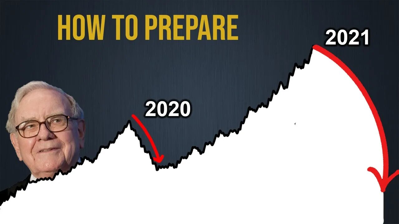
Was the 2020 market crash simply a prelude to a bigger crash in 2021? Let's discuss...
__________________________________
In the year 2020 we had one of the quickest & sharpest market crashes that we’d ever seen. The S & P 500 fell 31% in just 1 month & shortly thereafter most countries in the world went into a recession.
But what we’ve seen since then has surprised most investors. Instead of the market taking years & years to recover, in a matter of months we were back to previous price levels & the months after that we were reaching new stock market highs. These prices some predicted we wouldn’t see for decades.
We had seen a recession spread throughout the world, a great pandemic hurting businesses, but stocks were at all-time market highs. Investors were richer than they’d ever been before. This has left a lot of people wondering if we’ve simply delayed the next market crash until later on in 2021. A crash that could be potentially worse than the one we saw in 2020.
What we’ll do in this video is go over the different market crash indicators & assess the likelihood on a crash occurring this year…
First indicator that I always like to go to is the Warren Buffett indicator. The Buffett indicator is Warrens favorite one on assessing where valuations are in the market.
If we take a look here, we can see that the Buffett indicator is currently ridiculously high. It’s sitting at 227% that’s 80% higher than the historical average fair value line. This is the highest that it has been over the past 30 years of this graph. Higher than what it was in the 2008 housing bubble, and even higher that what it was in the 2000 great internet bubble. Back there it was 67% higher than fair value today we’re sitting at 80% higher. This is a graph that should many stock investors question there assumptions…
227%. This means that the market value of all stock prices are over 2 times higher than what they produce, the GDP. Historically we have not seen this before, at least not over the past 70 years, that’s as far back as I can get the data on.
Let’s look at some more indicators though. One of my favorite indicators of all-time is the 10-year treasury minus the 2 year treasury, because it’s so consistent at predicting a crash…
Whenever this graph inverts to below zero it is one of the strongest signs of a recession. If we go back to 1989 it inverted below zero, and a year later we saw a recession. In 2000 we saw it invert, & in 2001 we had a recession. 2006 it inverted again & what do you know 2 years later we got hit with a great recession. Then most recently in 2019 we saw an inversion & obviously we’ve just been through a recession in 2020.
Now if we take a look at this indicator, it’s actually gone up since the 2019 inversion, up by a lot, it’s currently sitting at 1.46. 1.46 that’s nowhere near close to another dip. This means that according to this indicator we will not see another recession soon unless we see a double recession from the previous dip in 2019. That’s a total possibility.
So why is it that whenever we see this indicator dip below zero that we almost always see a recession? I believe it’s predicted the past 8/10 recessions, an 80% success rate.
It’s because investors are worried. The market is shaky & people will take any low interest, just to lock their money away for 10 years. So much so that they will take a lower interest in a 10-year treasury compared to a shorter-term 2-year treasury. They just want their money stowed away for a long-time not in something that could potentially crash soon. So 10 year treasury minus 2-year treasury that’s always a good indicator to pay close attention to…
Another thing that any smart investor should be looking at when analyzing the chances of a crash is the S & P 500 p/e ratio. Basically, what this metric does is it compares the price to the earnings. Now the average p/e ratio across time is 15. Anything above that means prices are higher compared to the earnings that they normally produce.
As you can see right now we’re sitting at a p/e ratio of 44.6. This is higher than what they were in the 2000 crash, but not quite as high as the 2008 one. Still 44.6, this means prices are almost 3 times higher than the average across history…
Subscribe Here: https://bit.ly/2Y1kNq8
___
DISCLAIMER: It's important to note that I am not a financial adviser and you should do your own research when picking stocks to invest in. This video was made for educational and entertainment purposes only. Consult your financial adviser. * Some of the links on this webpage are affiliate links. This means at no additional cost to you, we earn a commission if you click through and make a purchase and/or subscribe. This has no impact on my opinions, facts or style of video.
-
 5:30:52
SpartakusLIVE
8 hours agoDuos w/ @GloryJean || #1 Masculine Muscle MASS sears YOUR retinas with MIND BENDING content
197K3 -
 3:05:49
TimcastIRL
7 hours agoNew DOCS PROVE Obama Hillary CONSPIRACY To SABOTAGE Trump Admin | Timcast IRL
211K87 -
 2:29:36
Laura Loomer
7 hours agoEP136: YOU'RE FIRED! White House Vetting Crisis Continues
52.4K29 -
 8:07
8:07
MattMorseTV
7 hours ago $5.51 earnedTrump just LOWERED PRICES by 75 PERCENT.
31.4K32 -
 LIVE
LIVE
Misfit Electronic Gaming
10 hours ago $3.68 earned"LIVE" "Blind Descent' +"Dollhouse of Dead" Playtest 10 Followers till we hit 1000! We CAN do this!
506 watching -
 21:53
21:53
Glenn Greenwald
9 hours agoMichael Tracey on the Street: What Do People Think of the Epstein Case?
124K57 -
 2:26:28
megimu32
6 hours agoOTS: Board Games Gone Wild! The Loud, Weird & Chaotic Games That Raised Us
33.7K9 -
 4:25:16
DamnDanieI
7 hours agoKill First, Loot Later – OTG Live
51.9K1 -
 56:41
56:41
Donald Trump Jr.
11 hours agoLies, Leaks, and Lawfare: Censorship Corruption Exposed | TRIGGERED Ep.263
174K159 -
 1:19:46
Precision Rifle Network
8 hours agoS4E25 Guns & Grub - Rex Is Back, I shot the 6.5PRC finally...
30.4K1