Excel Tables: Use Smart Conditional Formatting for great table layout
Mar 2, 2017 Excel Charts
This is part of my Advanced Online Data Visualization Course: https://courses.xelplus.com/
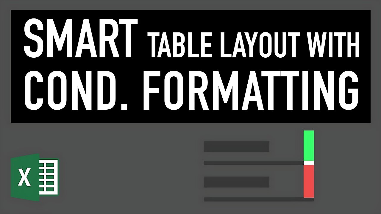
In this lecture you will learn how you can use conditional formatting smartly to highlight negative and positive differences based on a threshold. The method used here is one of my favorite conditional formatting methods in Excel.
This way you can improve readability of your Excel tables that are used for corporate reporting.
★ My Online Excel Courses ► https://courses.xelplus.com/
✉ Subscribe & get my TOP 10 Excel formulas e-book for free
https://www.xelplus.com/free-ebook/
EXCEL RESOURCES I Recommend: https://www.xelplus.com/resources/
Get Office 365: https://microsoft.msafflnk.net/15OEg
Microsoft Surface: https://microsoft.msafflnk.net/c/1327040/451518/7593
GEAR
Camera: https://amzn.to/2FLiFho
Screen recorder: http://techsmith.pxf.io/c/1252781/347799/5161
Microphone: https://amzn.to/2DVKstA
Lights: http://amzn.to/2eJKg1U
Note: This description contains affiliate links, which means at no additional cost to you, we will receive a small commission if you make a purchase using the links. This helps support the channel and allows us to continue to make videos like this. Thank you for your support!
#MsExcel
-
 16:44
16:44
Russell Brand
1 hour agoAmerica’s Hidden Royalty
1.3K4 -
 2:05:29
The Quartering
3 hours agoEscape From New York, Harvard Bombers Caught, Trump DEFIES Court On SNAP, Bomb Threat On Plane!
95.9K56 -
 LIVE
LIVE
StoneMountain64
2 hours agoBattlefield REDSEC leveling guns for attachments
242 watching -
 LIVE
LIVE
Pop Culture Crisis
2 hours agoCoca-Cola's WAR ON CHRISTMAS, Movie Press Tour CRINGE, Gen Z HATES Gen Z | Ep, 949
542 watching -
 16:30
16:30
Clintonjaws
17 hours ago $4.31 earned'The View's' Producer Stops Show & Forces Whoopie To Correct Lie
18.8K6 -
 1:10:24
Steve-O's Wild Ride! Podcast
5 days ago $0.38 earnedMatt McCusker Makes Steve-O Nervous | Wild Ride #272
13.1K1 -
 17:09
17:09
Bearing
9 hours agoHasan Goes NUCLEAR On Chat ☢️ ROASTED By JD Vance Over Dog Allegations 🚨
18.8K28 -
 LIVE
LIVE
The HotSeat With Todd Spears
1 hour agoEP 203: The Military "Whistleblower"
780 watching -
![[Ep 784] Election 2025: NYC is Screwed | Tatum Calls Out Kirk Conspiracists | Guest: Sam Anthony](https://1a-1791.com/video/fwe2/00/s8/1/U/Q/E/w/UQEwz.0kob-small-Ep-784-Election-2025-NYC-is.jpg) LIVE
LIVE
The Nunn Report - w/ Dan Nunn
1 hour ago[Ep 784] Election 2025: NYC is Screwed | Tatum Calls Out Kirk Conspiracists | Guest: Sam Anthony
162 watching -
 1:22:54
DeVory Darkins
4 hours agoTrump makes shocking announcement as Major ELECTION UPDATE drops after bomb threat
91.8K53