Historic Market Crash Warning: This 30-Year Pattern Signals Trouble Ahead
🟢 BOOKMAP DISCOUNT: https://bit.ly/3F8qdGb
🟢 TRADE IDEAS & DISCORD: https://www.patreon.com/figuringoutmoney
🟢 TRADE WITH IBKR: http://bit.ly/3mIUUfC
______________________________________________________________________________________________
In this episode of Michael Silva's Stock Market Brief show, he discusses an important topic that he feels people are not taking seriously enough, which is the debt ceiling. The debt ceiling is a limit set by the US government on how much it can borrow to finance its operations, and if the ceiling is not raised, it could lead to a default on government spending and federal debt. The drop-dead date for the debt ceiling is estimated to be around June 1st, which could have serious consequences for the market. Michael Silva points out that the market has not gone anywhere, and there have been wild swings, which is a cause for concern.
Michael Silva talks about credit default swaps, which are starting to gain attention. In 2011, leading up to the debt ceiling crisis, the market fell 20% in four months, and we saw a rise in credit default swaps. We are seeing a similar rise in credit default swaps now, almost to the level that we saw in 2008. Michael Silva also discusses the one-year Credit Default Swaps, which is much higher than it was in 2011 and even higher than during the 2008 financial crisis.
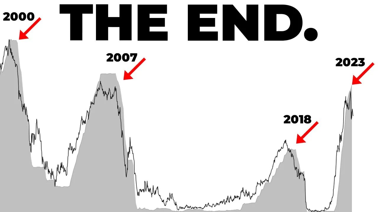
Michael Silva points out that all of this is happening at a very interesting time. In January, the federal funds rate went above the two-year yield, which typically marks the end of the hiking cycle. This was also around the same time as the banking crisis. Michael Silva presents a graph that shows the times when the red line (federal funds rate) got above the blue line (two-year yield), and that was right before the 2000 and 2007 recessions.
Michael Silva warns that when the fed stops the hiking cycle and starts reducing rates, typically, something happens, and we have seen the market fall off many times. He mentions that we need to be careful of the catalysts that are around us, and that the yield curve is the best indicator of a recession. When the curve inverts, it's not a good sign, and we saw this before the great financial crisis and the dot-com bust. Michael Silva concludes by urging people to be open to the idea of what might happen and to be careful of the catalysts that are present.
🔔 Subscribe now and never miss an update: https://www.youtube.com/c/figuringoutmoney?sub_confirmation=1
📧 For business inquiries or collaboration opportunities, please contact us at FiguringOutMoney@gmail.com
📈 Follow us on social media for more insights and updates:
🟢 Instagram: https://www.instagram.com/figuringoutmoney
🟢 Twitter: https://twitter.com/mikepsilva
______________________________________________________________________________________________
How To Predict How Far Stocks Can Go (EXPECTED MOVES):
○ https://youtu.be/JT32L89ZpEk
Saylor To Schiff Bitcoin Indicator:
○ https://youtu.be/zuG9Tjnud9k
Show Me The Money Scan:
○ https://youtu.be/dzRjEuUUb5g
Party Starter Scan:
○ https://youtu.be/zzaN91gcJOI
Bouncy Ball Scan:
○ https://youtu.be/7xKOo6vNaq8
Dark Money Scan:
○ https://youtu.be/ZUMuHaSg1ro
Sleepy Monster Scan:
○ https://youtu.be/C9EQkA7uVU8
High Volatility Scan:
○ https://youtu.be/VC327ko8DfE
______________________________________________________________________________________________
DISCLAIMER: I am not a professional investment advisor, nor do I claim to be. All my videos are for entertainment and educational purposes only. This is not trading advice. I am wrong all the time. Everything you watch on my channel is my opinion. Links included in this description might be affiliate links. If you purchase a product or service with the links that I provide I may receive a small commission. There is no additional charge to you! Thank you for supporting my channel :)
#stockmarket #sp500 #macroeconomics
-
 38:47
38:47
MattMorseTV
3 hours ago $6.80 earned🔴Tulsi just CLEANED HOUSE.🔴
33.9K52 -
 LIVE
LIVE
Reolock
4 hours agoWoW Classic Hardcore | WE'RE BACK!!
91 watching -
 LIVE
LIVE
SynthTrax & DJ Cheezus Livestreams
6 hours agoShell Shock Live - The Scorched Earth Remake/Upgrade - 4pm PST / 7pm EST - RUMBLE GAMING
138 watching -

Illyes Jr Gaming
2 hours agoBack to Black .....Ops 6 w/ ILLYESJRGAMING
5.93K1 -
 1:07:59
BonginoReport
6 hours agoBoston Mayor Defies Trump, Protects Illegals - Nightly Scroll w/ Hayley Caronia (Ep.115)
98.4K75 -
 40:45
40:45
Donald Trump Jr.
6 hours agoPeace by Peace: Solving One Problem After Another | Triggered Ep.268
63.7K57 -
 LIVE
LIVE
FrizzleMcDizzle
3 hours ago $0.43 earnedRemnant 2 - Dark Souls-like Shooter?!
113 watching -
 LIVE
LIVE
FoeDubb
2 hours ago🏰KINGDOM MENU: 🏈FOOSBALL & 🎮DELTA FORCE PEW PEWS DILLY DILLY!!
15 watching -
 11:43:31
GritsGG
14 hours agoWin Streaking! Most Wins 3390+ 🧠
60.9K -
 1:08:29
TheCrucible
6 hours agoThe Extravaganza! Ep. 24 (8/19/25)
79.3K18